Comm100 Rebrand
Comm100 is a SaaS company that offers omnichannel customer service software, including live chat, chatbots and digital engagement solutions. During 2021, Comm100 strategically transitioned its market focus from catering predominantly to small businesses, to prioritizing medium to large enterprises. They also refined their target demographics, concentrating efforts on Higher Education, Government and Credit Unions. This transition prompted a reassessment of its visual branding to ensure alignment with its evolving market strategy.
My role: Lead designer, responsible for conducting a brand analysis through user interviews and surveys, competitor research, producing new brand concepts, brand guidelines and website designs.
The team: Product marketing, growth marketing and a content manager.
Timeline: 6 months in 2021
Process:
Brand analysis
I partnered with a content manager to execute a brand and buyer journey analysis. We did this by conducting four surveys to three different audiences and four customer interviews. We targeted internal employees, existing customers and prospective clients. The objective was to understand:
- The perception of Comm100's current visual brand among each audience segment
- Identification of which visual elements were deemed suitable for an enterprise software company
- Understanding which characteristics they would expect the brand to have
- Important factors influencing the selection of new software
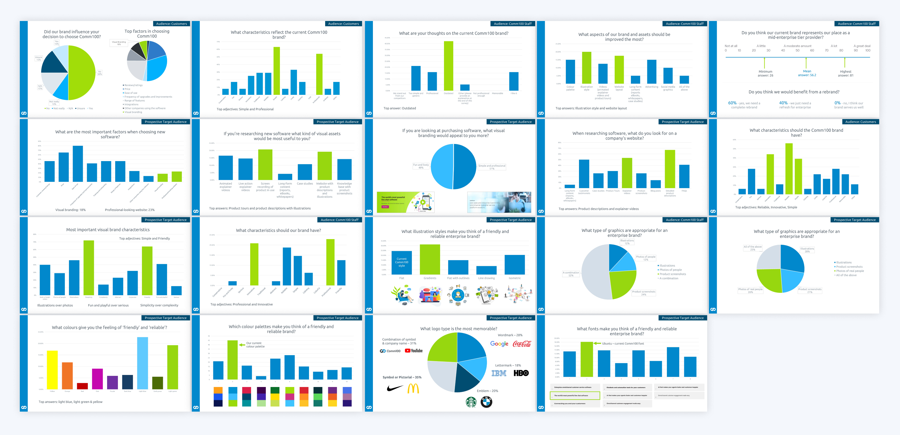
Key insights
Our existing brand was seen as simple and professional.
Customers and prospects expressed a desire for our brand to embody the attributes of reliability, simplicity, friendliness and innovation.
There was no distinct preference on graphic styles out of illustrations, photography and product screenshots.
The colours that were perceived to represent a "friendly" and "reliable" brand were seen as light blue, light green and yellow.
Internal employees were very critical of the visual brand, advocating for the need to rebrand.
Competitor and customer brand research
I conducted competitor and customer brand research with the objective of identifying where we were positioned in the market in terms of visual branding, and if there were any gaps in the market that we could potentially leverage to stand out.
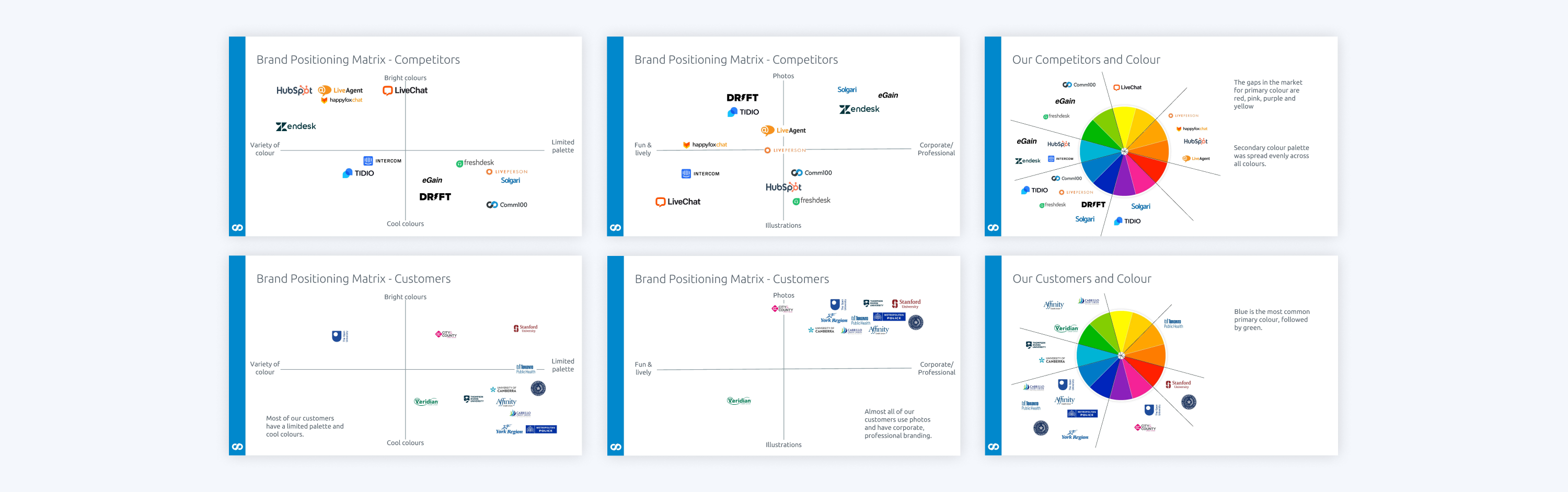
Key insights:
Almost all of Comm100's major customers had very corporate branding, using primarily photos, with blue as their primary colour.
Our competitors had a balanced distribution between using bright colours and having a diverse colour palette, and opting for cool colours with a more restricted colour palette.
Our competitors used a variety of graphic styles ranging from photos to illustrations, and were divided between adopting a corporate professional brand and a vibrant, lively brand.
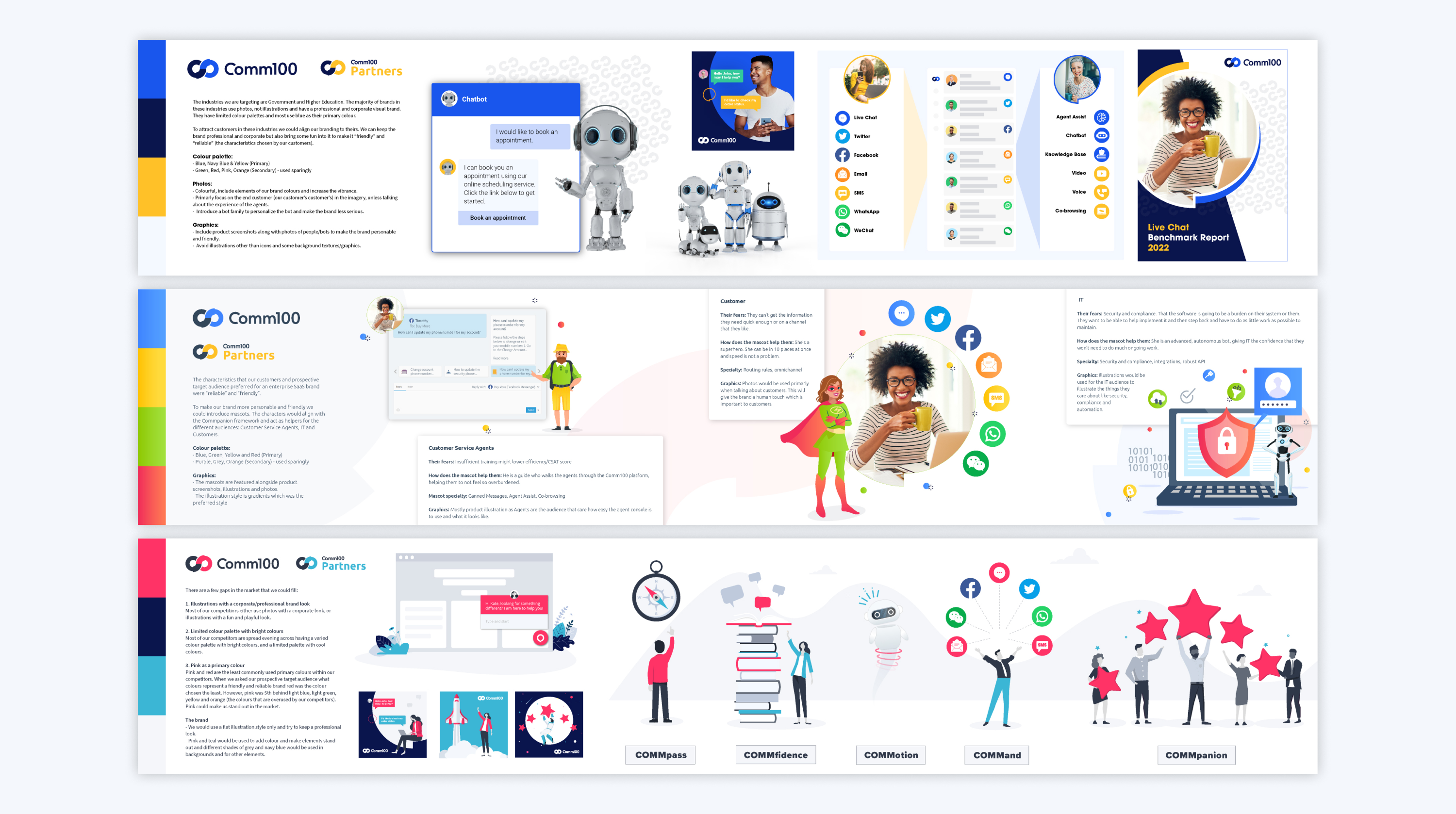
Concepts
Using the customer and market research, I produced three initial brand concepts with different aims:
- To align with Comm100's customers' branding
- To portray Comm100's brand personality
- To stand out from competitors by filling a gap in the market
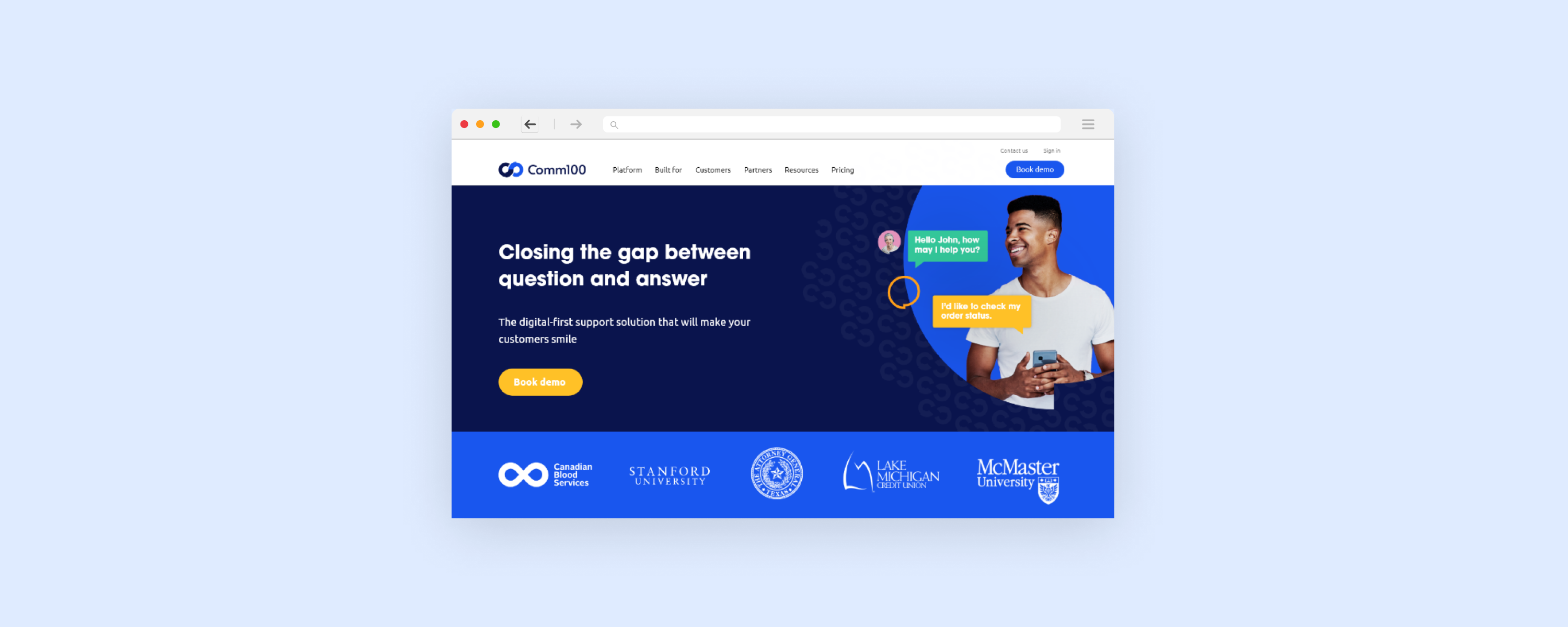
I presented these ideas to the team, as well as the CEO and we decided the most effective concept was the first, so I worked on designing a new homepage concept using this new brand direction.
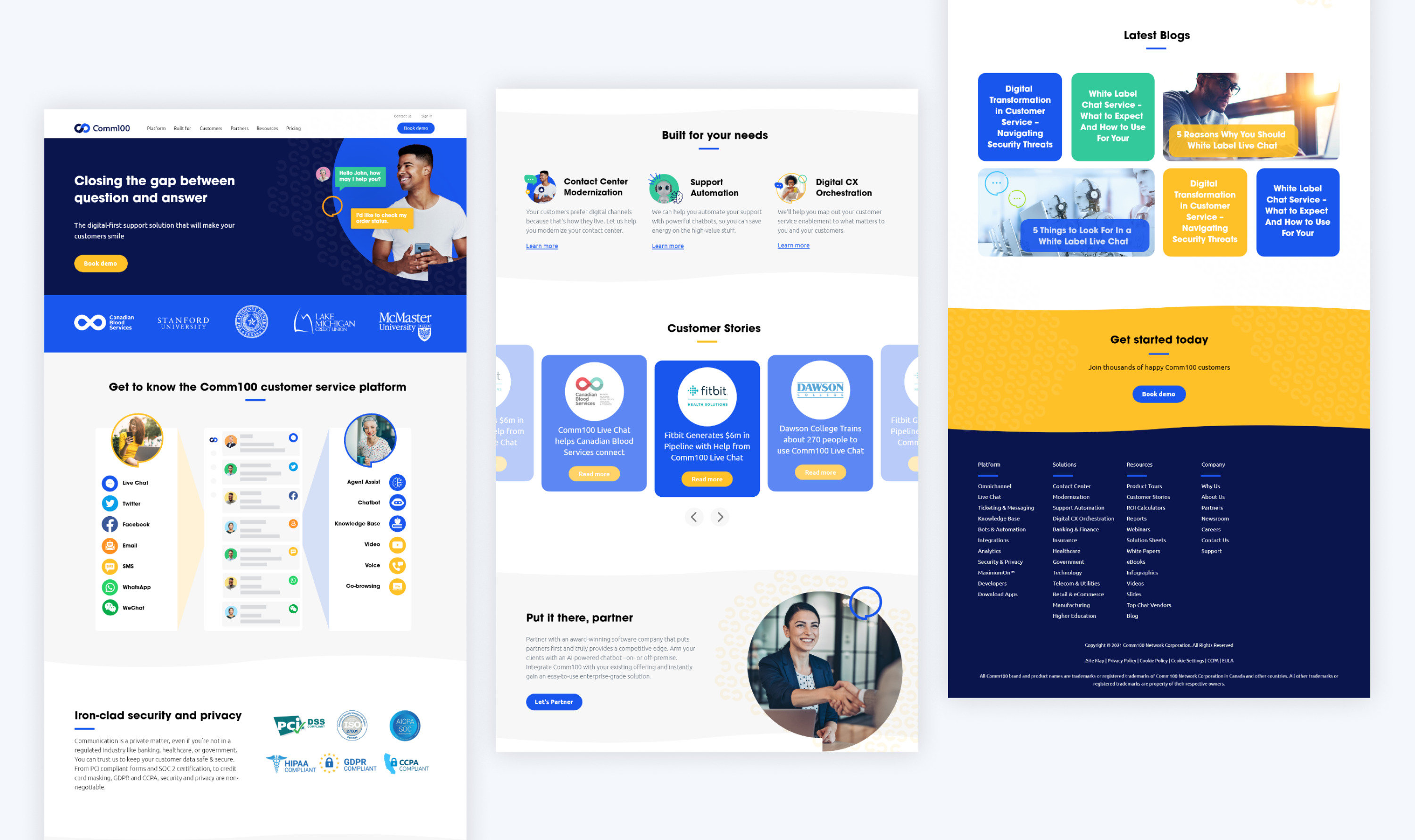
Homepage concept
The new concept aims to align with Comm100's customers' branding which tends to be very professional and corporate, mainly using blue as the primary colour and photography as the main visual. It also aimed to convey the characteristics "friendly" and "reliable" while also being more modern, vibrant and fun.
Further customer surveys
We wanted to compare this new brand with the existing brand so I conducted further user tests involving both our customers and employees. Participants were asked to articulate their preferences, providing rationale for their choices with a specific focus on assessing the alignment of each brand with the identity of an enterprise SaaS company and with certain characteristics.
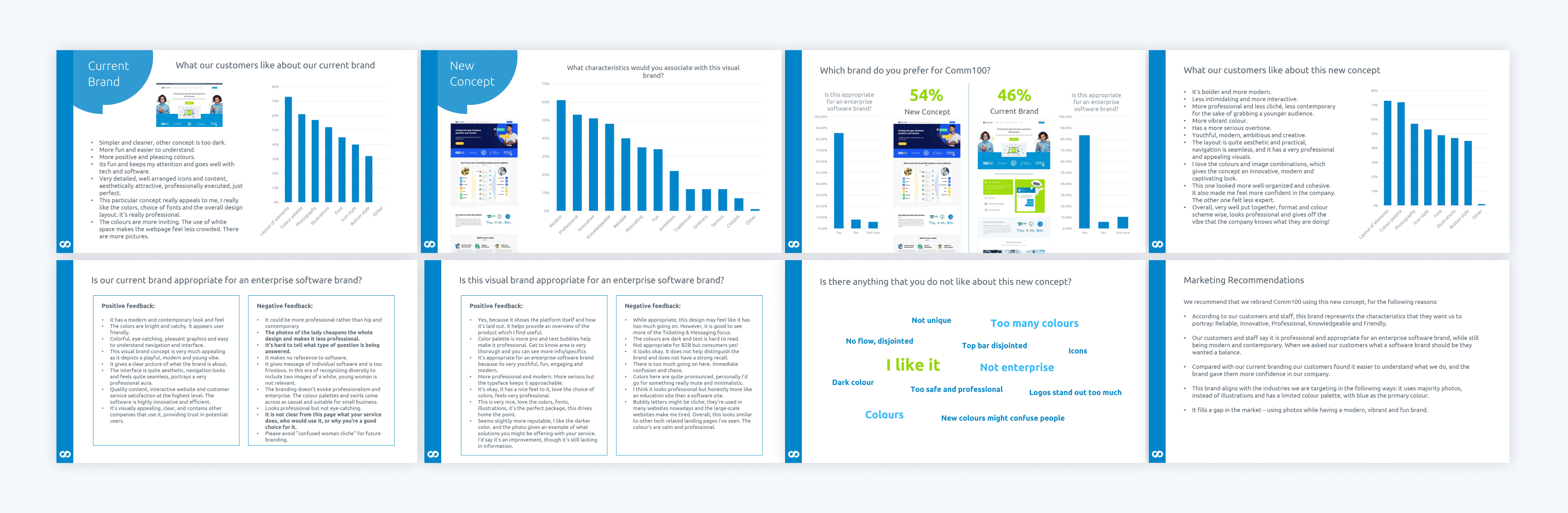
Key insights:
The new brand made it easier for customers to understand what Comm100 was and it gave them more confidence in the company.
The new brand represented the characteristics we were aiming to portray: reliable, innovative, professional and friendly.
Common impressions of the new brand was that it was modern and vibrant.
Similar to the earlier research, Comm100 employees were very critical of the old brand and preferred the new one. Whereas, there was a smaller gap in preference for customers, with the new brand still winning overall.
Outcome
We decided to proceed with the new brand as it achieved what we were hoping, it was seen to represent Comm100 well in the new positioning and it held the characteristics of our brand personality. I produced brand guidelines and began working on a roll out plan to launch the new brand across the organization.