Ik’splôr Mobile App
As part of my UI/UX design professional certificates I worked on a mobile application which I named “Ik’splôr”. The project brief was to create a highly usable, functional and delightful design solution for a digital experience, such as a web or desktop application, a mobile app, or any other digital product. The process to achieve this involved conducting user interviews, identifying personas, creating sketches and wireframes, creating a brand guide and a functioning prototype in Figma.
The problem
The problem I chose to solve was: Backcountry enthusiasts need to use multiple different apps and websites to manage all their activities/trips into the backcountry.
Potential users of the solution: Outdoor enthusiasts who love exploring the backcountry. They could be doing the following activities: hiking, mountain-biking, skiing/snowboarding, hunting, motorbiking, snowmobiling, snowshoeing.
User interviews
I interviewed five people that would be potential users of the solution to understand their pain points, motivations and behaviors.
Common pain points
- Safety in the backcountry
- Being unable to find up-to-date, accurate or relevant information
- Accessing information offline when out of phone reception
- Having to use multiple platforms
Common motivations
- Fitness
- Challenge
- Escape
- Adventure
- Scenery
- Socializing
User behaviour
- Users don’t usually go into the backcountry alone. They usually go with at least one other person.
- When going on remote or multi-day trips people send a trip plan to family/friends for safety.
- A number of users like to keep a record of their trips and see stats on them.
- Users often screenshot or download webpages and documents to access offline as they trust the manual process.
Insight
Backcountry enthusiasts would feel safer and have more time to enjoy the backcountry if they had easily accessible and accurate information that was available offline and on one single platform.
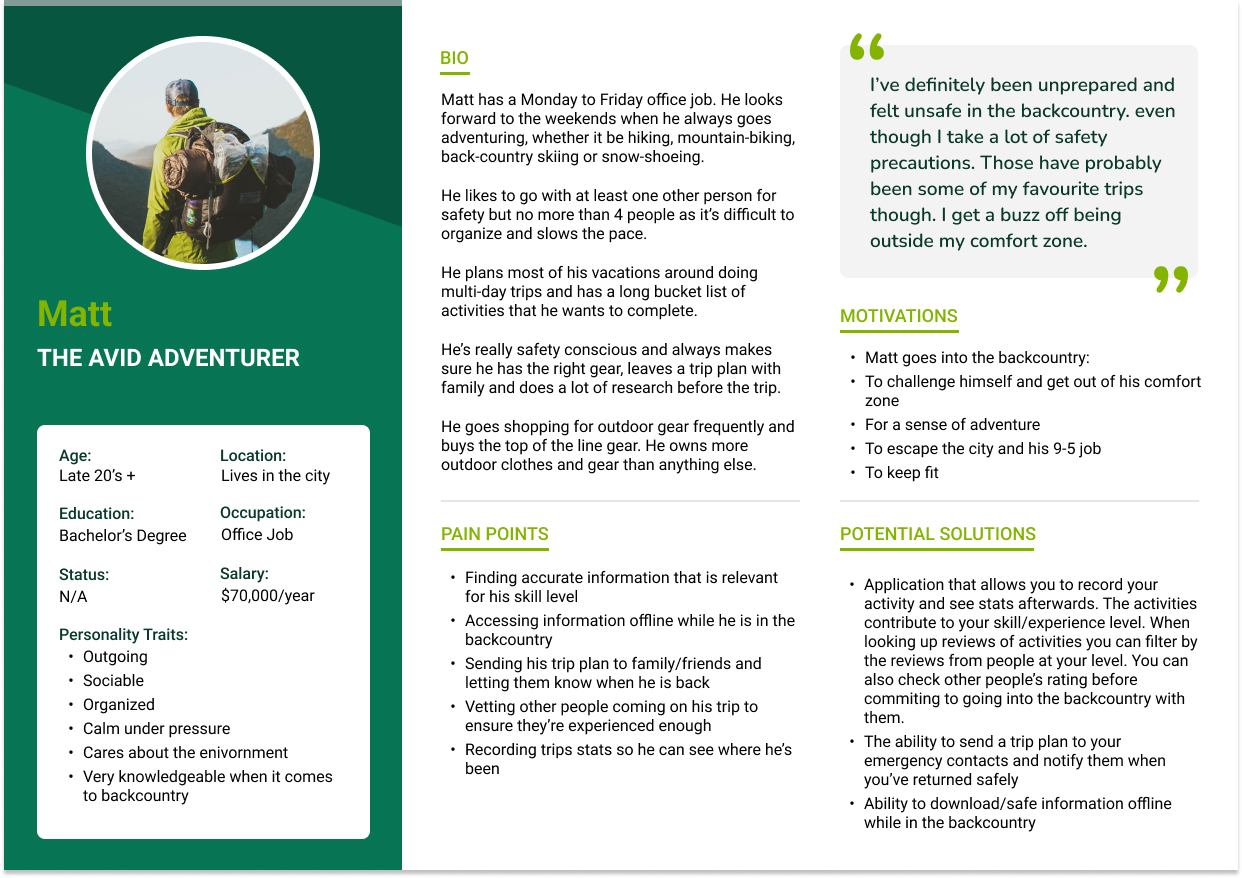
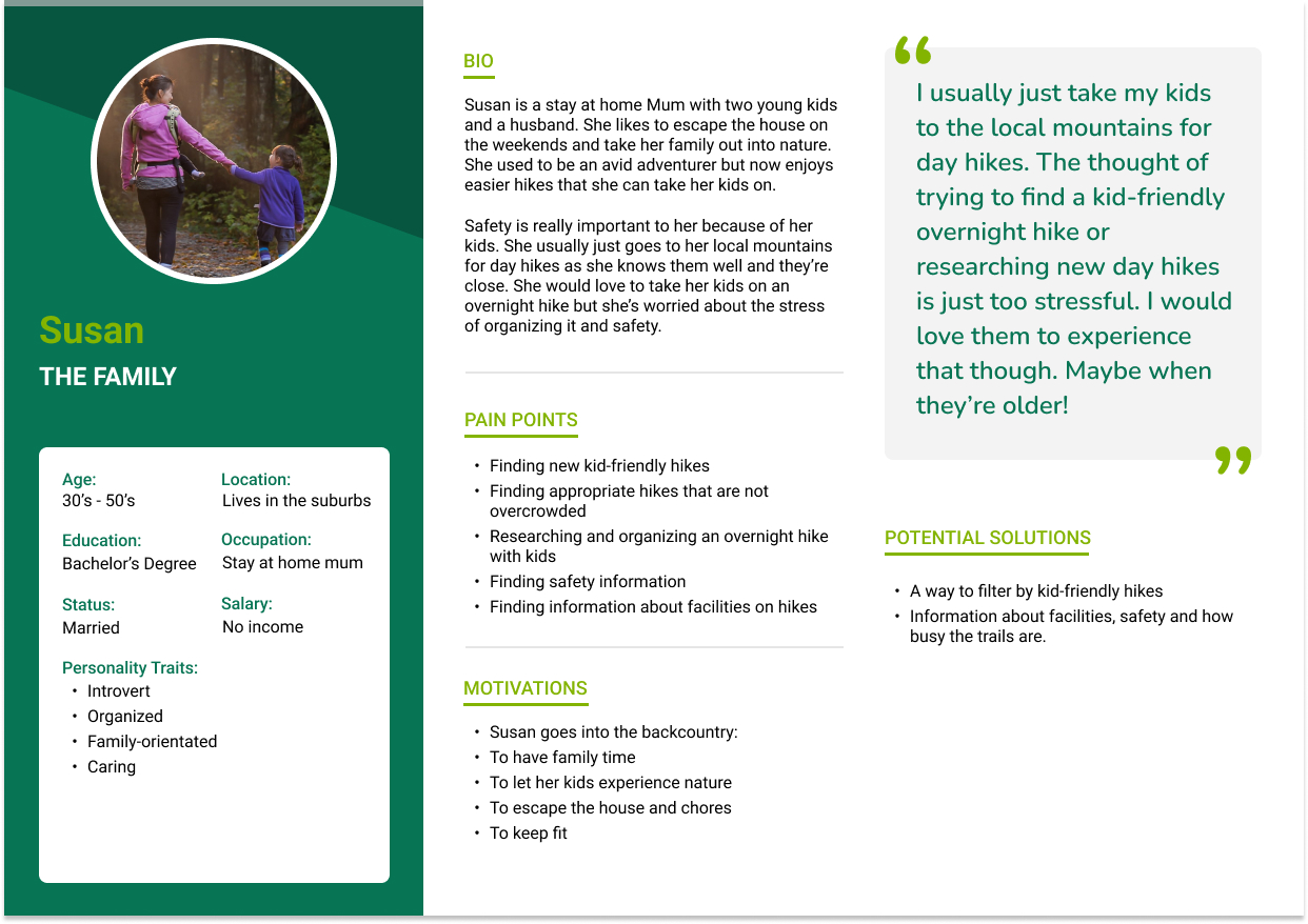
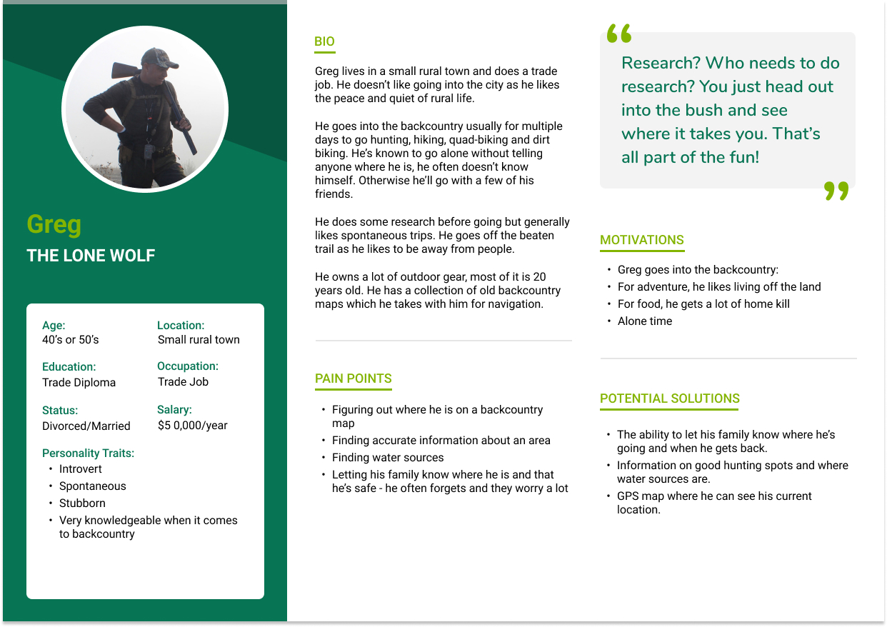
Personas
I identified four different personas who would be using the mobile app:
- The social weekend adventurer
- The avid adventurer
- The lone wolf
- The family

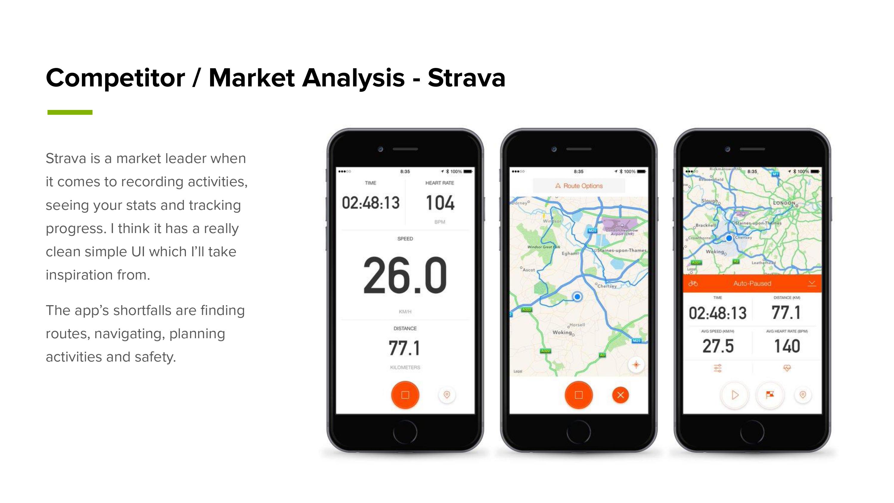
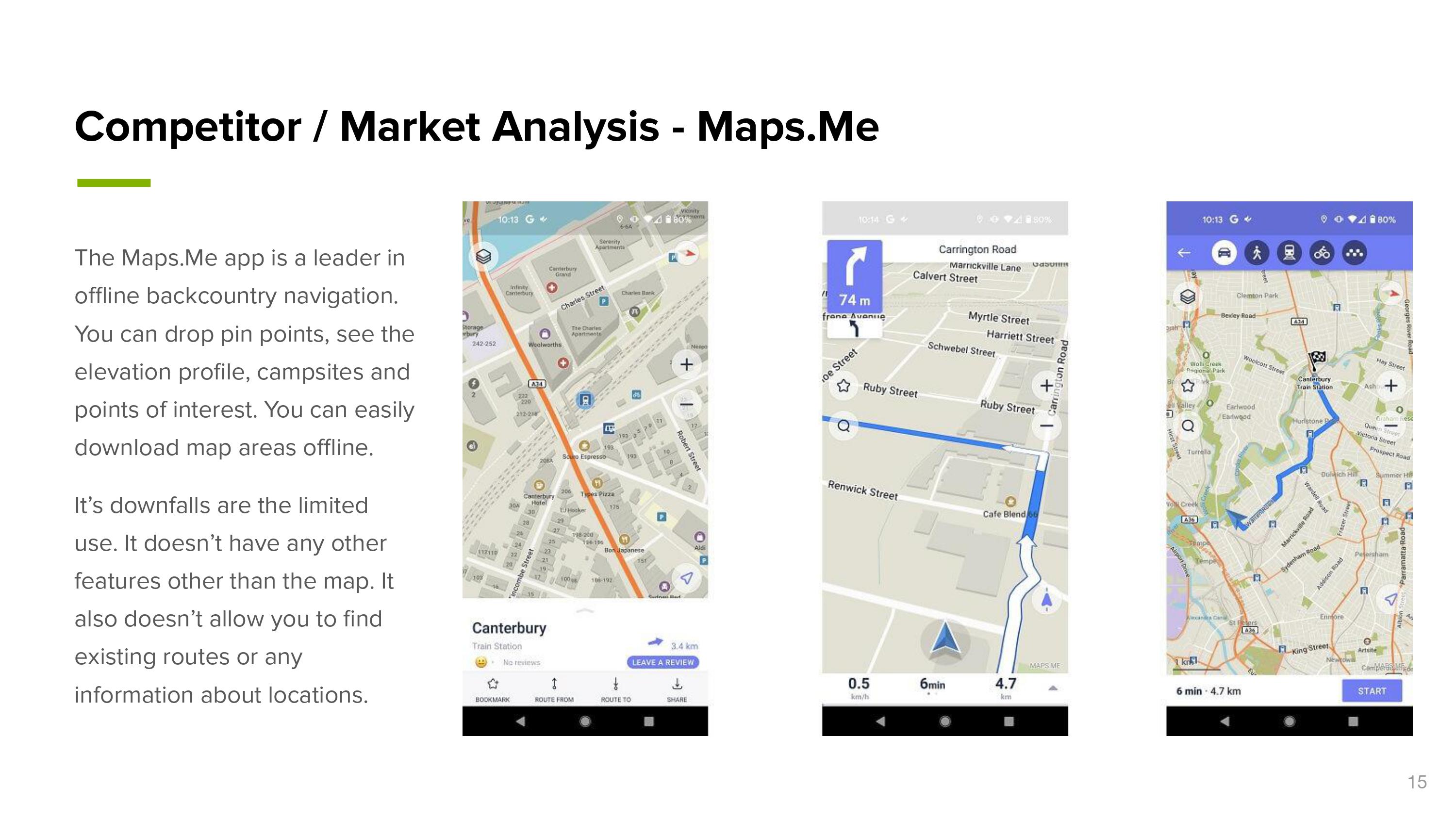
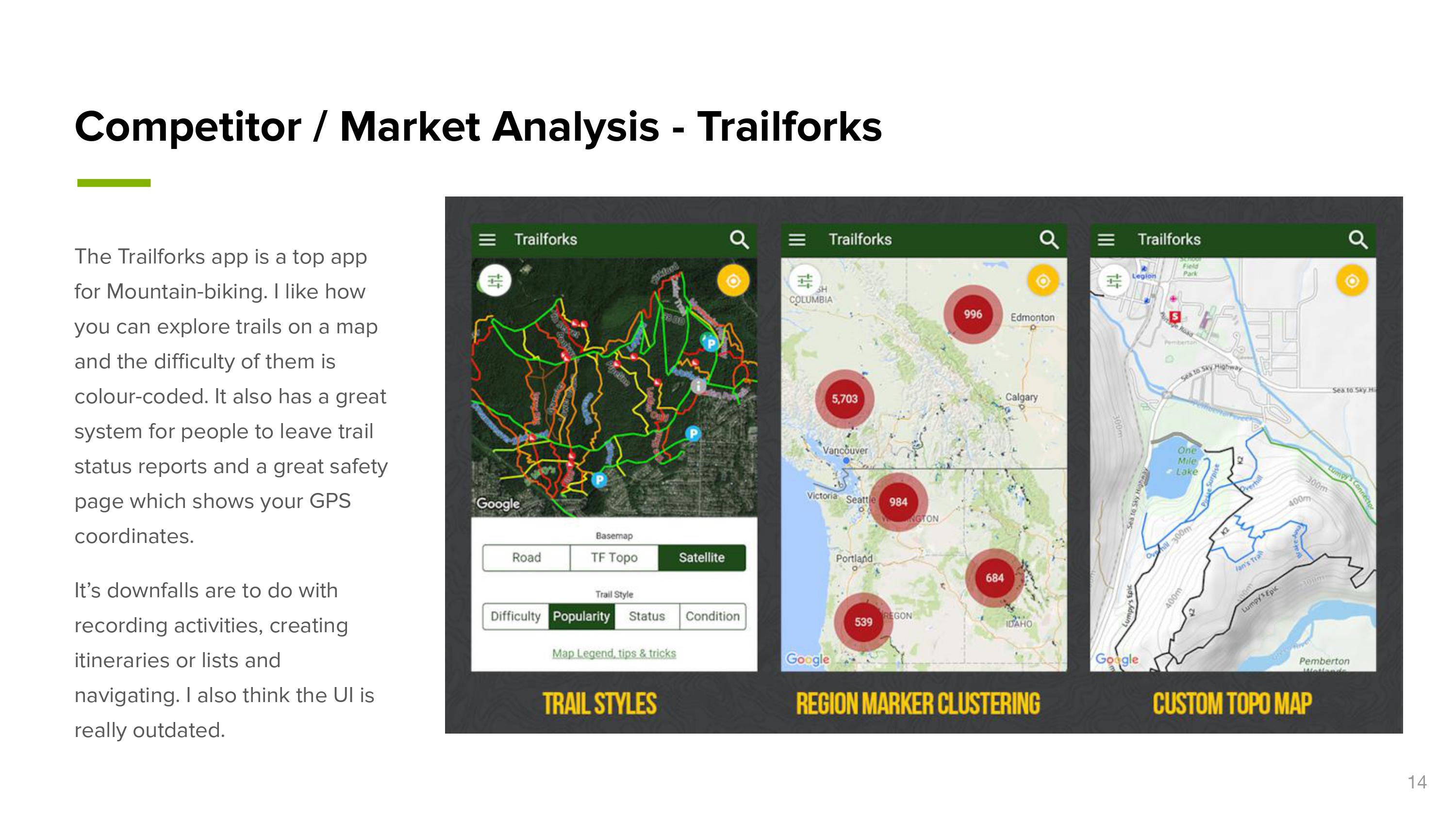
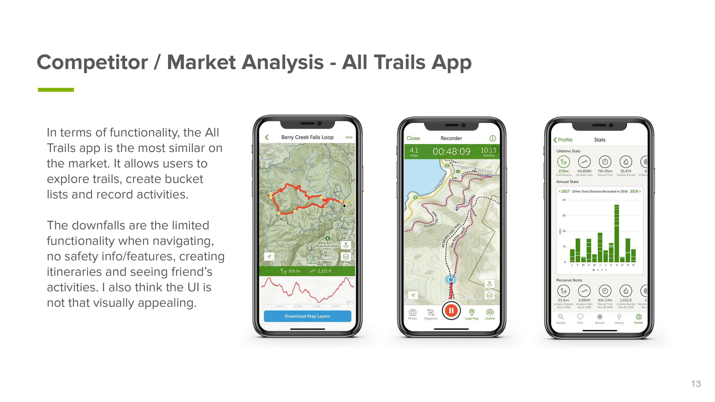
Competitor research
I researched a number of market leaders in activity recording, navigation and research. I identified elements that would be useful to my target audiences and the limitations of each app.
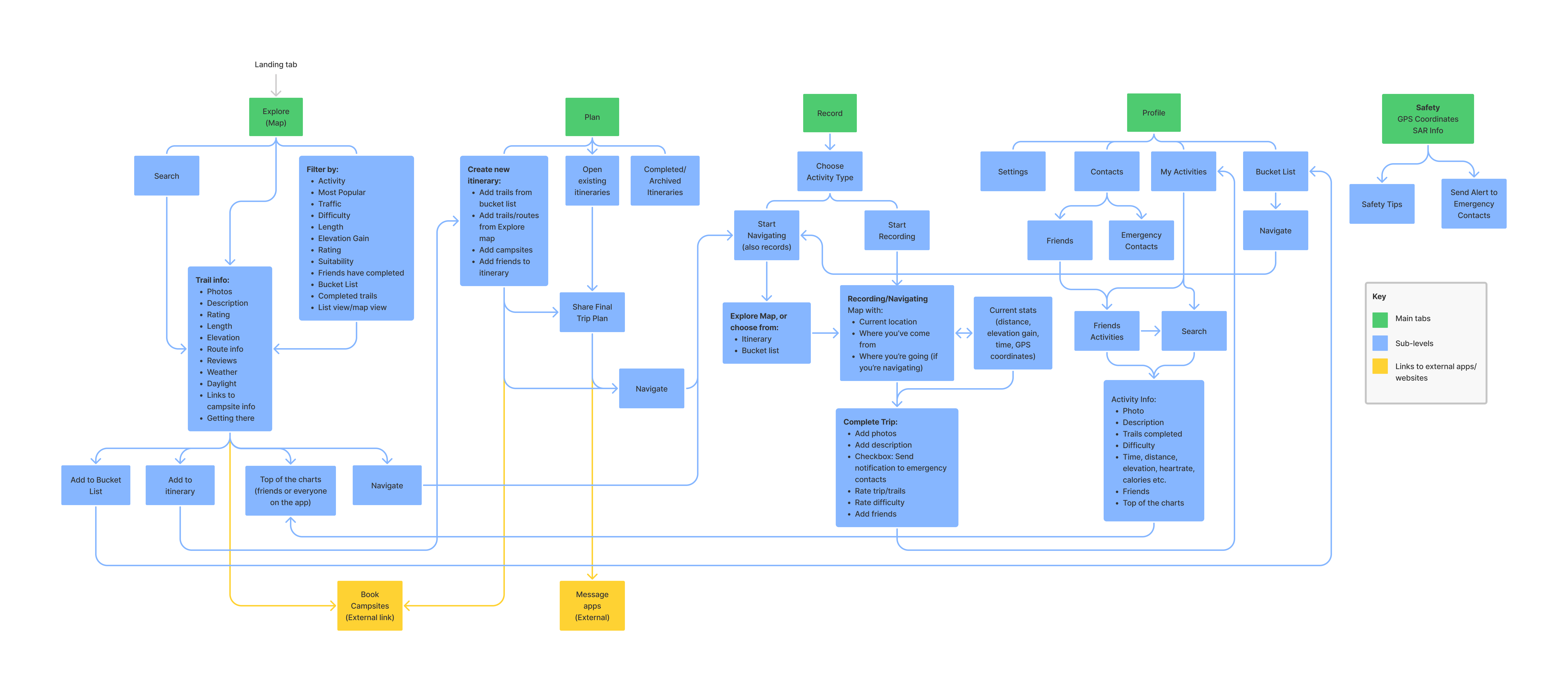
Information architecture and user flows
I used the initial research to identify the five main tabs of the app. I then did a card sorting activity with the interviewees and asked them to place features under the categories that made sense to them. Using the results, I started mapping out the information architecture and user flows.
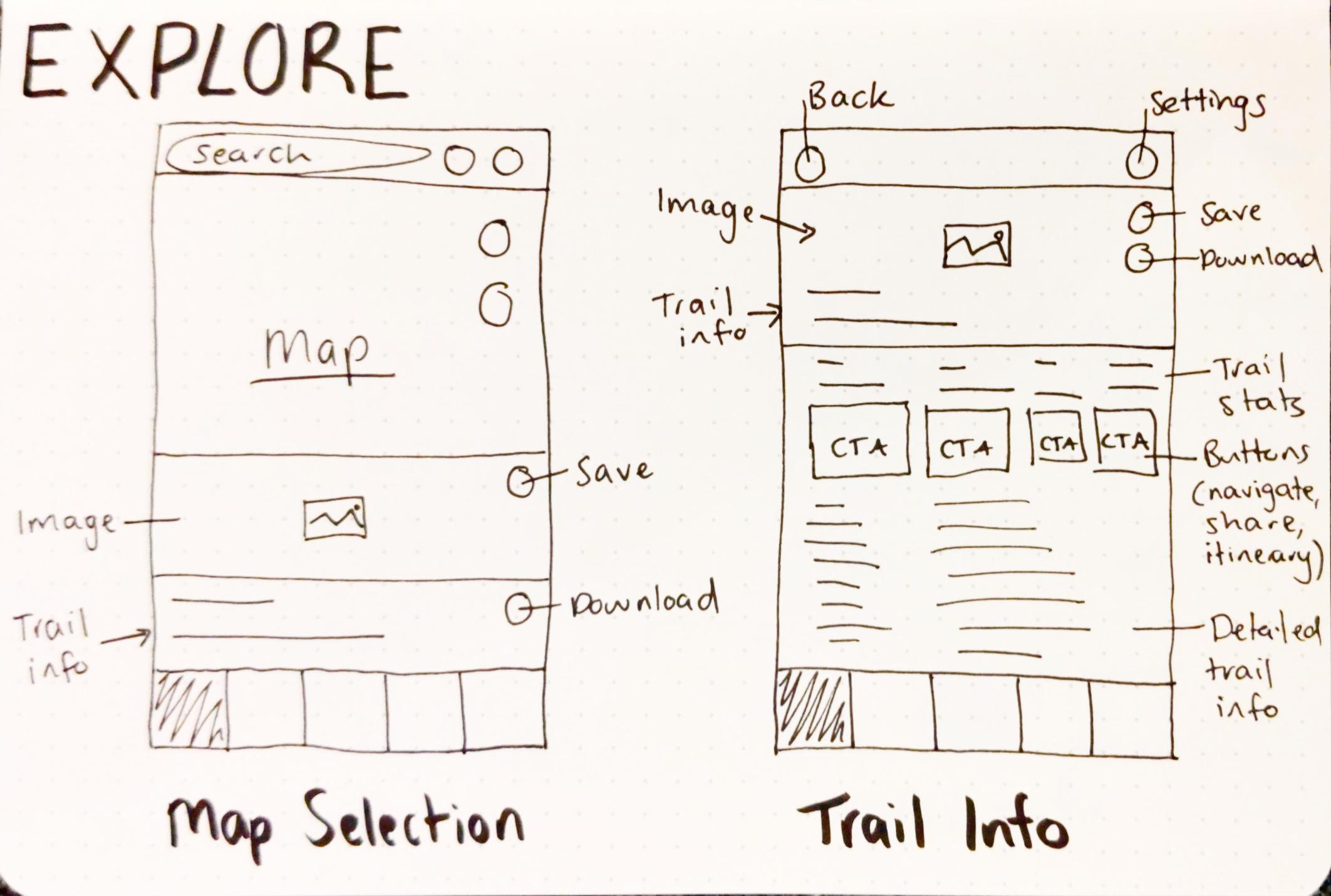
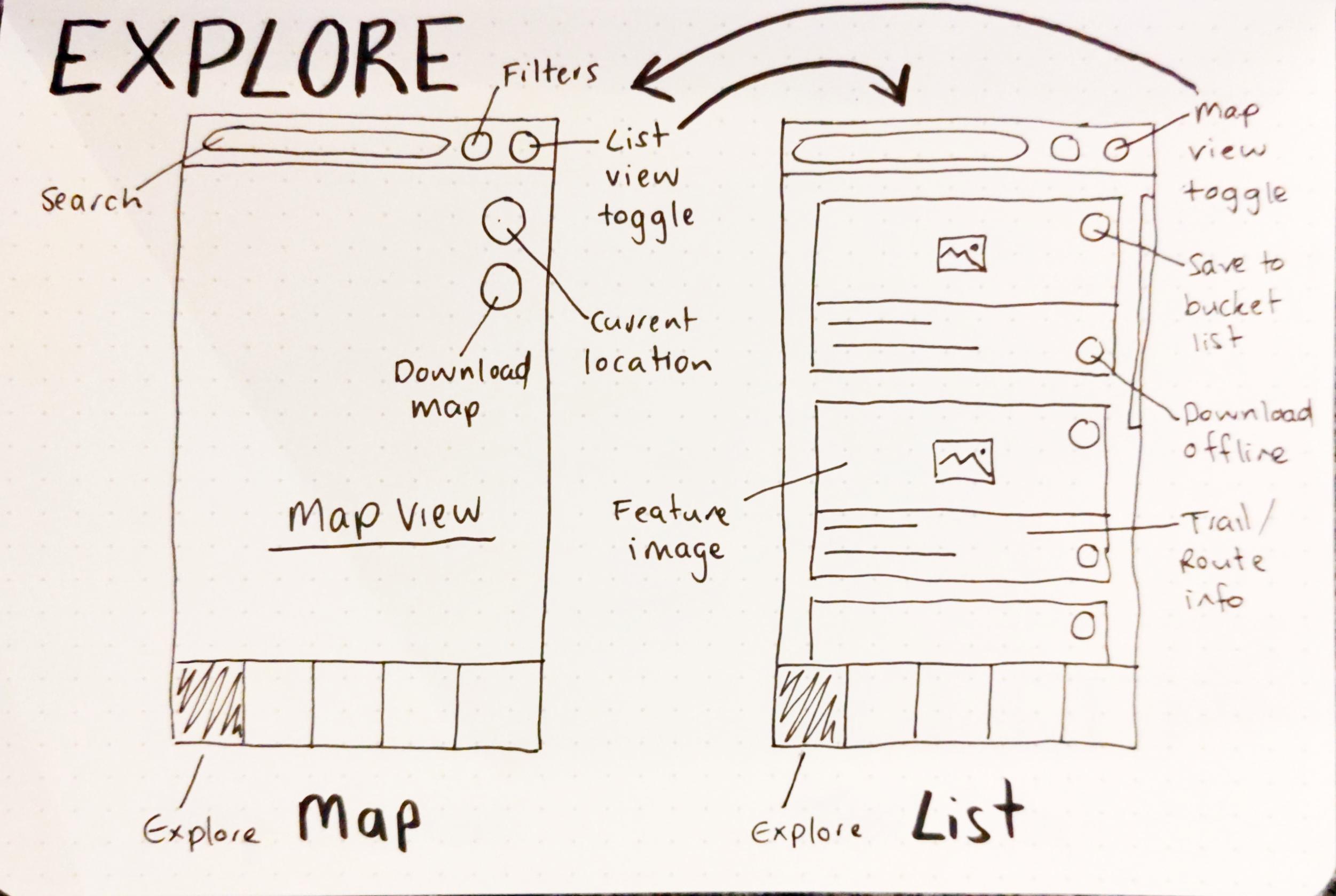
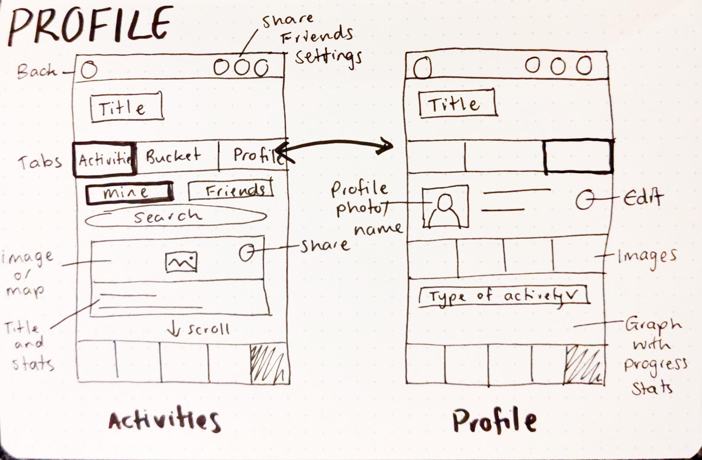
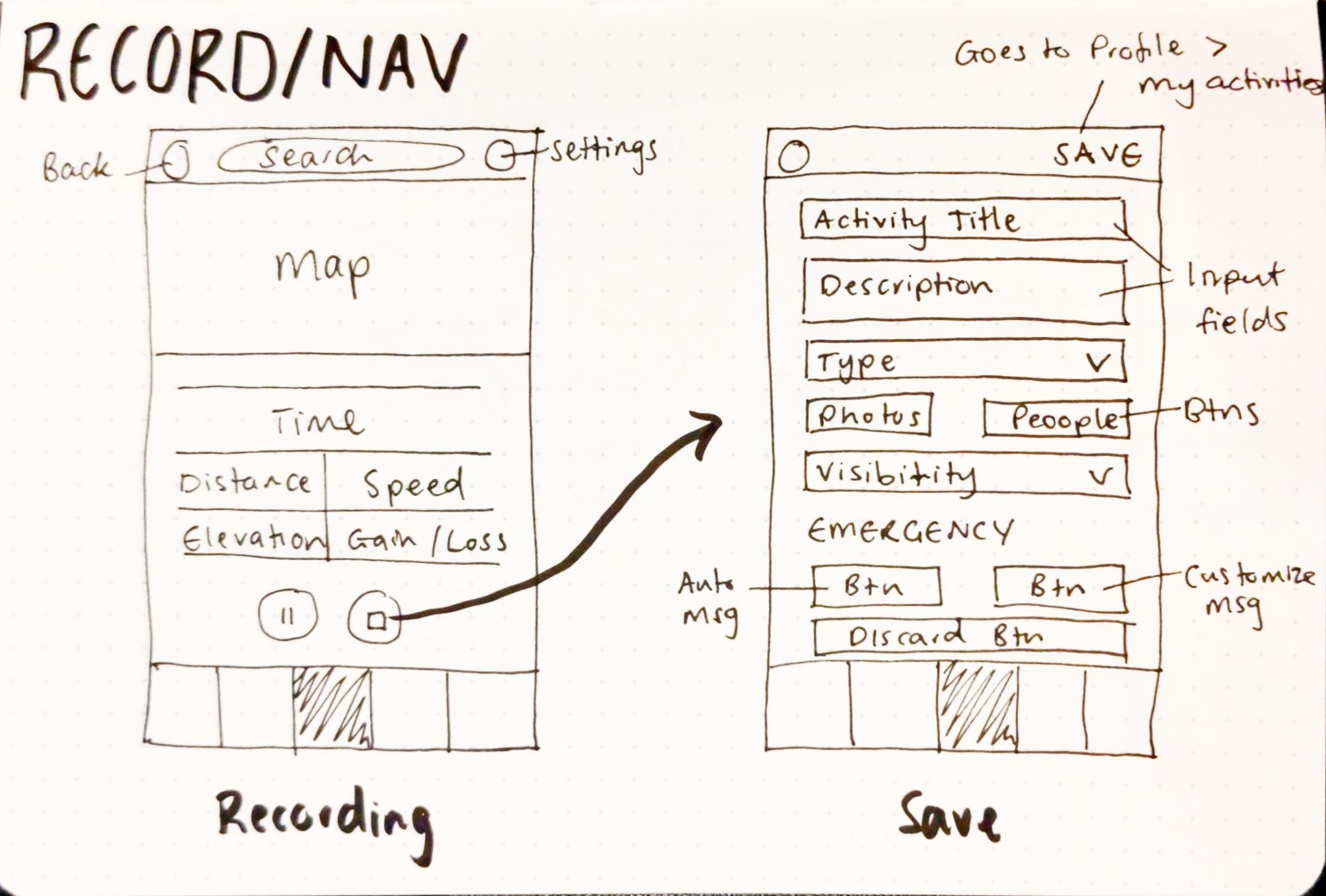
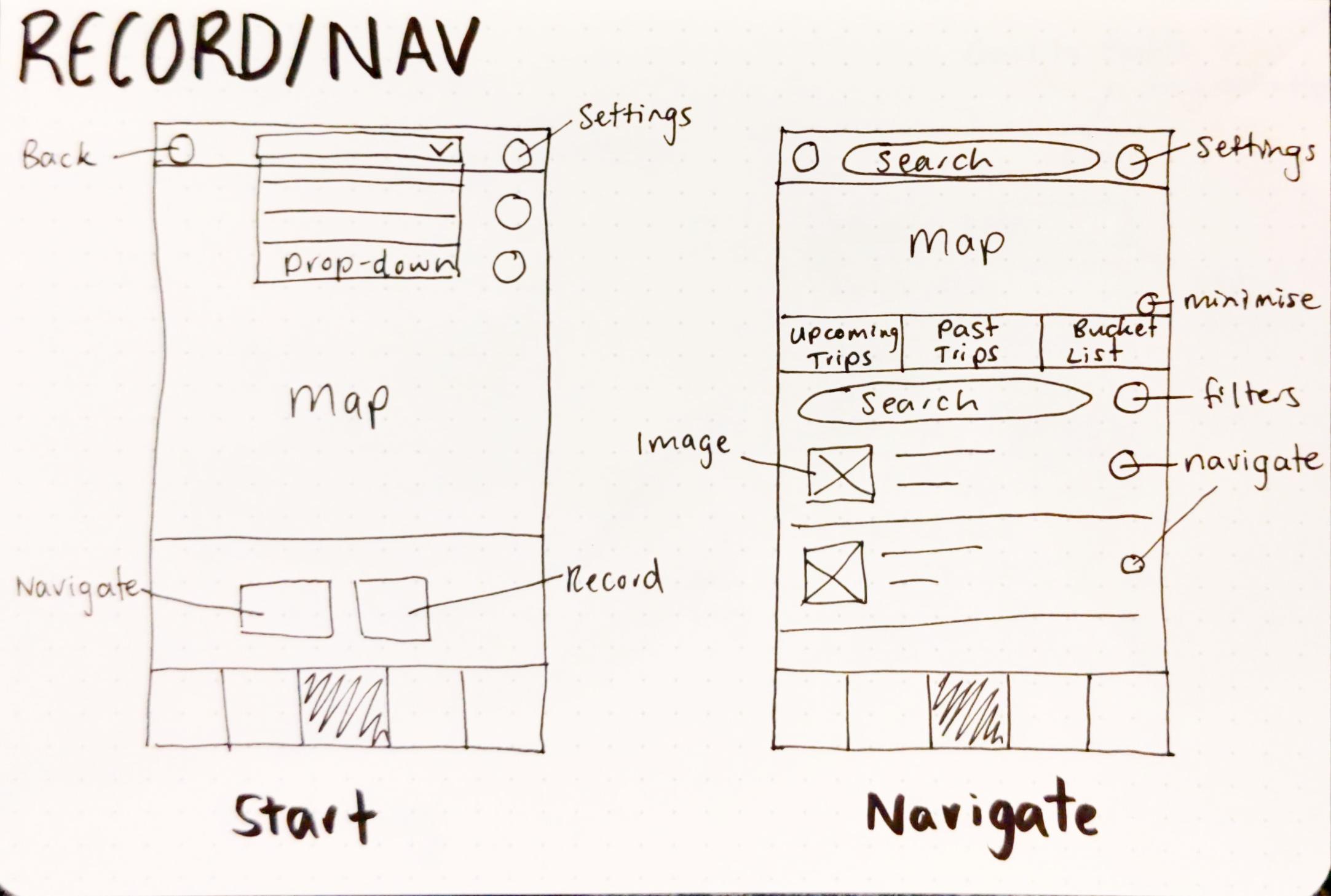
Sketches
Based on the information architecture above I started sketching the main screens of the mobile app.

Wireframes
I translated my sketches into low-fi wireframes. I conducted further user testing on these wireframes to identify any improvements to the user experience. Here is a summary of the key improvements identified:
- Not all information is relevant to every persona and every backcountry activity so there needed to be a lot more customization of filters and functions.
- Certain users were really concerned about safety and wanted more prompts to send trip plans to their emergency contacts, whereas others found this annoying.
- Users found it difficult to use the Navigate tab so I worked to simplify it.
- There were certain features that weren’t immediately obvious. Having more first time tips and info buttons could help with this.
- Users wanted more feedback from the app, for example a notification to say an emergency text failed to send, feedback that a recording had successfully saved or that information was downloaded offline.
- Users were confused by the placement of the search bars in the top bar. They thought it was an app wide search, rather than a page search. Moving the search bar down helped with this.
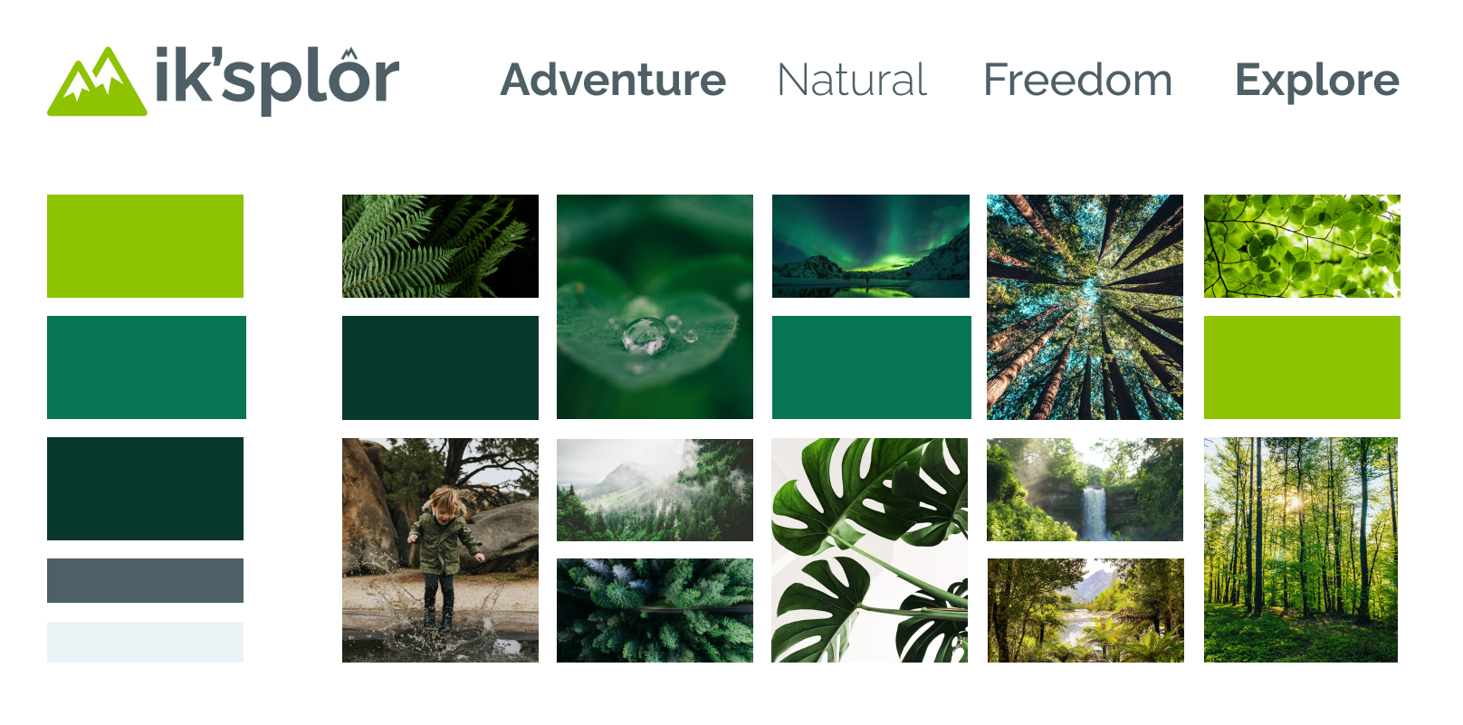
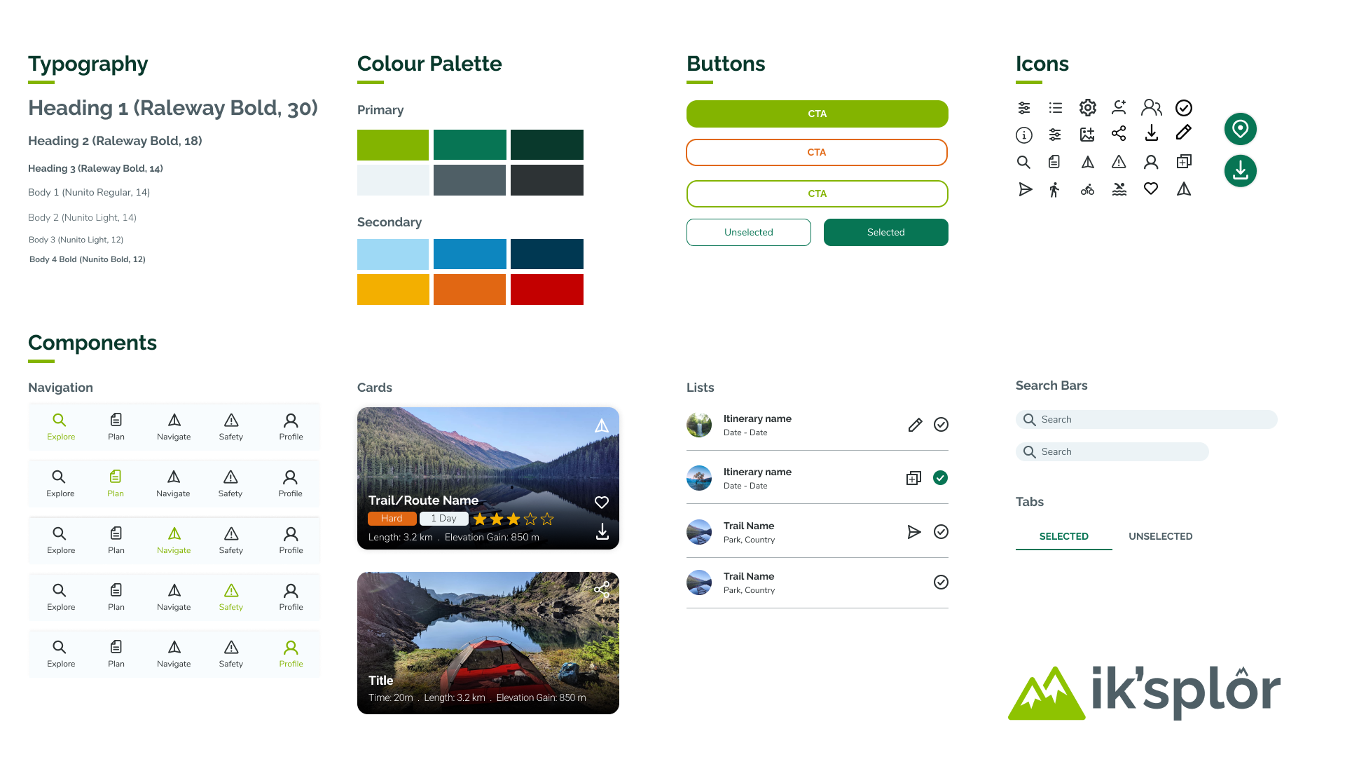
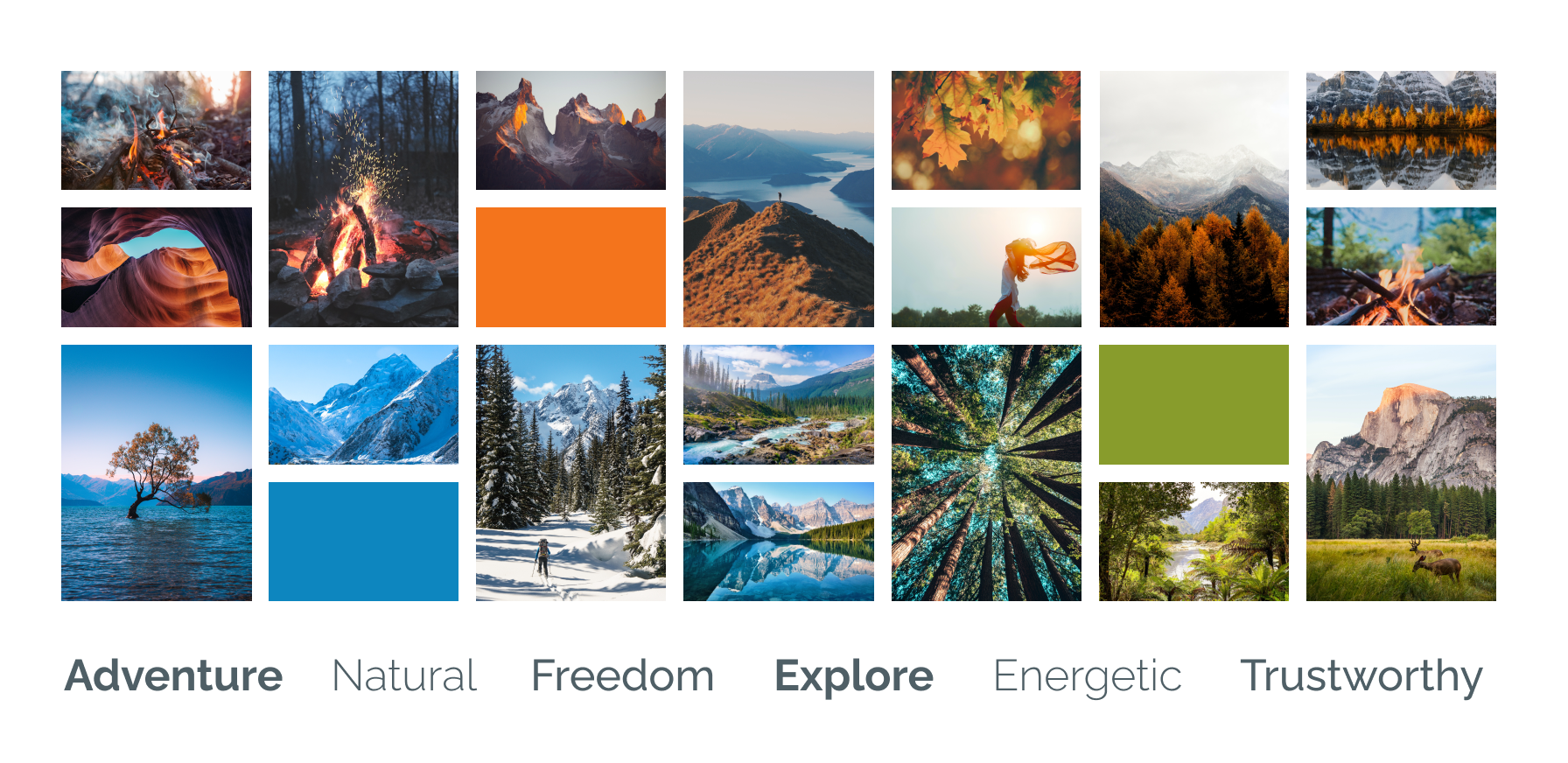
Branding
I created a mood board with photos that portrayed the feelings and visuals I wanted for my app. I then chose my colour palette from this mood board and used it to develop a basic style guide and design system to start applying to the hi-fi designs.
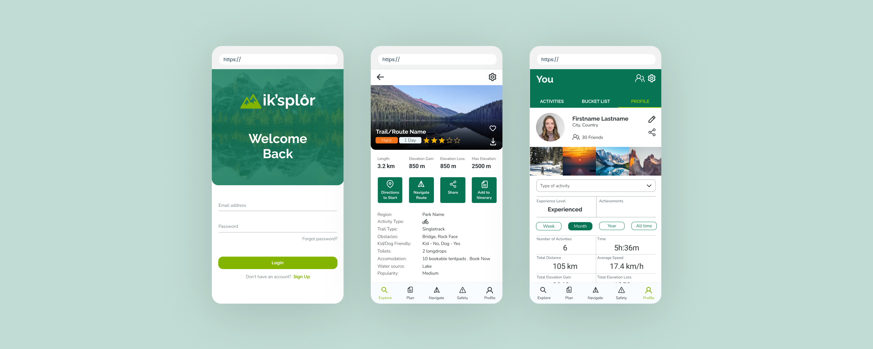
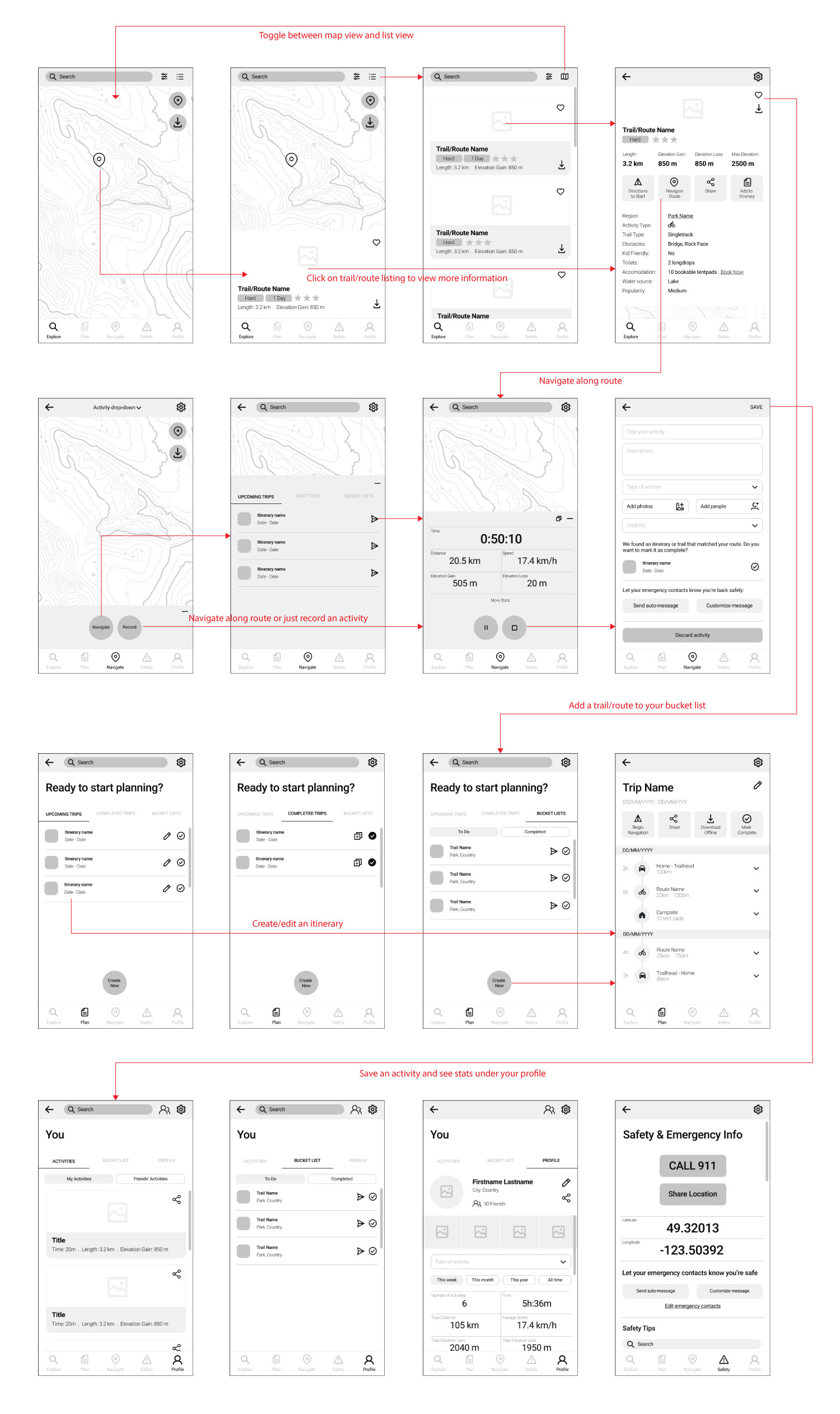
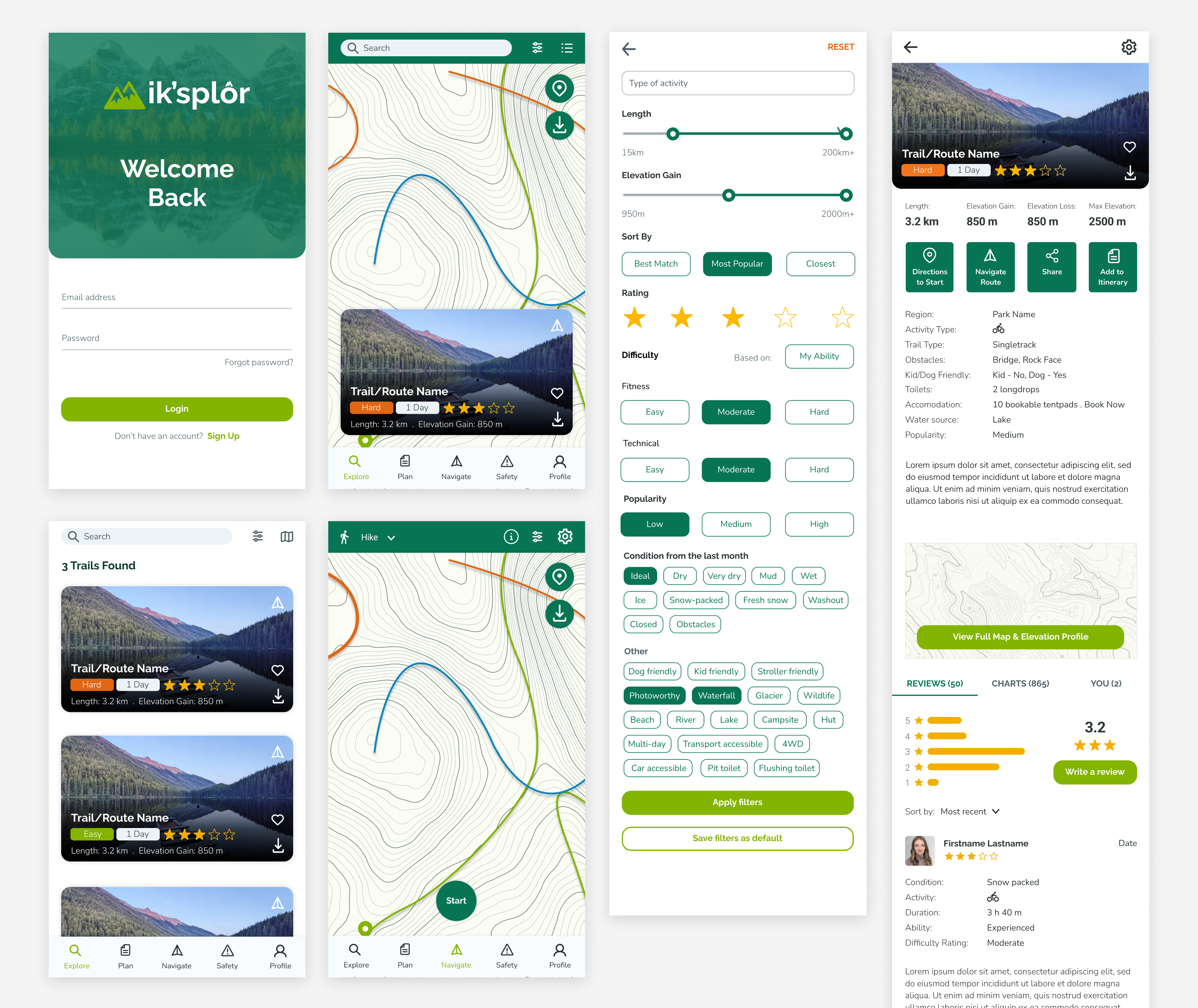
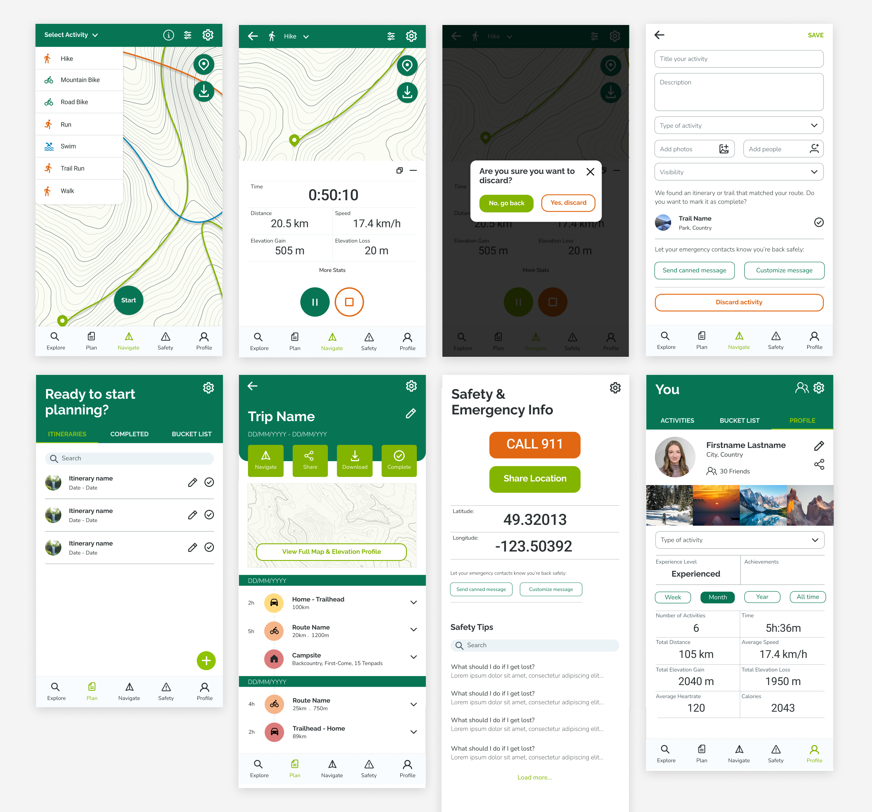
Hi-fi designs & prototype
Next I produced high-fidelity designs of the app and a Figma prototype.
Key learnings
- The importance of understanding your users and ensuring every design decision you make is for them.
- That with my app in particular there were four main personas and they all had very different requirements so customization of the app was really important..
- The importance of user testing during every phase of your designing (sketches, wireframing, high-fi designs and prototyping).
If I was to take this app further, my next steps would be to do further user testing, now that the UI design and prototyping is complete, and refine. I would then work on the animations, transitions and interactions throughout the app.