Clio Cloud Conference Agenda
The Clio Cloud Conference is the legal industry's #1 conference. This hybrid, annual, two-day event event brings together legal professionals from across the nation and around the world. The conference website serves as the central hub for attendees, providing essential details such as the agenda and event information.
Each year, the Clio Creative team crafts a fresh brand identity for the event, necessitating a redesign of the conference website. Building upon feedback from the previous year, which highlighted challenges with agenda accessibility, particularly on mobile devices during the conference, we began efforts to enhance usability and optimize the mobile experience.
My role: Lead UI/UX designer, responsible for research, wireframing, producing hi-fi designs, dev hand-off and QA testing.
The team: Web developers, web designers and events managers.
Timeline: 3 months in 2022-2023 (2 weeks for research, 1 month for design, 1.5 months for development and QA)
Process:
Research
I initiated the process by delving into user behavior patterns leading up to and during the previous conference, leveraging heatmaps and page recordings in Hotjar. Analysis revealed that attendees encountered difficulties navigating the previous year's agenda, particularly with the grid view, which required scrolling across a timeline. Recognizing the user challenges, especially on mobile devices, I noted a preference for the list view, which emerged as the most utilized option. Responding to customer feedback, there was a demand for enhanced filtering capabilities to streamline session selection.
I conducted extensive research on other conference and agenda websites, identifying trends and best practices. It became evident that the list view was a more widely adopted approach so we made an informed decision to eliminate the grid view and concentrate efforts on enhancing the list view. I explored various filtering solutions, presenting a range of options to the team, complete with recommendations.
Iterations
The team expressed a desire for extensive filter options, spanning categories such as in-person/virtual attendance, tracks, practice size, practice area, and job title. Among the various filter options I prominently explored two:
- Utilizing pill-like shapes as filters, which visually indicated applied filters while allowing users to easily toggle between selections. However, this approach proved challenging for development and risked overwhelming users when multiple filters were applied.
- Implementing filters in a dropdown format. I explored several placement options, including a left panel, integration into each column header within the table, or positioning them horizontally above the table. I evaluated each location for its effectiveness in enhancing user experience and accessibility.
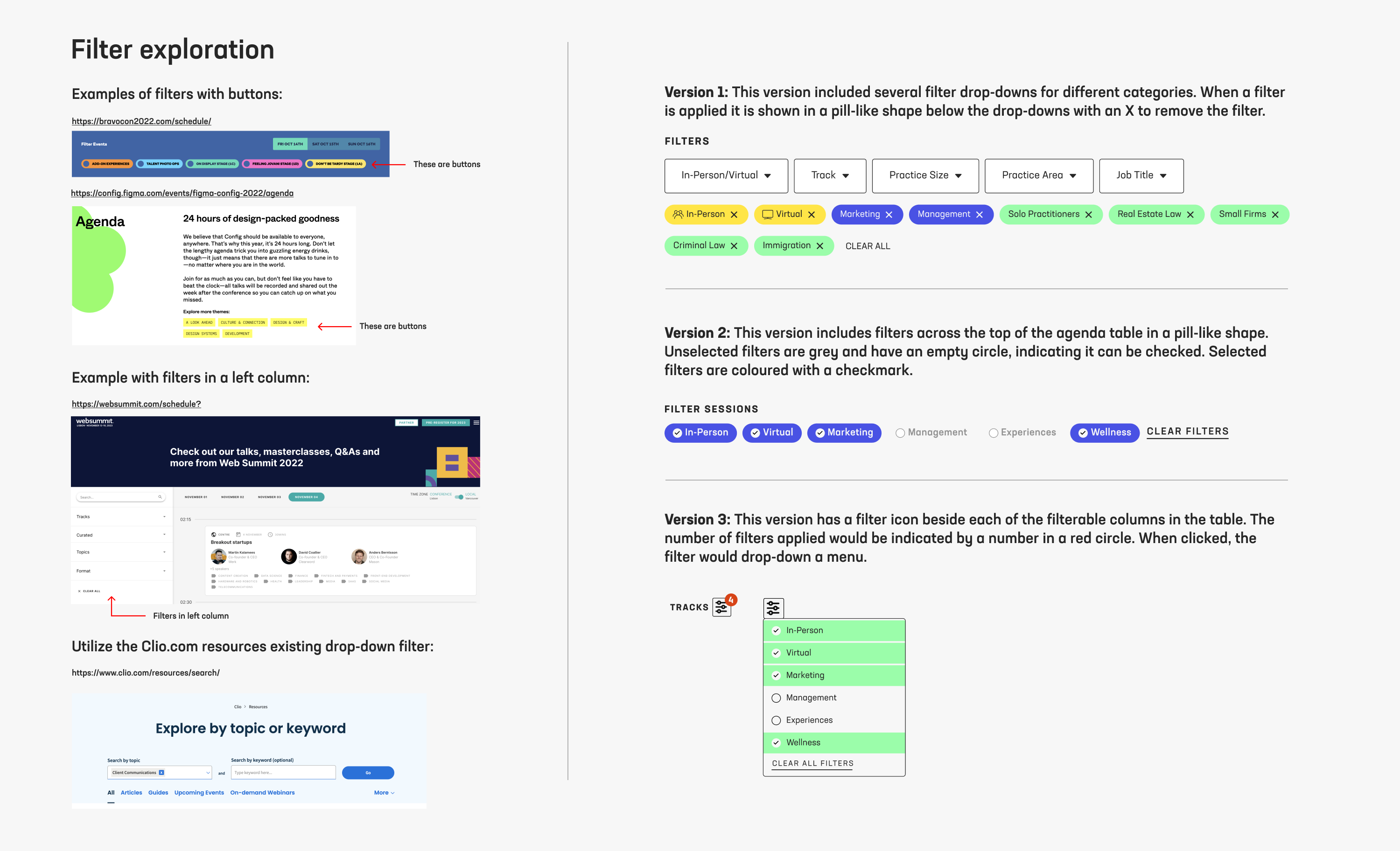
Following the presentation of these options to the team, we collectively recognized the need to streamline the number of filterable options to reduce the growing complexity of the project, both in terms of development and user experience. Our aim was to strike a balance, providing sufficient filtering capabilities without overwhelming users. Ultimately, we opted for a single dropdown filter positioned above the agenda, allowing users to filter sessions by different tracks and choose between in-person or virtual.
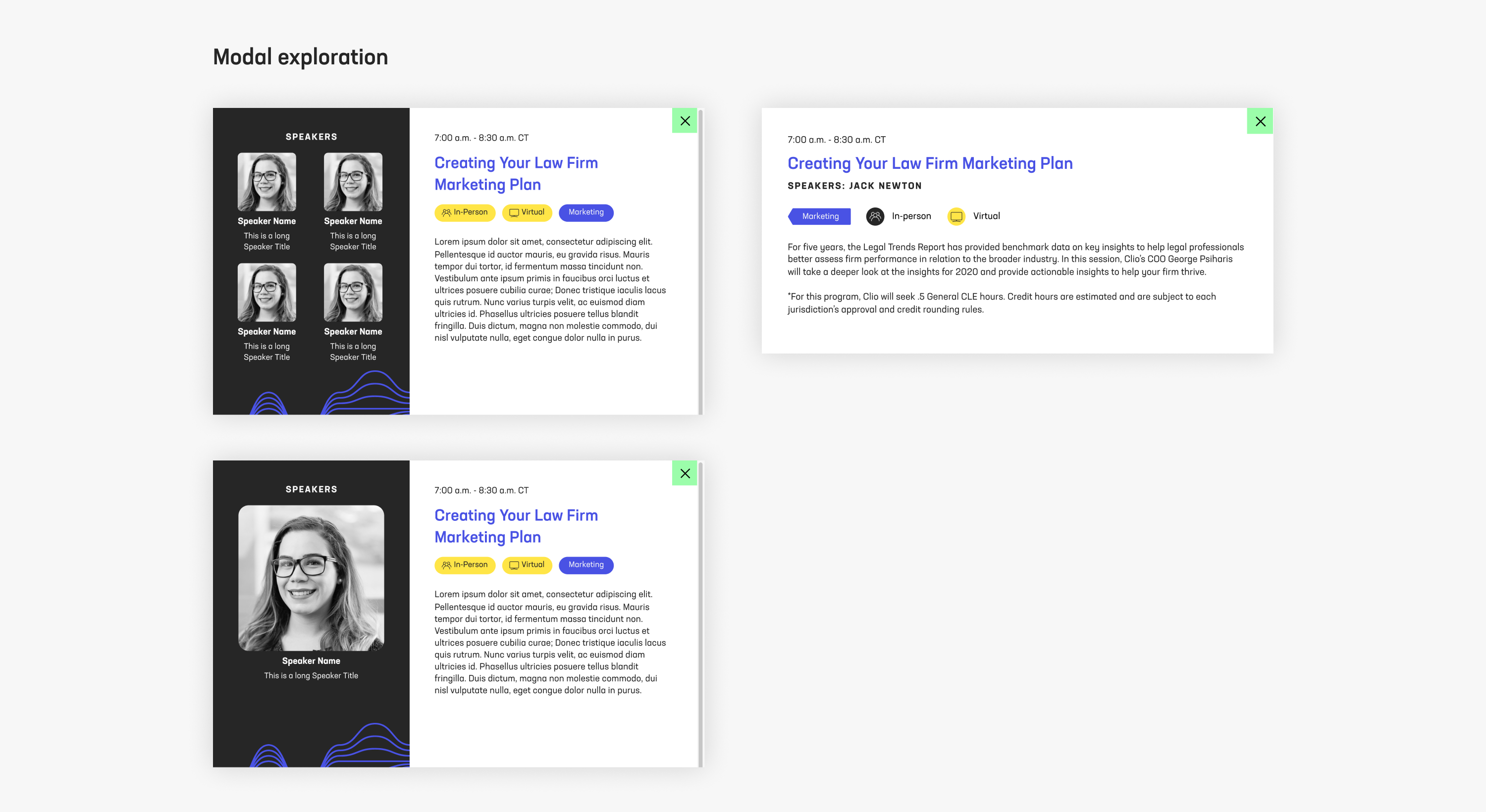
I also explored enhancing the modal design by incorporating visual elements such as speaker photos, titles and additional brand elements. However, discussions with the web developer revealed that these enhancements were beyond the project's scope due to CMS limitations. I focused on refining the existing modal design, making minor adjustments to the information presented while ensuring alignment with project constraints.
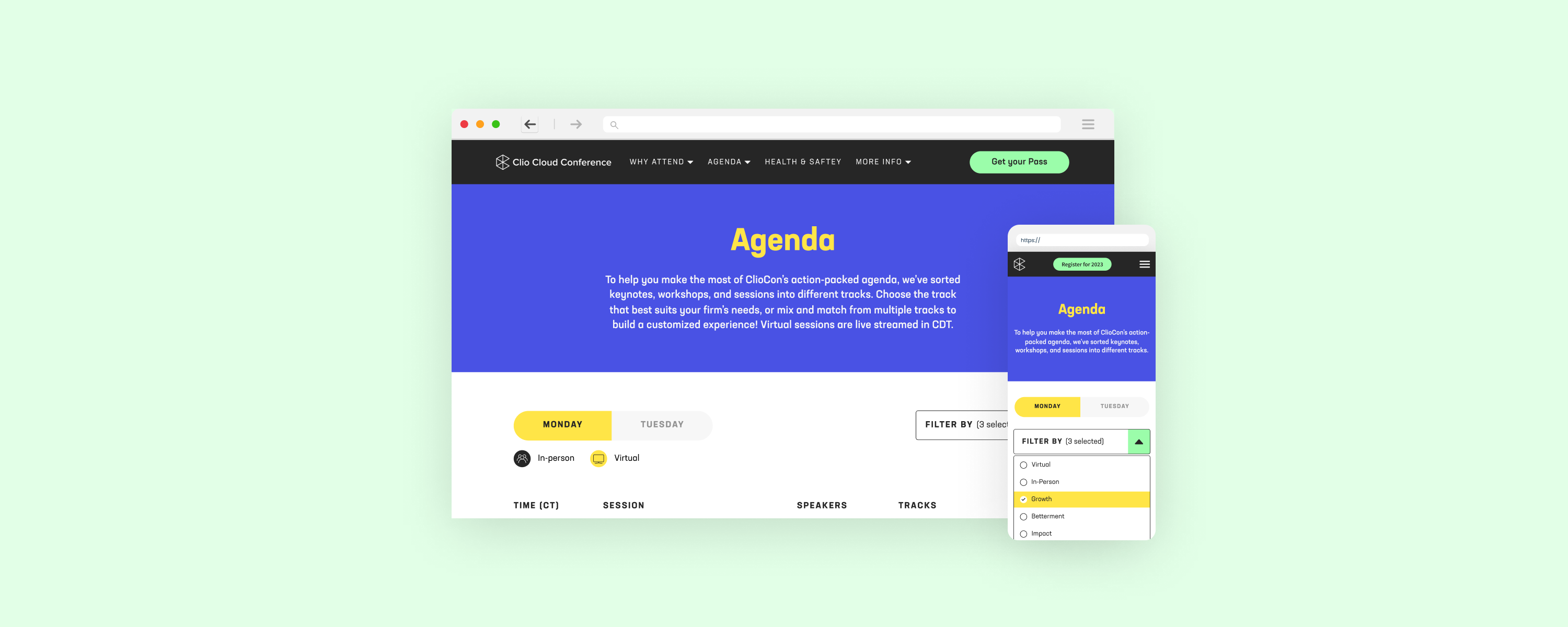
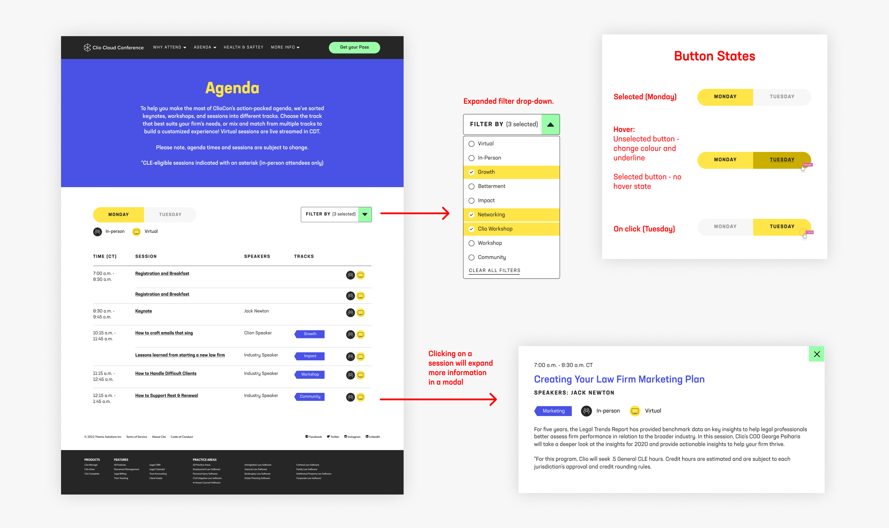
Final desktop design
The final desktop design included a reskin with the new branding, keeping in mind accessibility standards, as well as the following improvements:
- Introduction of the new "filter by" drop-down for streamlined session navigation.
- Integration of visual elements to the table, replacing text-heavy content with intuitive icons, as well as tag shapes for different tracks.
- Consolidation of sessions occurring simultaneously under a single timestamp, minimizing redundancy and improving clarity.
- Introduction of interactive features, such as highlighting session rows upon hover with background colours, enhancing user engagement.
- Incorporation of an expand icon to signify the ability to access additional session details within a modal window, promoting a more user-friendly browsing experience.
Below is a recording of the live desktop webpage.
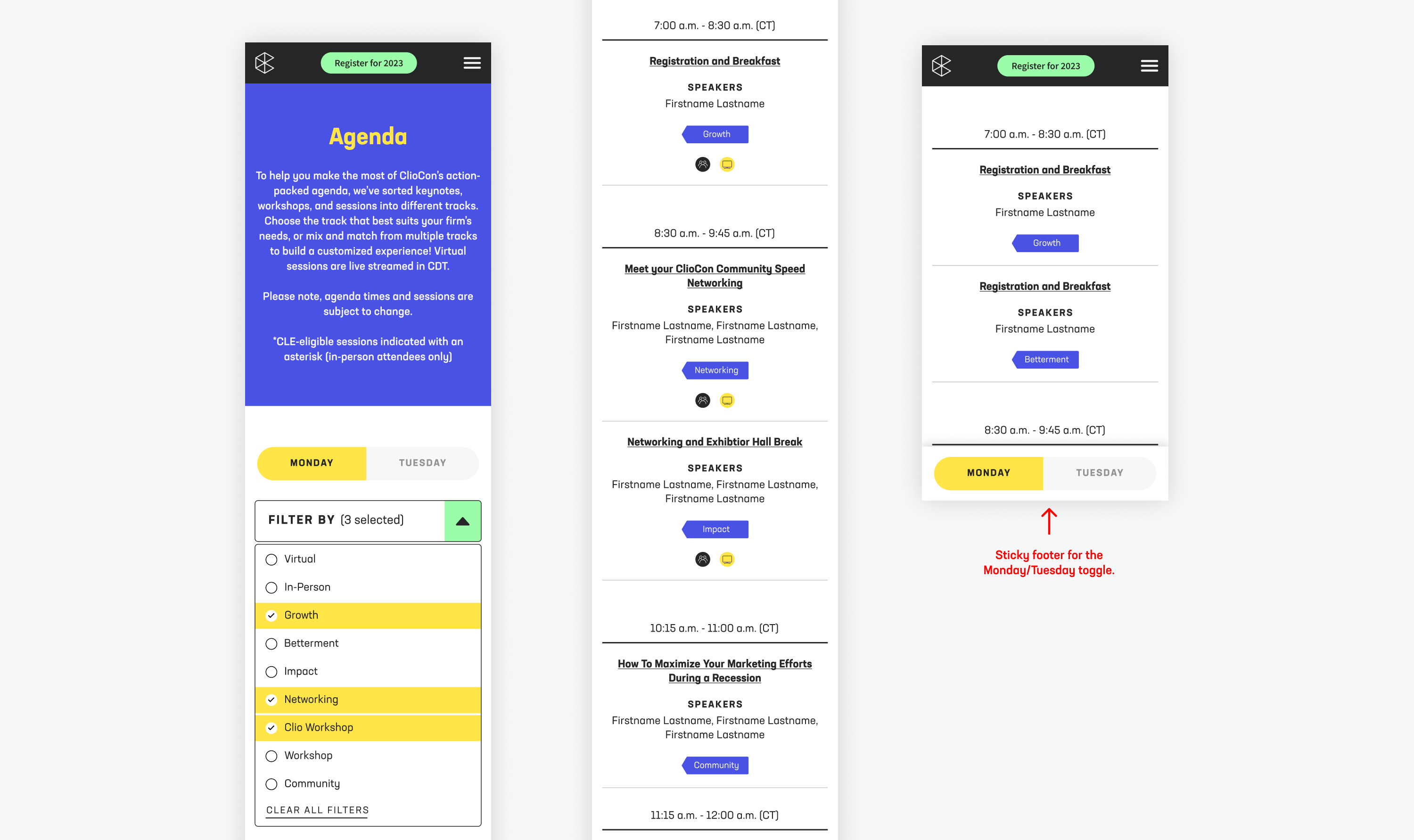
Final mobile design
I gave considerable attention to optimizing the mobile design, ensuring attendees could effortlessly navigate the agenda while on-site at the conference. Key enhancements included:
- Addressing a usability issue present in the previous agenda design, where the Monday/Tuesday toggle disappeared from view upon scrolling down the agenda. To mitigate this, I implemented a sticky footer for the toggle, allowing users to switch between days conveniently regardless of their scroll position.
- Similar to the desktop experience, I enhanced session interactivity by incorporating an expand icon and underlining session titles to signify their clickabililty.
- Consistency with the desktop version was maintained by utilizing the same filter functionality, which I adapted to ensure user-friendliness on mobile.
Dev hand-off and QA
Maintaining close collaboration with the web developer throughout the project was essential to stay within the defined scope, given our constraints on development time. After aligning our efforts and receiving approval on the design, I facilitated a handover of the Figma files.
During the development phase, my involvement extended to QA testing of the staging environment. This process led to several key improvements, including:
- Allowing users to close the filter drop-down by clicking outside of it, enhancing usability and navigation.
- Fine-tuning the appearance of lines between grouped sessions within the same time stamp, ensuring clarity and visual coherence.
- Ensuring the functionality of the sticky footer on mobile devices across various screen sizes, coupled with smooth scroll positioning, to optimize the mobile user experience.
Results
In the month following the agenda release, we saw:
- A 28.6% increase in users clicking the "Register Now" CTA after viewing the agenda, compared to the previous year.
- A large spike in registrations, compared to previous months - 250 in just the first week.
- A reduction in time spent on the page before registering in comparison to the previous year, indicating that users were getting the information they needed quicker.
During the conference:
- Analysis of user recordings revealed enhanced navigation efficiency and reduced user frustration.
- Feedback from attendees highlighted the ease of use of the agenda, particularly on mobile devices while at the conference.
- A notable decline in agenda-specific questions from attendees suggested that the agenda affectively provided the necessary information.