Clio Grow Website Builder
Clio Grow offers a website builder feature which allows lawyers to create a professional website without the need for specialized design or coding skills. Through this feature, users gain access to a selection of themes, color palettes, image upload capabilities, and customizable sections, enabling them to tailor their websites to suit their company.
Initially launched with just two themes, the popularity of the feature prompted customer requests for additional options. This lead to the initiation of this project, aimed at fulfilling the demand by developing a new theme.
My role: Lead web UI/UX designer, including mood-boarding, wireframing, producing hi-fi designs, development hand-off and QA testing.
The team: Web developers, product developers, product designers and product marketers.
Timeline: 4 months in 2023 (design - one month, development - one month, QA and revisions - 2 months)
Process:
Design considerations
Before beginning this project, I was briefed on a number of design considerations by the product designer. The theme should:
- Be created with accessibility best practices - for desktop, tablet and mobile
- Be simple and in line with Grow Websites target audience
- Not be drastically different from the previous two themes
- Work with the colour selector options and settings already available in the product
- Include the same sections as the current themes
- Reflect "Light & Airy", as requested by customers
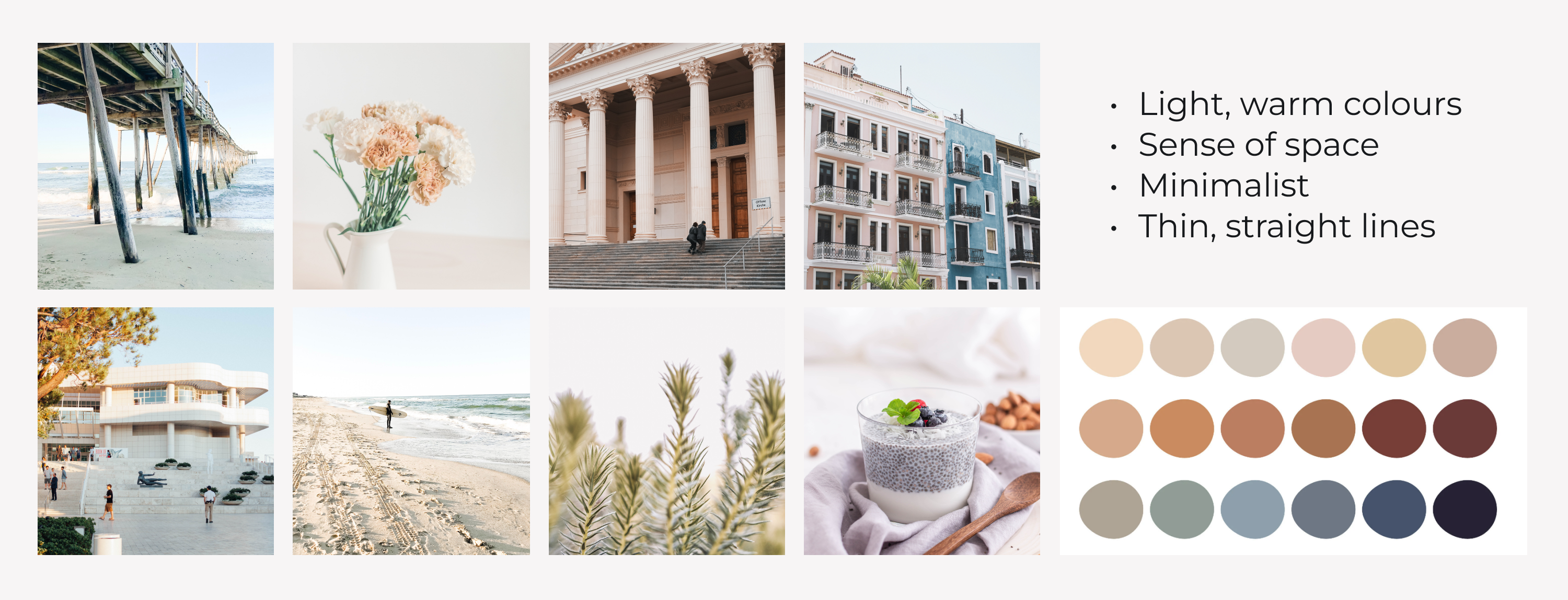
Moodboarding
My design process began with exploring what "Light & Airy" looked and felt like. I explored colour palettes, imagery and UI, and designed a moodboard.
Product limitations
Next, I dedicated substantial time to familiarizing myself with the website feature within the product. This involved immersing myself in the customization process by personally designing and configuring a website. Throughout this exploration, I documented the placement of all fields and sections on the front-end interface, taking note of the optional and required fields, content and image limitations, as well as the available color schemes. This gave me a comprehensive understanding of the feature's functionality and parameters.
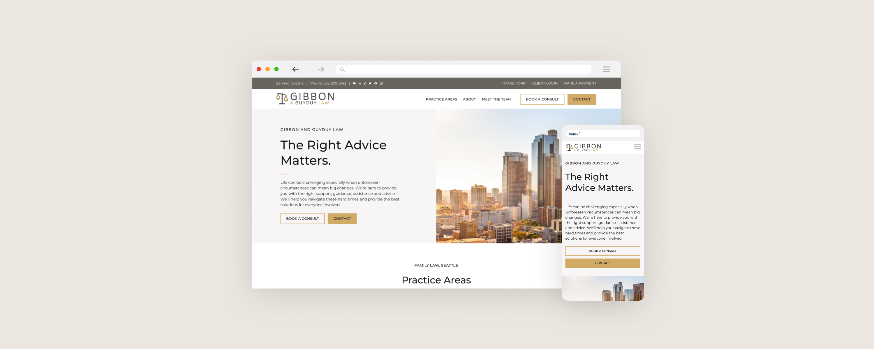
Initial design
Since the structure of the new theme was going to remain the same, I skipped the wireframing stage and went straight to translating the light & airy moodboard onto the website design in one of the colour themes.
Scenarios
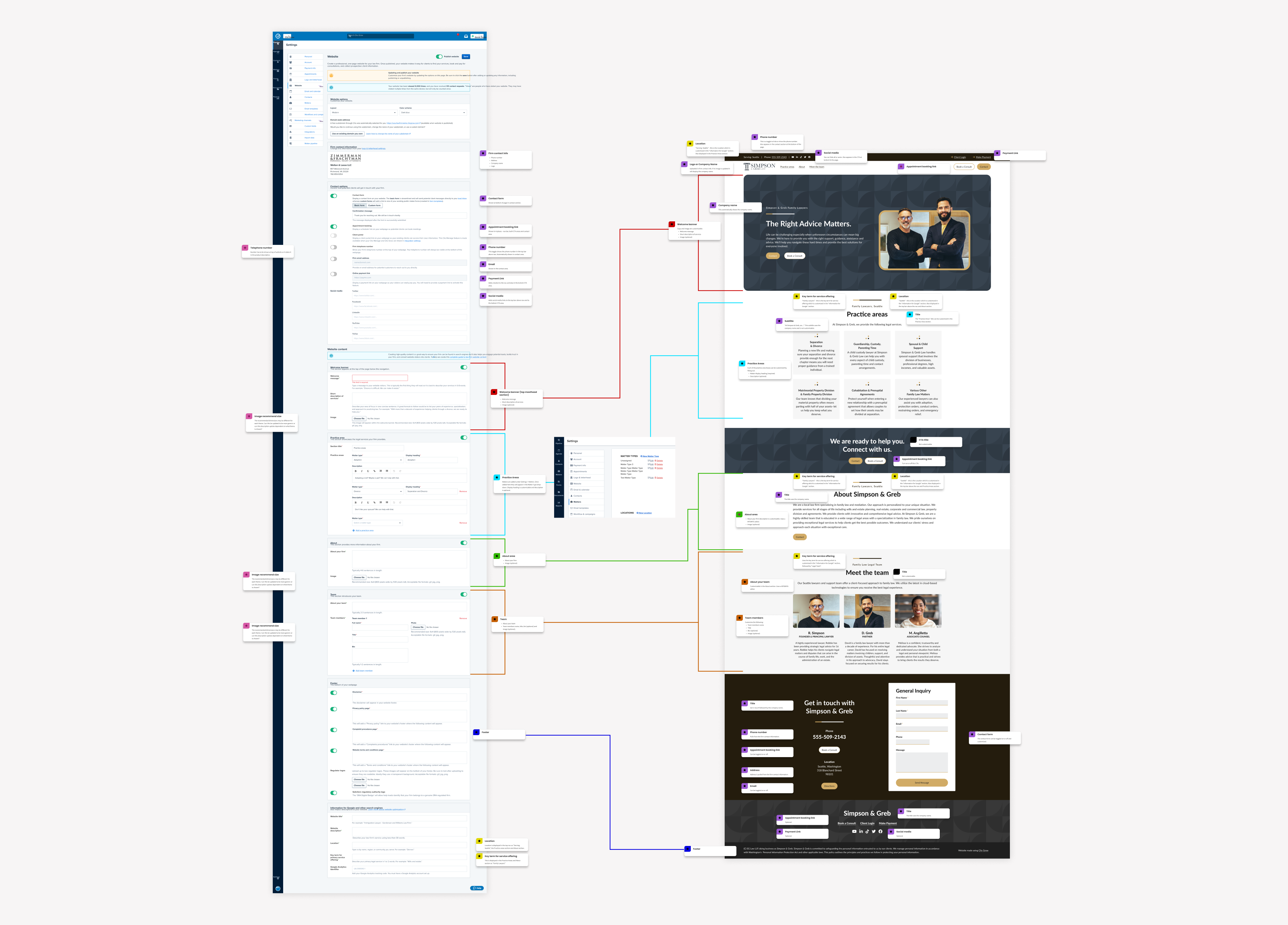
I evaluated and documented various scenarios around the ways users could customize their websites. Given that the target audience for this feature likely lacked design or development expertise, I anticipated potential challenges, preparing for worst-case scenarios. This is when I began close collaboration with the web developer, with whom I iterated on my designs with. The scenarios under consideration included:
- The appearance of each section with or without images, accommodating different dimensions and qualities of images.
- Varying lengths of copy.
- Diverse numbers of team members or practice areas.
- Flow of the page when certain sections were hidden.
- Adaptation of each layout to different screen sizes such as mobile and tablet.
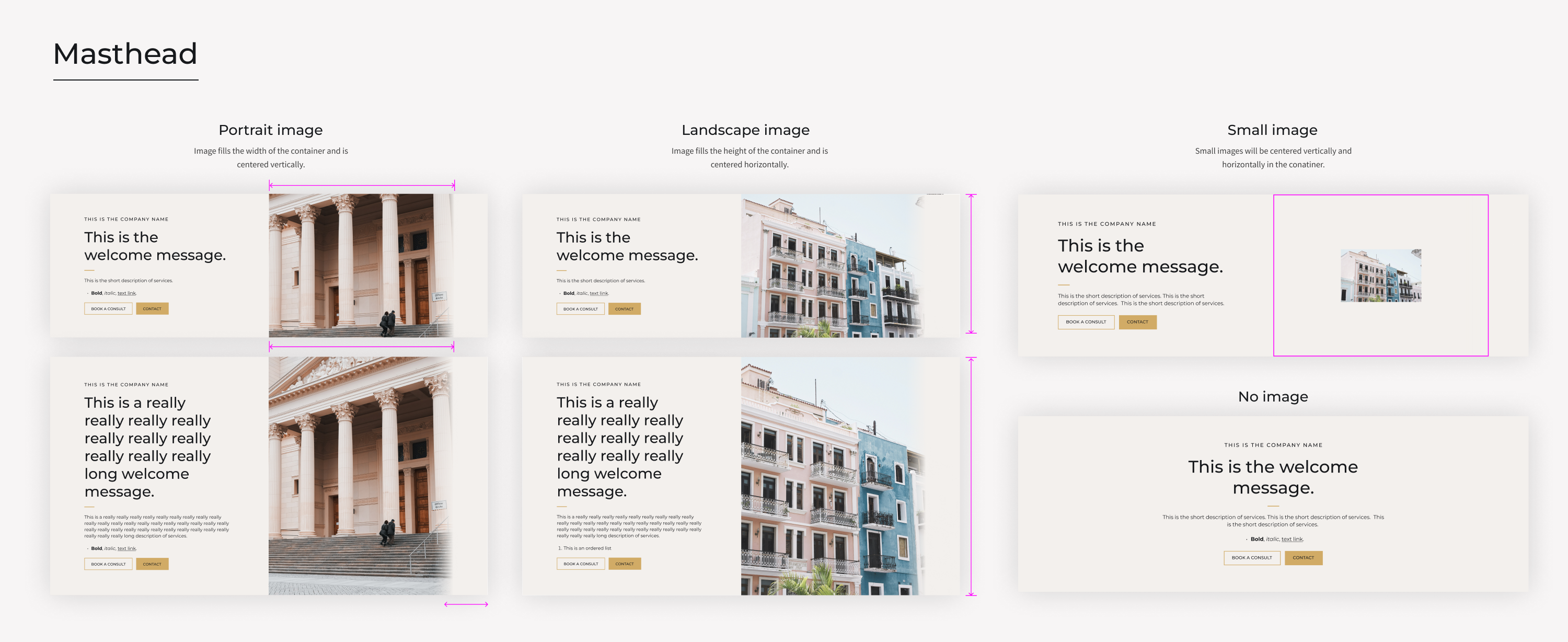
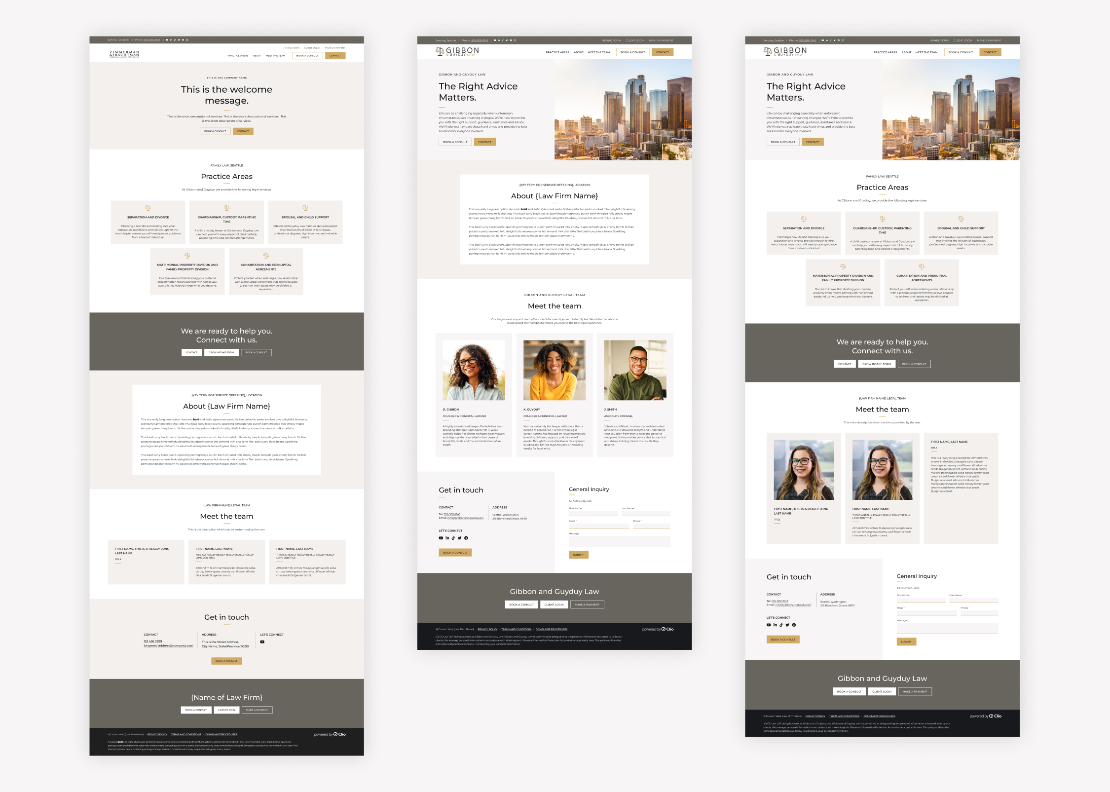
For the masthead specifically, I explored how the theme would interact with different lengths of headings and descriptions, as well as variously sized and oriented images, or no images at all. I documented guidelines for the developer regarding the cropping and alignment of images of different proportions.
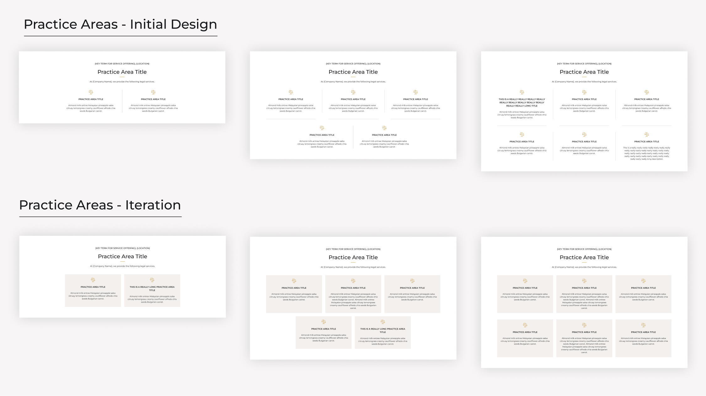
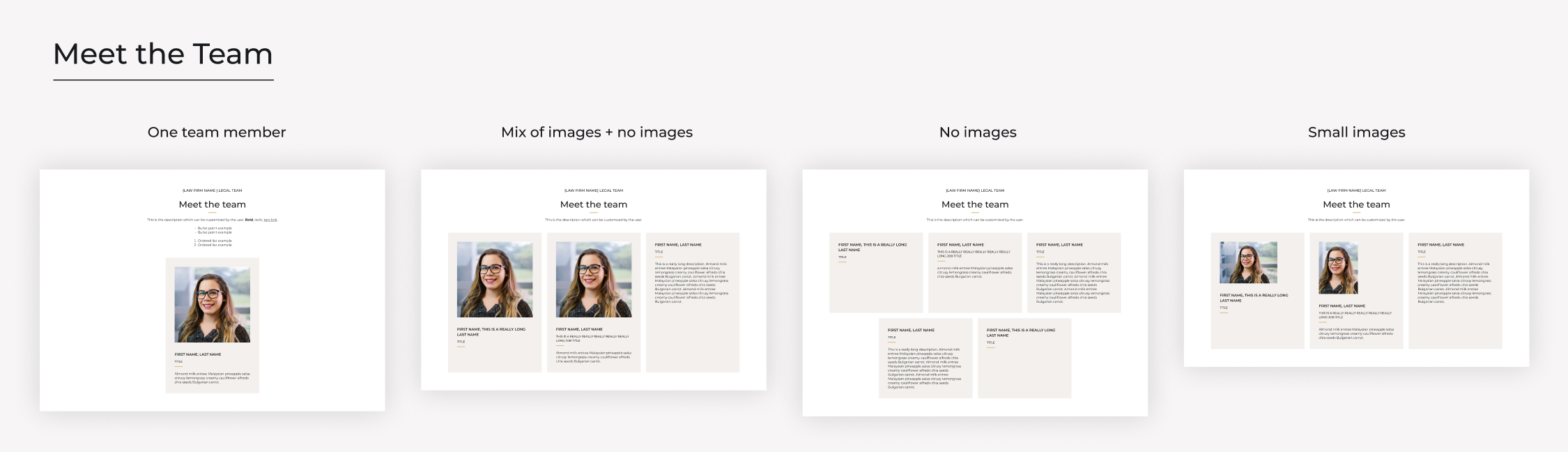
In addressing both the Practice Areas and Meet the Team sections, I accounted for varying numbers of tiles, each potentially having different lengths of copy and optional images. While my initial design of the Practice Areas section featured lines separating columns and rows, it proved overly complex for development. Collaborating closely with the developer, we agreed on an alternative solution that streamlined the development process.
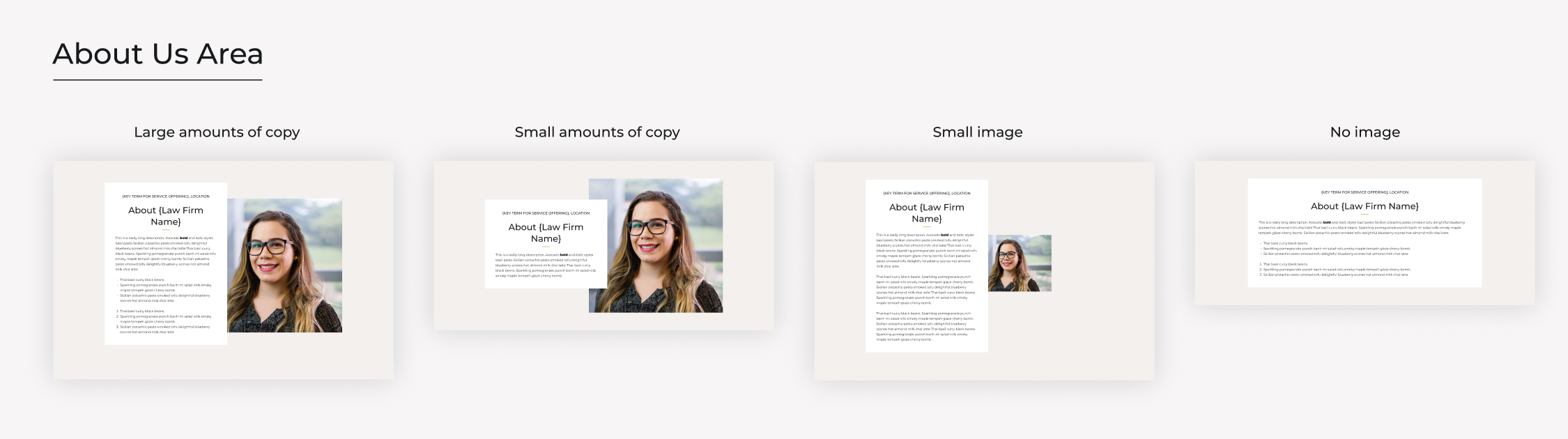
Similarly with the about us and contact areas, I navigated challenges with varying lengths of copy, image dimensions and quality, as well as planned for different layouts when hiding or showing elements. I addressed these challenges through iterative testing and collaborating with the web developer.
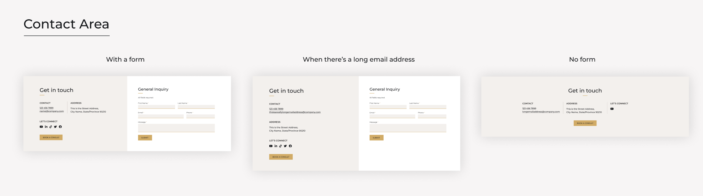
Following thorough consideration of scenarios for each section, I ensured seamless integration between them when certain sections were hidden. This involved creating multiple mock-ups with diverse layouts, testing configurations with varying content volumes and image presence. The aim was to test the theme's capabilities, preventing users from inadvertently creating bad layouts.
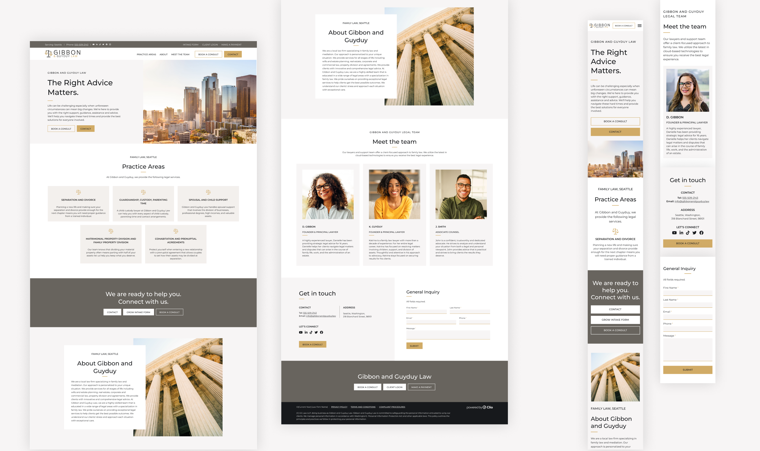
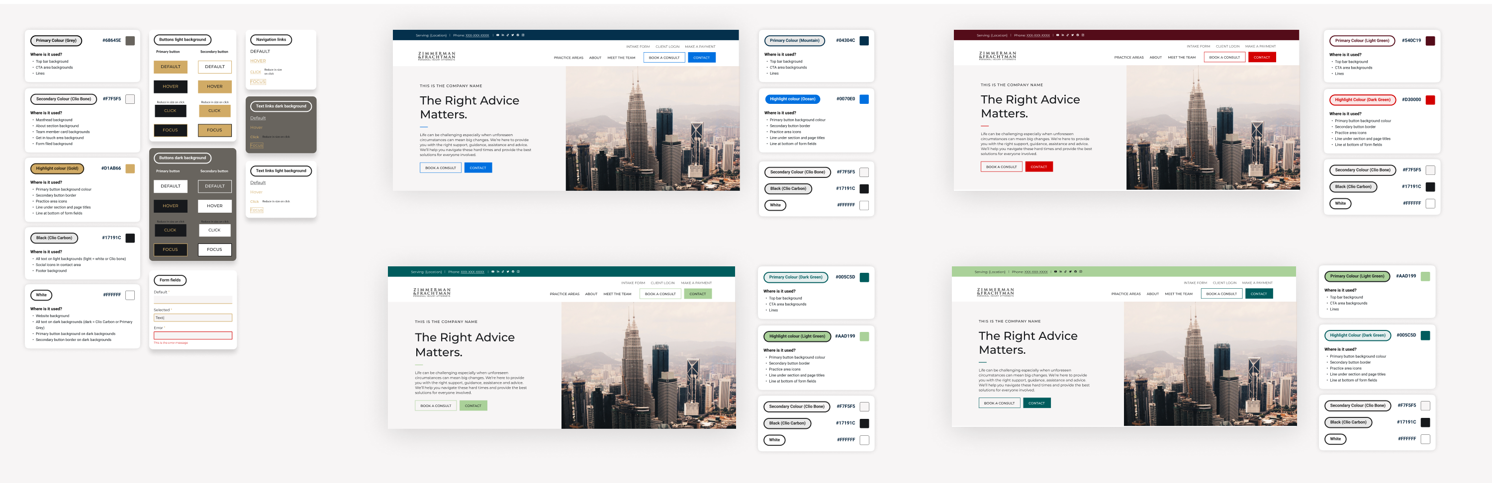
Colour schemes
The feature offered a selection of seven different color schemes via a dropdown menu which meant my colour choice was somewhat constrained. I tailored each colour scheme to the theme of light and airy and created individual website mock-ups for each, ensuring compliance with accessibility standards while documenting the states of CTAs and section backgrounds within each variation.
Development and QA
After finalizing the design to the satisfaction of the team, I documented all layouts and styles across desktop, mobile, and tablet in Figma, before handing them over to the web developer for implementation. During this phase, I identified an issue regarding some prompts within the product itself. Certain image fields provided specific recommended dimensions and other fields indicated where or how a setting would appear on the website and some of these prompts did not make sense with the new theme. I collaborated with the product designer to address this, suggesting updates to ensure generic prompts that aligned with all themes or tailoring prompts to align with each specific theme.
Following development, we initiated a QA phase. Initially, I provided feedback solely on the accuracy of the developed theme compared to the Figma designs. Subsequently, both a product designer and I conducted a more thorough testing phase, exploring every setting and scenario within the product staging environment to identify and resolve any potential issues.
Here is a live demo of the theme and below is a video of the final design:
Marketing promotion
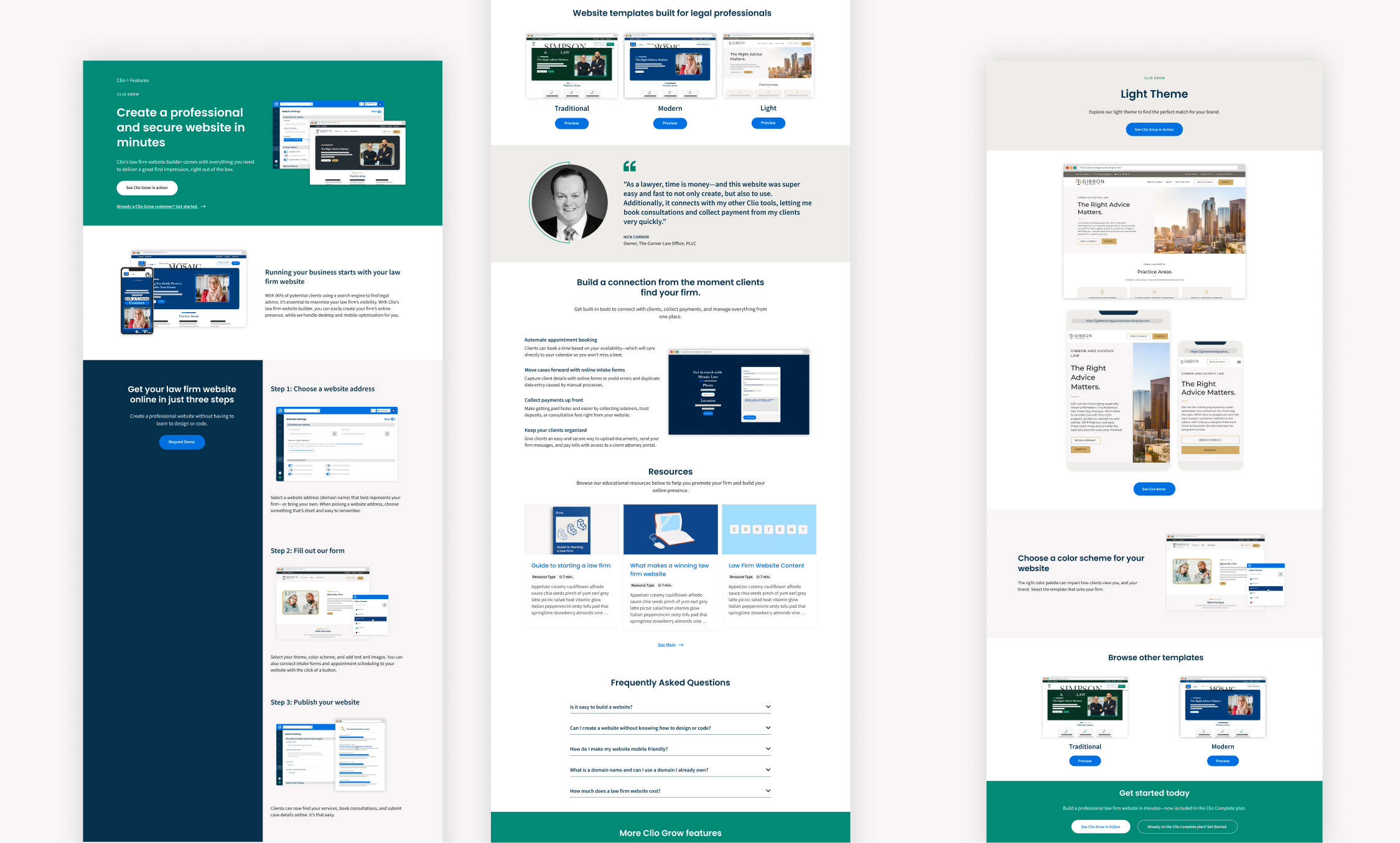
While we already had a feature page on our website spotlighting the website builder, it required a refresh to align with the introduction of the new theme. I spearheaded the initiative, proposing enhancements for the main page and crafting a new page template tailored to showcase each individual theme. Additionally, I built live demos for all three themes and produced simplified product user interfaces for use on the website and in other marketing materials.
Results and learnings
Following the launch of the new theme, we saw a substantial spike in the utilization of the Clio Grow Website Builder. Over the subsequent four months, the new Light & Airy theme emerged as the frontrunner among the three available options, capturing 51% of users who published websites.
After the launch, I facilitated a project retro, gaining valuable insights:
- Recognizing the importance of gathering more comprehensive feedback from customers regarding their preferences for a new theme, rather than relying solely on brief descriptors like 'light and airy.' Strategies such as customer interviews or surveys could have provided deeper insights.
- Identifying the need for a staging environment accessible to individuals outside the product department from the project's outset. Streamlining access would have reduced significant time spent configuring systems.
- Emphasizing the importance of planning for minor updates to product labels to ensure compatibility with all future themes. Proactive planning in this regard would facilitate smoother integration of new themes moving forward.