Clio Pricing Page
Clio is a leader in legal practice management software. As the company's software would experience substantial expansion over the next year, with the introduction of a number of new products, features and add-ons, the pricing page needed a reevaluation. The page serves as a crucial touchpoint where prospects can gain a deeper understanding of what Clio offers and assess the compatibility with their requirements, prior to engaging in a demo or trial.
My role: Lead UI/UX designer responsible for analyzing user behavior and competitor websites, producing wireframes and prototypes, solving UX problems, development hand-off, QA testing and leading a project retro.
The team: Content writers, web developers, pricing and packaging specialists, product marketers and website managers.
Timeline: 6 months in 2023 (research - 2 weeks, design - 3 months, development - 1 month, QA - 2 months)
Process:
Page goals
Before beginning the project, as a team we identified the target audience of the page as any prospect, whether they are evaluating alone or in a sales conversation, and the goals of the page redesign:
- Provide enough information for prospects to consider Clio's products but not enough for them to decide for themselves. Instead, we want to encourage them to talk to our sales team to find the right package.
- Position plan pricing so savings are obvious for higher tier packages.
- Optimize for future evolvements including the addition of new add-ons, features and products, limiting future development work.
- Answer the question: Is Clio worth it?
Research
I began by researching user behavior on the current pricing page by looking at Hotjar heatmaps and watching recordings of users. Some of the key learnings I identified were:
- The annual/monthly toggle was the most interacted with aspect of the page
- A large number of users weren’t scrolling past the feature table likely due to its length so were missing key content below it.
- The mobile conversion was lower than desktop and recordings showed users were having trouble using the feature table.
I conducted an analysis of various other competitor and SaaS websites, revealing several common strategies for managing multi-product offerings. Of particular interest were the mobile adaptations of these sites. I focused on methods to minimize scrolling and optimize display of feature tables.
Design challenges
Early in the process, I identified several design challenges:
- Balancing the presentation of Clio's complex product, add-on and plan structure to provide prospects with a comprehensive understanding and motivation to find out more.
- Designing a page layout capable of accommodating the current plan structure, while also allowing seamless expansion in the future, reducing the need for extensive redevelopment of the page.
- Ensuring seamless transition of design elements to smaller screens, like mobile and tablet, while preserving optimal usability.
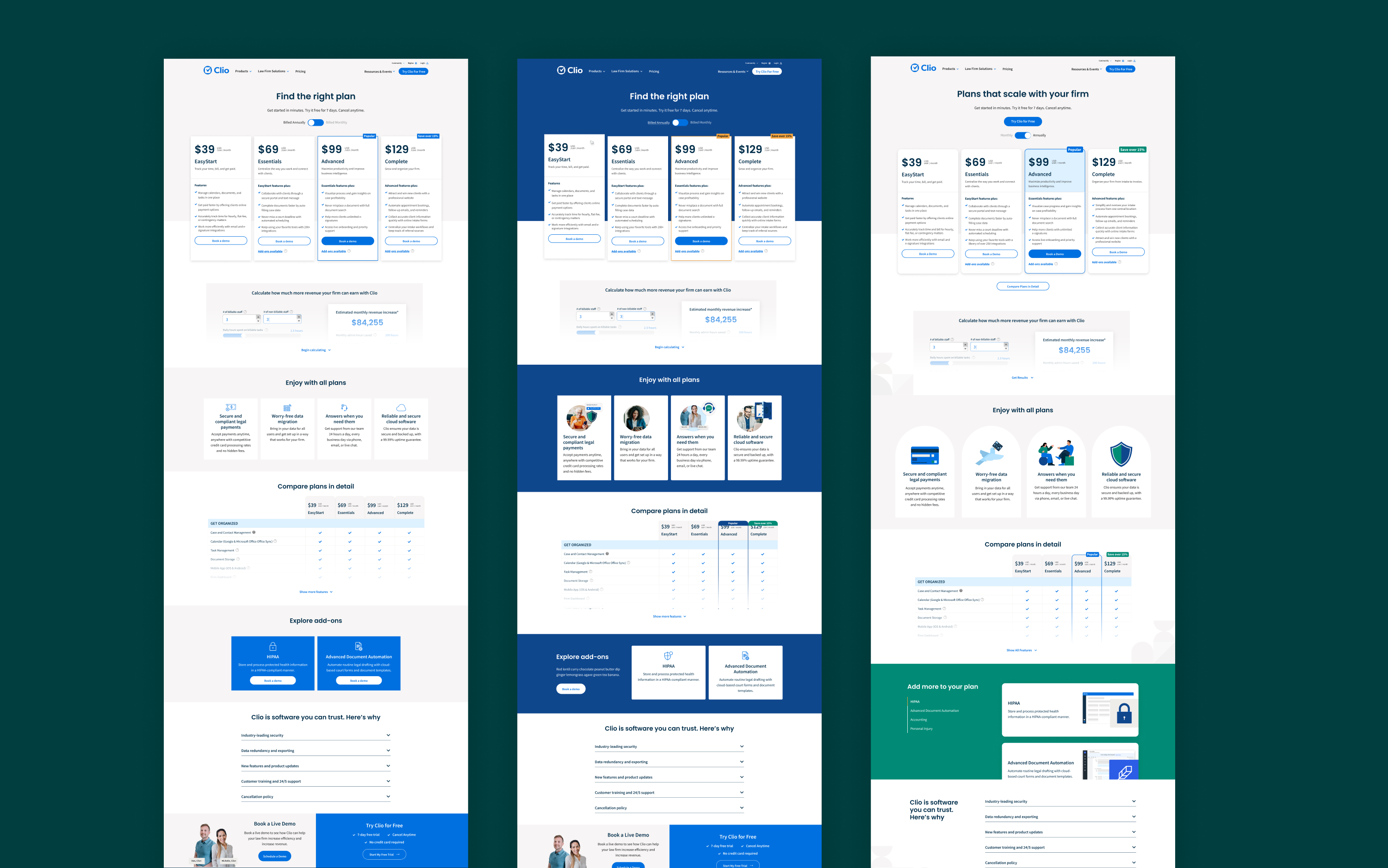
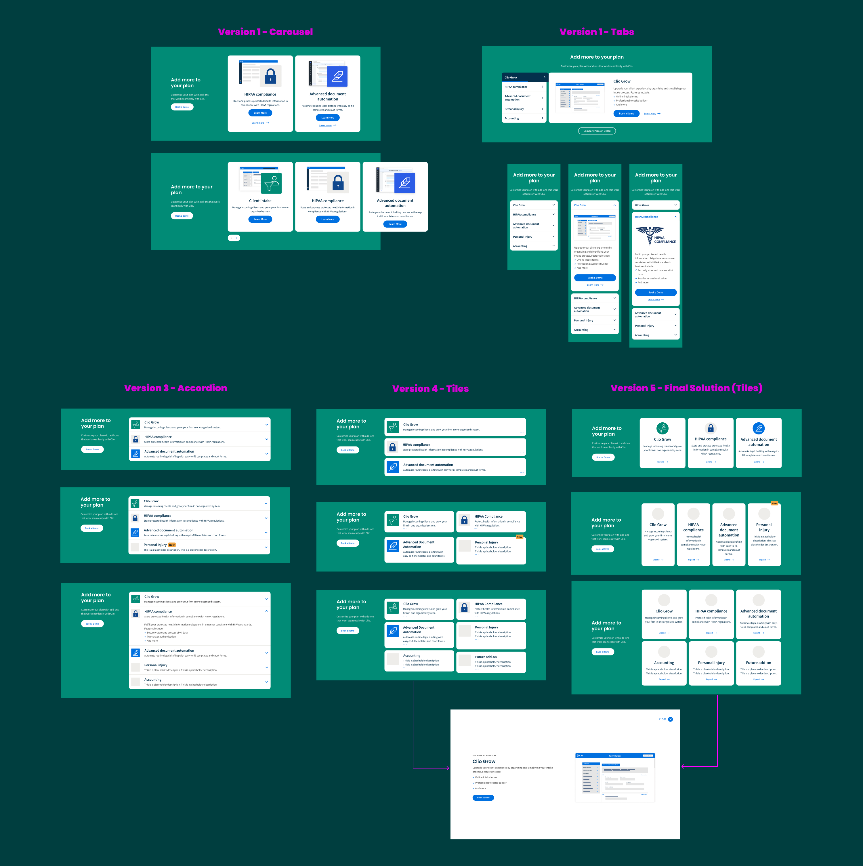
Wireframing
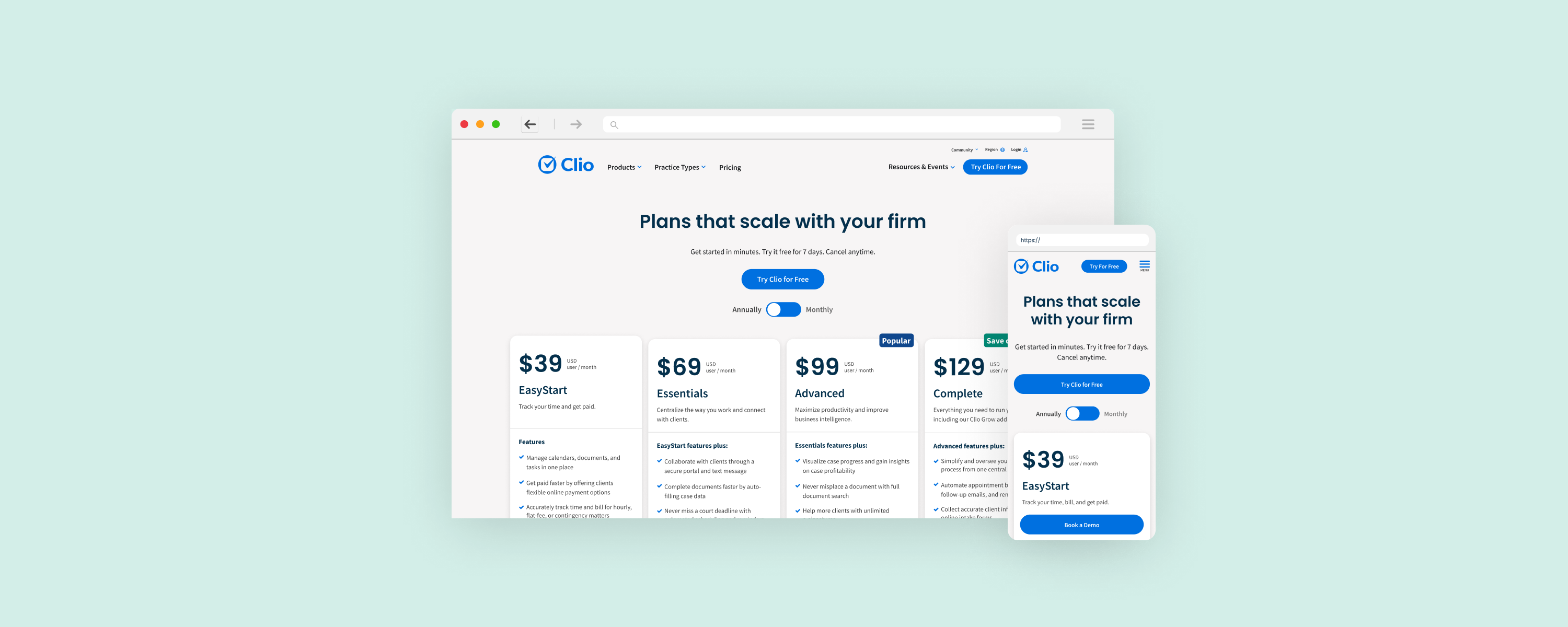
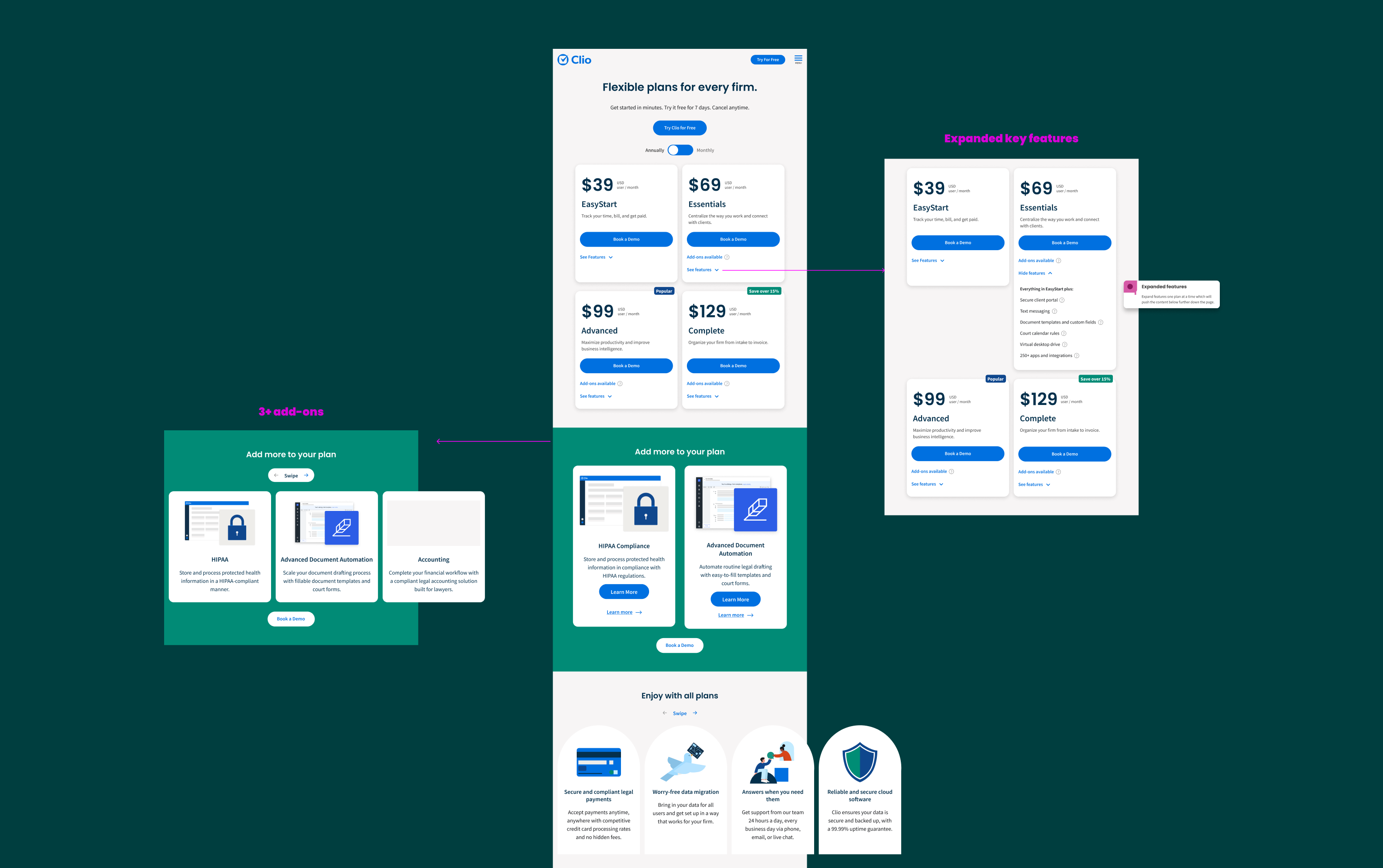
After thorough research and with the page objectives in mind, I assessed numerous solutions and proposed a recommendation. It involved consolidating all of Clio’s products into a single pricing page, using a horizontal tabbed layout that enables seamless expansion with Clio’s evolving product suite. Additionally, I advocated for extracting add-on details from the feature table and allocating them to a dedicated section. This approach would create ample space to showcase upcoming add-ons in greater detail.
Additionally, I suggested the implementation of a new comparison feature, enabling users to selectively compare plans and add-ons of interest. This interactive functionality would hopefully not only allow easier comprehension of the increasingly complex product suite but also should draw more interaction, as proven by the current page data.
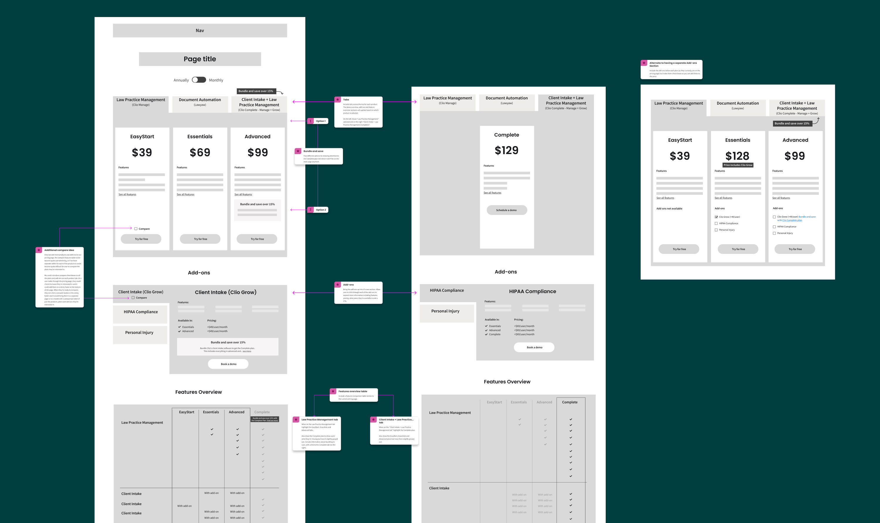
After creating the initial wireframe shown above, I presented this solution to the pricing team, leading to extensive discussions on the strategic positioning of Clio's products and add-ons. It also led to us defining what was considered a core product, standalone product versus add-on.
This discussion was ongoing throughout most of the wireframing and subsequent high-fidelity design phase, leading to several pivots as we explored various options to determine the optimal solution. Each time we pivoted I assumed the responsibility for iteratively refining the wireframes to address emerging challenges.
The primary areas where we pivoted revolved around how best to promote our add-ons and whether to disclose pricing or provide detailed information about them, whether to integrate our standalone products or maintain separate pages, how effectively to showcase savings on higher tier plans and the overall page structure.
A/B testing
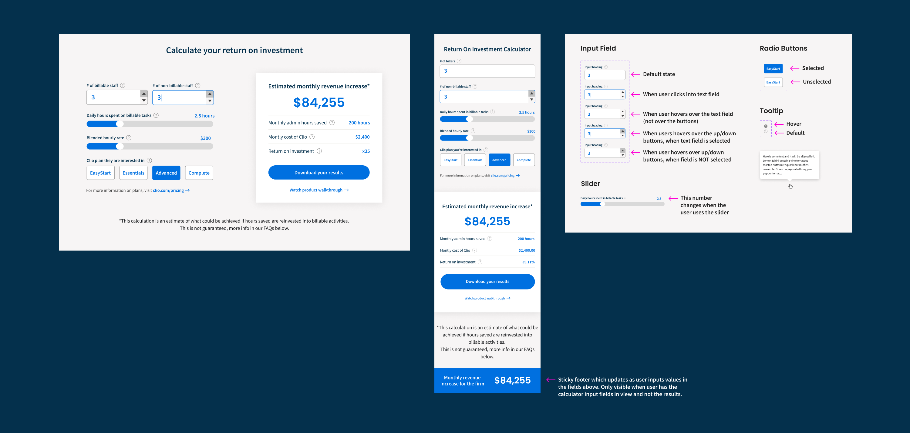
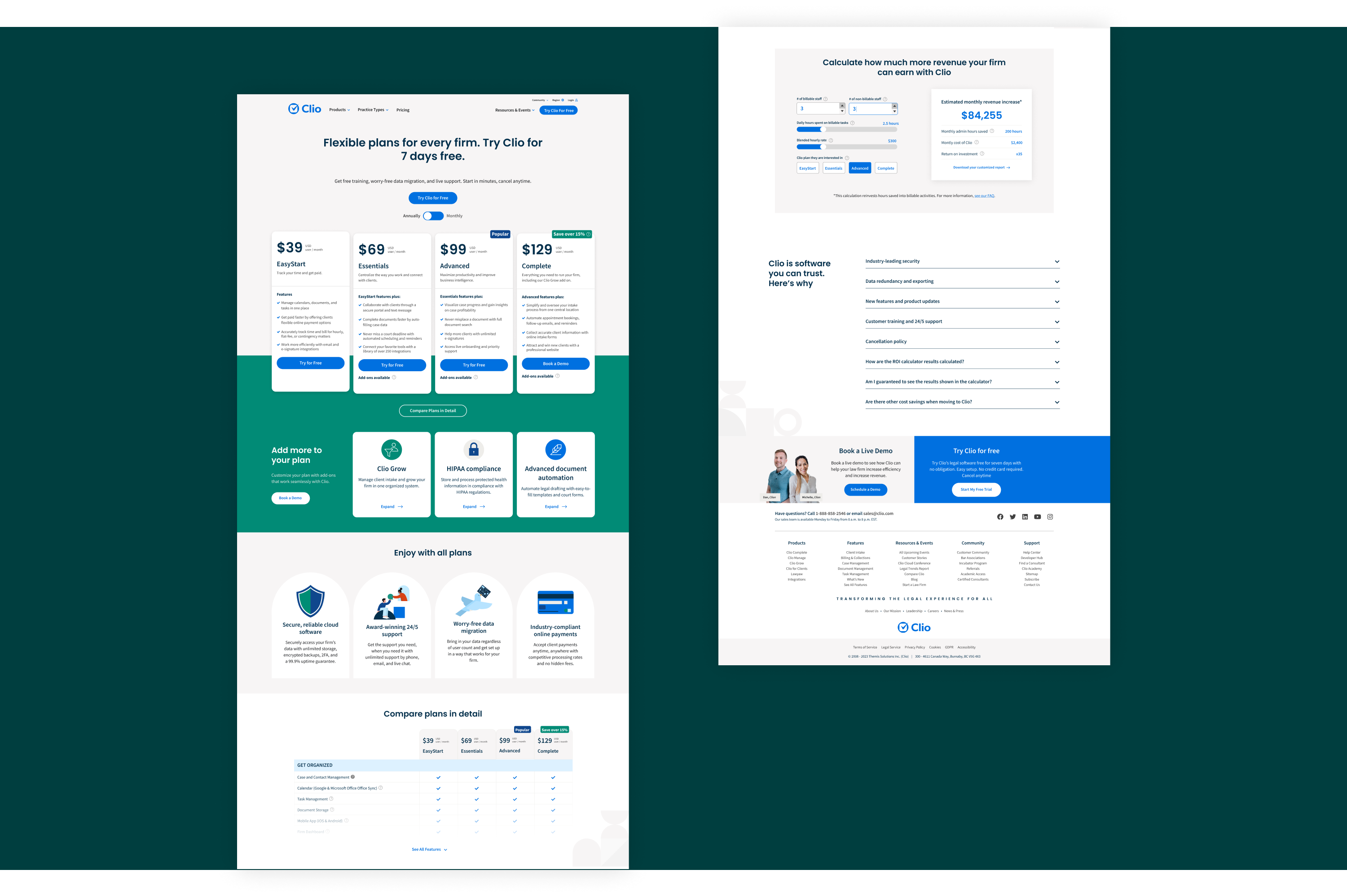
One of our key objectives was to address the question: Is Clio worth it? To achieve this, I investigated incorporating Clio's ROI calculator onto the page. This tool, which I had previously designed as a versatile website component, enabled users to input specific parameters and receive an estimate of their monthly ROI.
We conducted an A/B test by adding a link to the ROI calculator on our existing pricing page, opening it within a modal. The results revealed a notable increase in the page's conversion rate compared to the control. Subsequently, we further refined our approach by testing the direct embedding of the calculator onto the page, which yielded even more promising results.
High-fidelity designs
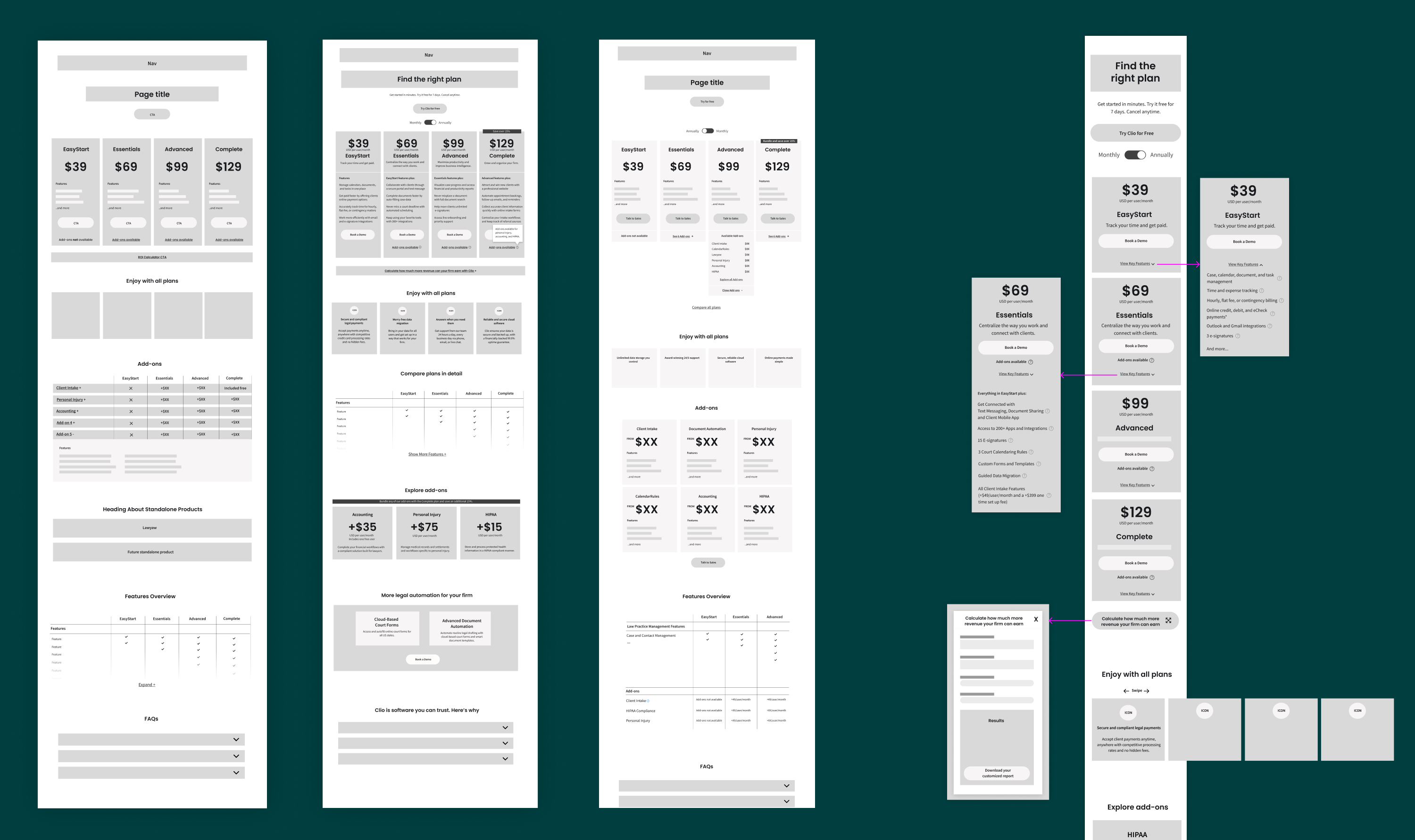
Once the wireframes reached an optimal state, I transitioned to high-fidelity mock-ups. As the team was undecided on the use of development resources, I designed a range of solutions, spanning from minimal to more extensive development efforts. After presenting the options, we reached a consensus that we shouldn't constrain the design.
Throughout this phase, I collaborated closely with the content team to ensure both content and design worked seamlessly, with a brand designer to bring the brand to life through additional graphic elements and lastly with the web development team to ensure my designs were feasible and within scope.
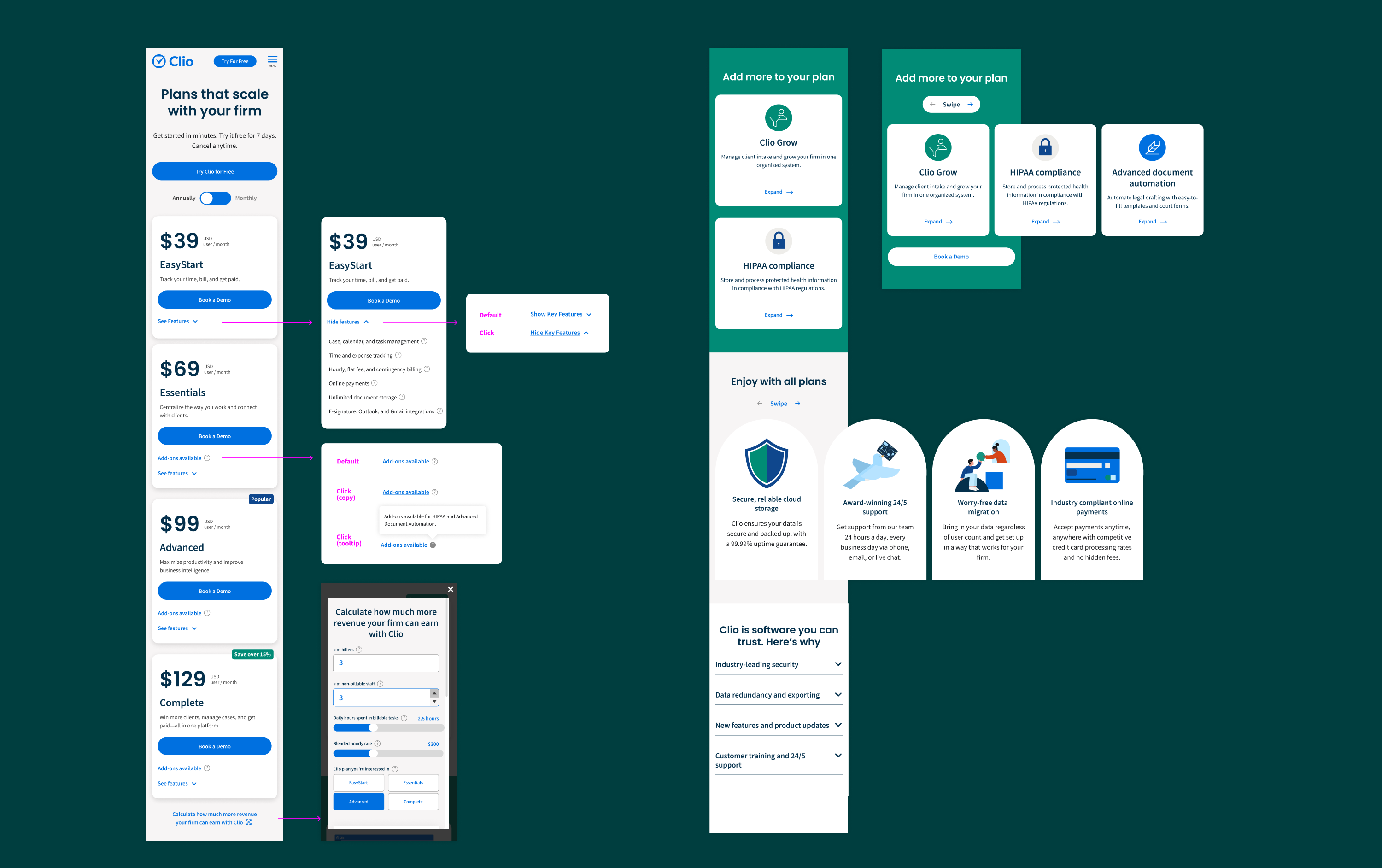
During this phase, I dedicated considerable effort to refining the mobile and tablet user experience. Exploring various methods to display the feature table, each approach presented its own set of advantages and drawbacks. After evaluating all options, it became evident that none offered the desired level of user-friendliness. Consequently, I advocated for the removal of the table altogether.
Recognizing the necessity for prospects to compare features, I came up with an alternative mobile experience. This solution enabled users to expand a concise list of key features beneath each plan. To address the issue of vertical scrolling, I introduced swipeable carousels for sections containing multiple tiles, along with implementing several other customizations.
Navigating the development constraints with the need for consistency between mobile and desktop pages, I collaborated closely with the developer to ensure my solutions were feasible.
Dev hand-off and QA phase
Following the approval of the final design by all stakeholders, I documented it in Figma, before passing it over to the web developer. Throughout the development phase I remained actively involved in quality assurance testing. This involved providing feedback on the design implementation and identifying any bugs.
A last minute pivot
Upon reviewing the design in staging, the team expressed concerns regarding the need for user interaction with the carousel to see all add-ons. They also wanted to provide more information here without overly expanding the section. This prompted a rapid pivot in the design approach.
I proceeded to explore several alternative solutions, carefully weighing their advantages and drawbacks. After thorough evaluation, I determined that the optimal solution was implementing tiles that could expand to provide additional information within a modal. This approach ensured visibility of all add-ons, allowed for the incorporation of more detailed information, and maintained the section's height. Recognizing the imminent expansion of this section in the future, I proactively planned for scalability while ensuring compatibility with different screen sizes.
Another challenge arose during the QA phase when we uncovered that the North American pricing page was linked to all other regional pricing pages. This unexpected discovery meant that updates to specific sections of the page would alter the design of other regional pages. Initially the project scope included only North America, so this revelation significantly expanded the project's scope.
Complicating matters further was the fact that each region had a distinct plan structure, adding complexity to finding a resolution. Collaborating closely with the web developer, and project team, we devised a solution, ensuring consistency in the design while accommodating their unique requirements.
Below are recordings of the live desktop and mobile pages:
Results and learnings
In the month post-launch, I conducted a thorough analysis of the page performance, looking at conversion rate data, heatmaps, and user recordings. The findings revealed significant enhancements:
- Conversion rate increased from 8% to 8.9%.
- Bounce rate plummeted from 71% to 29%.
- Successful promotion of a new add-on through the page
- Increased engagement as users now navigated to sections further down the page, facilitated by the collapse of the feature table
- The mobile experience aligned precisely with our intentions, particularly in facilitating comparison, following the removal of the feature comparison table.
Following the project's conclusion, I led a project retro, from which several valuable insights emerged:
- The necessity for clearer identification of approvers throughout the process to minimize additional design iterations post-approval.
- Recognition of the complexity of the page highlighted the potential benefits of producing a Figma prototype to simulate the user experience across various devices, reducing post-development changes.
- Emphasis on early collaboration between web designers and web developers to investigate the connections between regional websites, ensuring a comprehensive understanding of project scope from the outset.