Clio Website
Clio is a legal technology company who offers law firms cloud-based software that handles various law practice management tasks, including client intake, contact management, document management, timekeeping, billing and payments.
My role: I was a Web UI/UX Designer responsible for owning the UI and UX of Clio's websites, coming up with ideas to improve usability and conversion, and managing the design process from research to implementation.
Below are a selection of website projects I worked on.
Mid-Market microsite
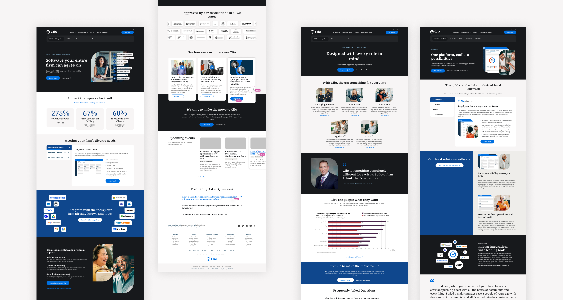
Clio had traditionally not been seen as a product suited for mid-sized and large law firms, and the company aimed to shift this perception. The creative team designed a new visual brand that would appeal to this audience. The brand incorporated professional and corporate fonts, imagery, and colors while maintaining ties to Clio’s existing brand identity.
My role involved translating this refreshed brand into a compelling website experience. I collaborated closely with content writers, web developers, demand generation, and marketing managers to launch a new sub-site targeting this audience on Clio's main website. This project was design-driven, so I utilized research and user behavior data to craft a landing page tailored to the audience's preferences. I then worked hand-in-hand with the content team to ensure our narrative was effectively communicated within the design framework, and the development team to ensure the designs were feasible within the constraints of the website and the timeframe.
Website components
Clio uses the WordPress CMS for their websites, employing a component system that allows for customization of content, colors, and layout variations within each component. During my time at Clio, I contributed to several enhancements of this component system, including:
- Redesigning a flexible column component to support additional columns and improved interactivity.
- Refreshing the testimonial component to include photos and diverse layout options.
- Adding a new feature to the masthead component, enabling the upload of background images and videos.
- Optimizing the use of animation and video on the website.
- Adjusting font sizes across both desktop and mobile platforms.
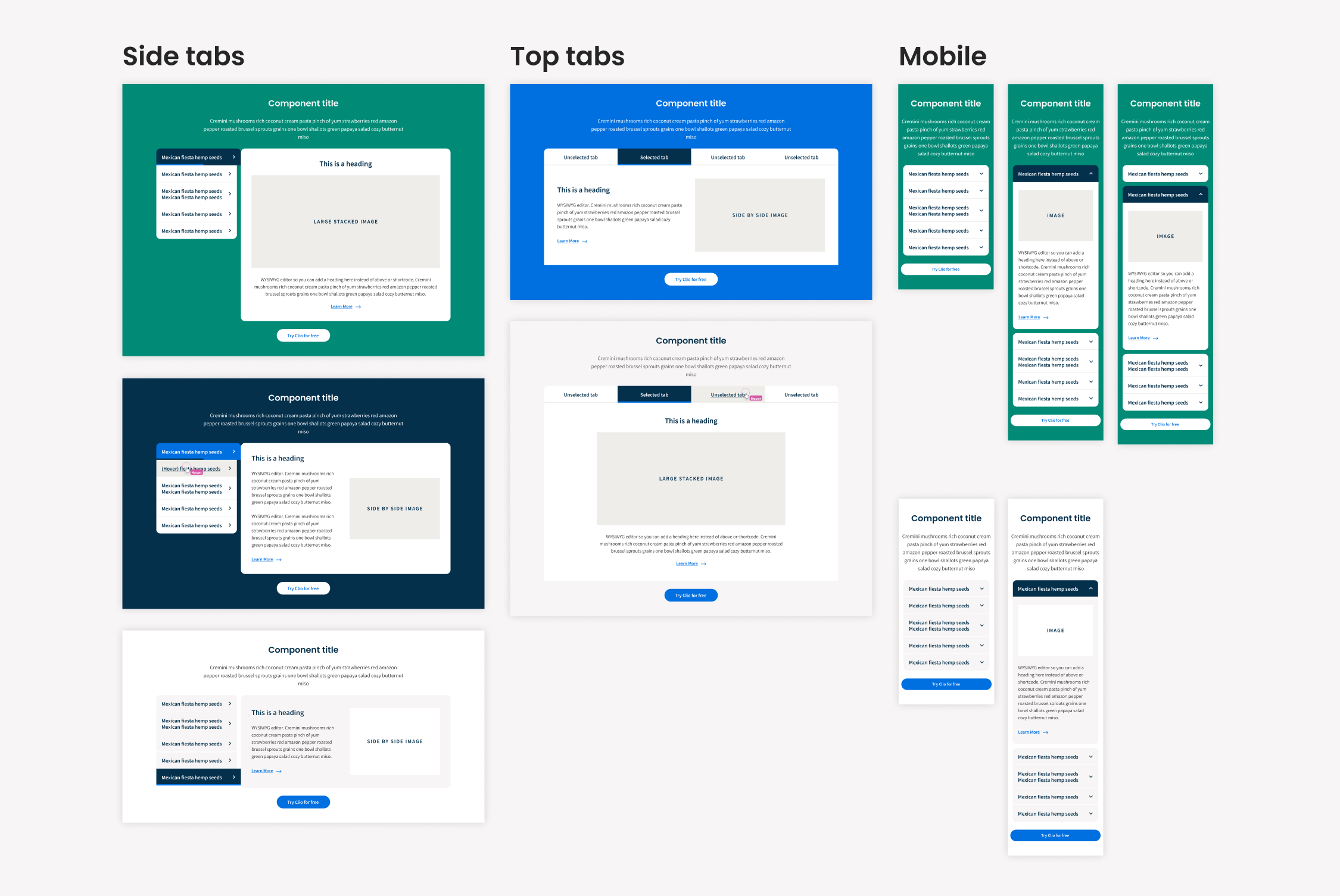
Additionally, I designed a brand-new tabbed component, shown below. This component was designed to display extensive product information within a compact space. I created two layouts for this component: one with tabs on the left side and another with tabs across the top. The component featured an automatic rotation through the tabs, indicated by an animated progress bar, which could be paused by hovering over or interacting with the component. On mobile devices, the component transformed into an accordion format.
Several considerations and challenges were addressed during the design of this component, ensuring that it:
- Supported various media types (video, animations, and images) of all sizes.
- Allowed flexibility in formatting and positioning text, headings, and images.
- Worked seamlessly with all core brand colors as backgrounds.
- Was user-friendly in the CMS, making customization accessible to users without development skills.
Web-based calculators
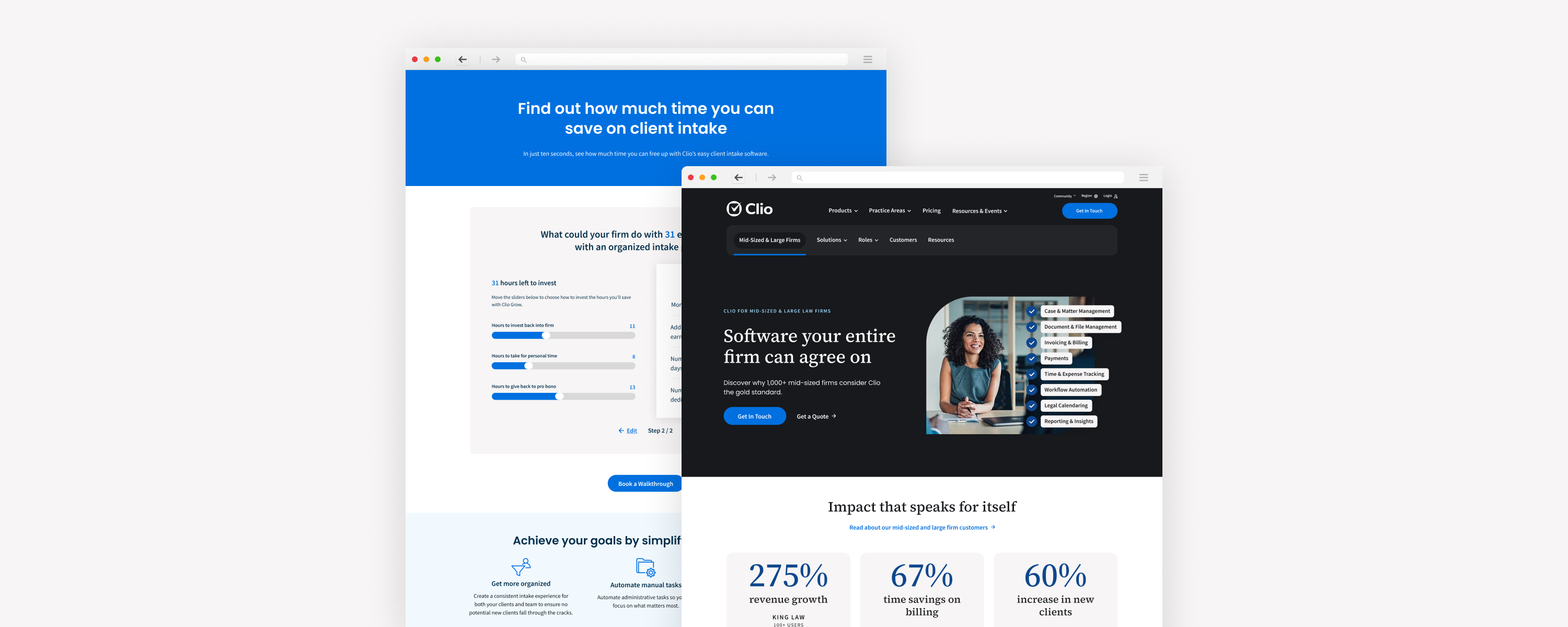
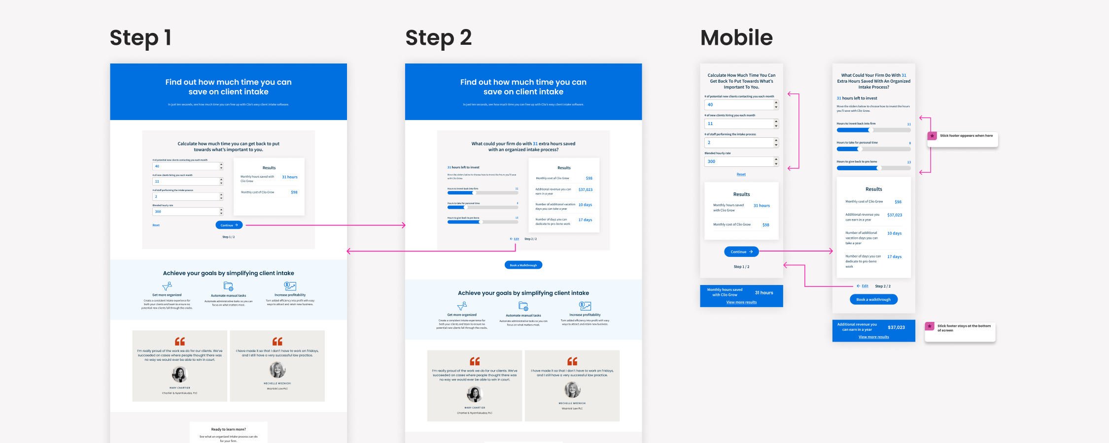
I designed two web-based calculators. The first, an ROI calculator, enabled users to input specific parameters and receive an estimate of their monthly return on investment. The second (shown below), a client intake calculator, allowed users to calculate the time and cost savings achievable with Clio's client intake solutions.
I designed both tools as a versatile component which could be added to any page on the website, as well as the main landing pages that housed each of the calculators.
Landing pages
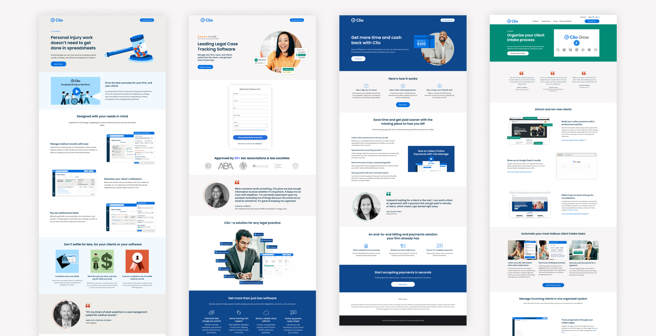
I was responsible for designing landing pages for a range of different purposes including:
- Showcasing Clio's products and features
- Campaigns and giveaways driven to by advertising campaigns
- SEM landing pages
- Competitor comparison pages
CRO testing
I was a member of the conversion rate optimization squad, collaborating closely with marketing managers, content writers, data analysts and developers, to brainstorm innovative ideas for enhancing the website conversion rate. We validated these hypotheses through A/B and multivariate testing. I played a key role in the ideation and design of several tests, including:
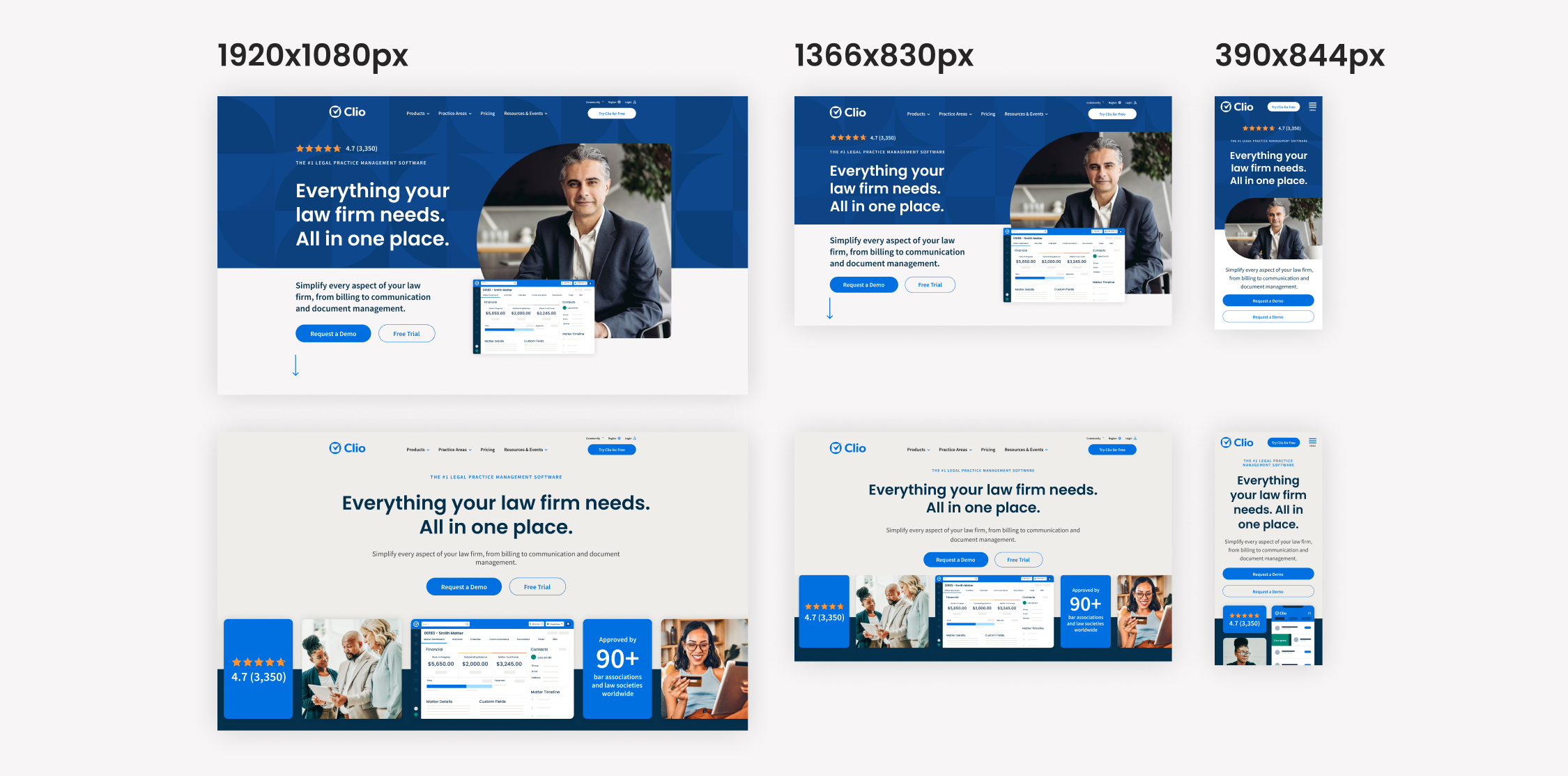
- New homepage masthead layouts
- New layouts for SEM landing pages
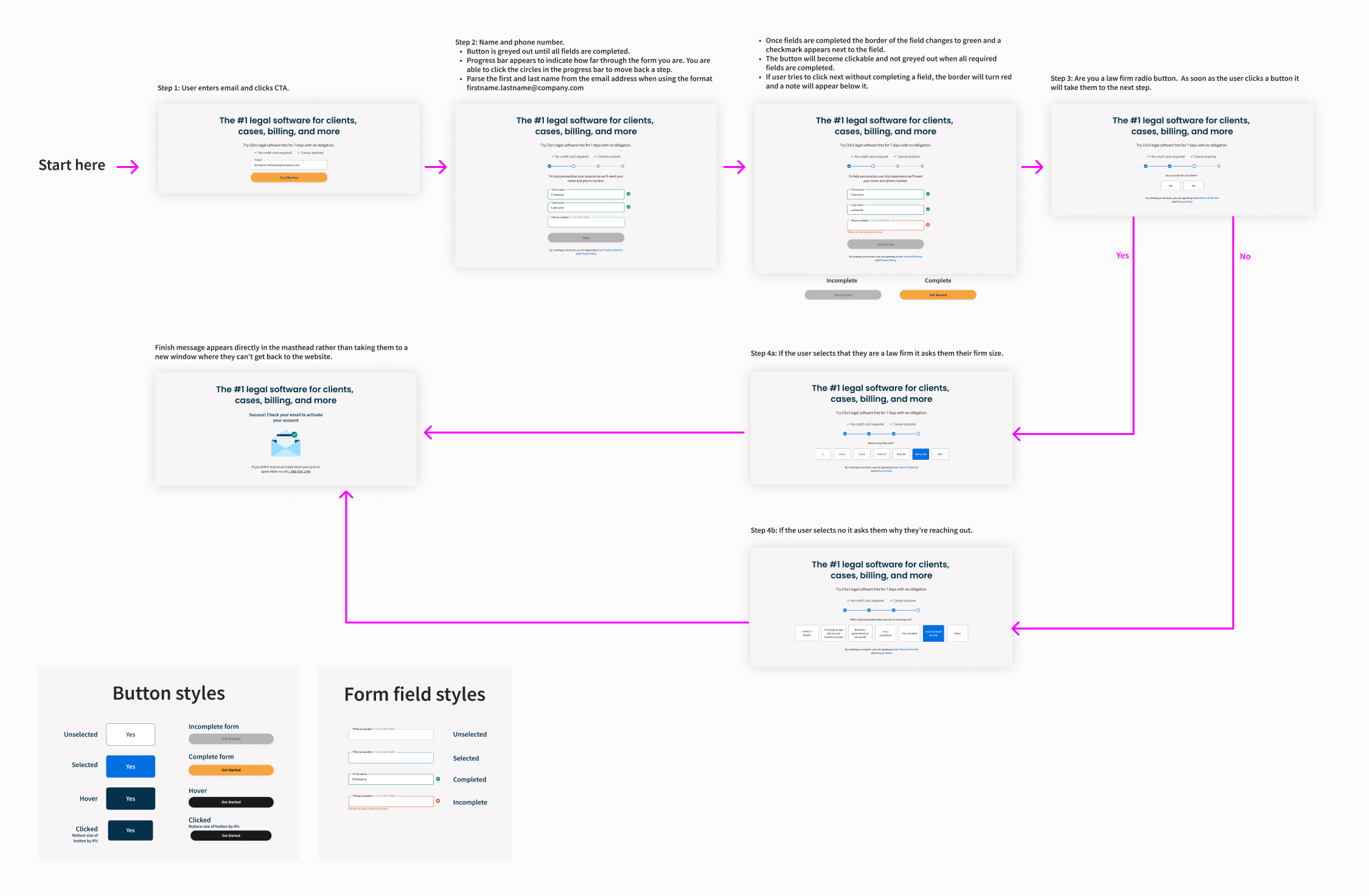
- A multi-step form to replace the existing form
- A new layout of a demo page
