EM:RAP Admin, Groups Feature
EM:RAP delivers world-class medical education to emergency medicine professionals worldwide. They offer a variety of platforms, including a website and app for streaming audio and video content, along with a dedicated platform for accessing medical and drug reference chapters.
The EM:RAP support team utilizes a web-based Admin platform to manage and publish content across these platforms. The original product, built in PHP, had become outdated and increasingly difficult to maintain. To address these challenges, we embarked on developing a new, modern Admin tool built with React and the Material UI design framework. This solution not only simplifies support but also allows for seamless expansion as EM:RAP introduces new advanced features.
My role: Lead product designer for the React-based Admin, responsible for conducting client interviews, creating wireframes, high-fidelity mockups, prototypes, and leading user testing.
Team: Several software developers, a product owner and a project manager.
Timeline:
- Research and design - 2 months
- Development - 5 months
- Internal testing and bug squishing - 2 months
- External testing and further bug squishing - 2 months
Process:
Goal
The "Customer Groups" feature enabled groups of medical practitioners to access discounted subscriptions based on group size. The EM:RAP support team managed the creation, update, and renewal of these groups through the Admin platform. The project aimed to migrate this feature to the new React Admin system, modernizing and enhancing it for greater efficiency and automation.
Client interviews
We conducted interviews with the EM:RAP support team to gain a comprehensive understanding of their workflow, both within and outside the current Admin system. During these discussions, we identified several issues and pain points and discovered, the group creation and renewal processes were largely manual and occurred outside the Admin tool. Some of the issues led to a general lack of trust in the platform, making the team hesitant to adopt a more automated solution, as they preferred to manually verify each step. We also learned that the team really valued maintaining personal touchpoints throughout the process, often via email.
The main pain points we identified during the interviews were:
- Using spreadsheets to manage calculations, creating invoices and receipts, managing upcoming renewals and assigning groups to support members
- Manually searching for accounts to verify existing subscriptions and upgrading members with different subscription types
- Lacking visibility into group members who haven't activated their subscriptions
- A confusing checkout process for new members, showing $0 orders during activation
- A separate manual sales tax calculator for calculating individual member taxes
- Processing payments through an external system
User flow
After analyzing the support team’s existing processes and pain points, I mapped out a new, streamlined user flow, detailing customer actions, support team responsibilities, and system processes. The proposed flow would address user pain points to:
- Automate many of the manual tasks the support team currently handles outside the Admin
- Maintain personal touchpoints with customers at key stages
- Reduce the number of inactive group subscriptions
- Enable group administrators to manage group creation and renewals independently
- Facilitate credit card payments within the Admin system
Wireframes
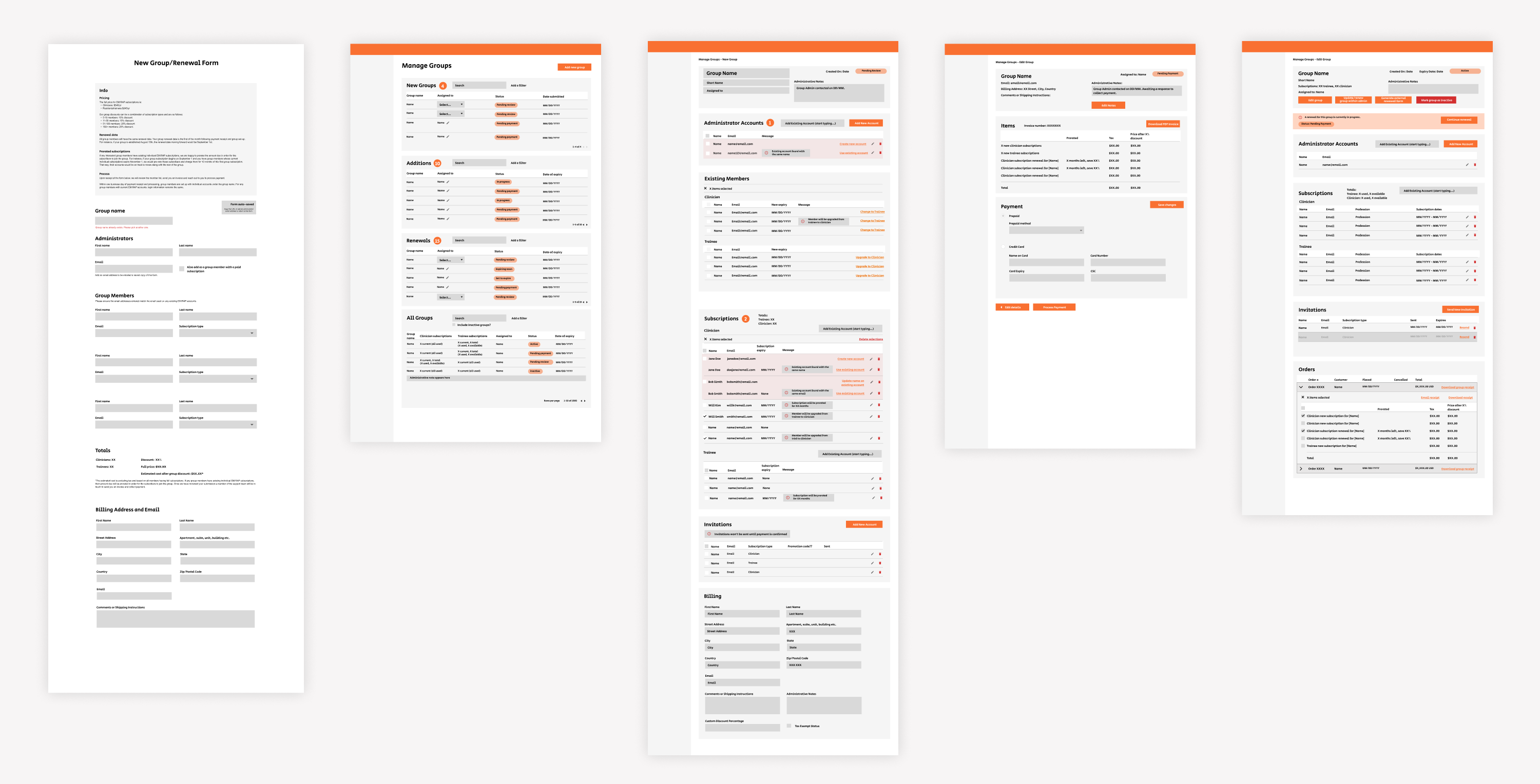
The next stage involved designing wireframes which focused on the key improvements. I created them in a medium fidelity so they would help the team visualize the feature. The main screens were:
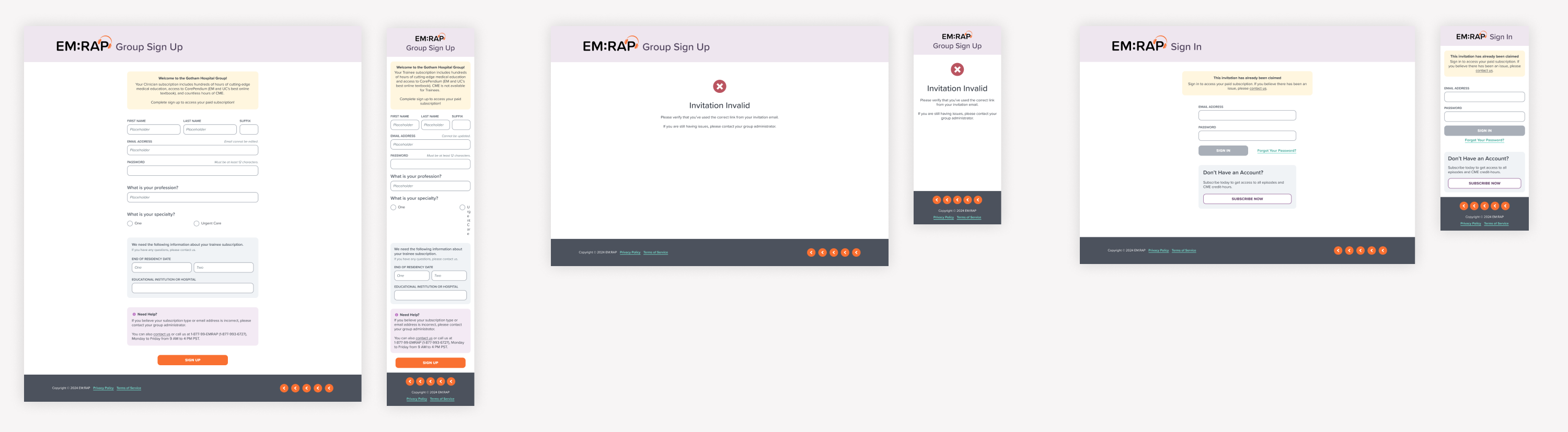
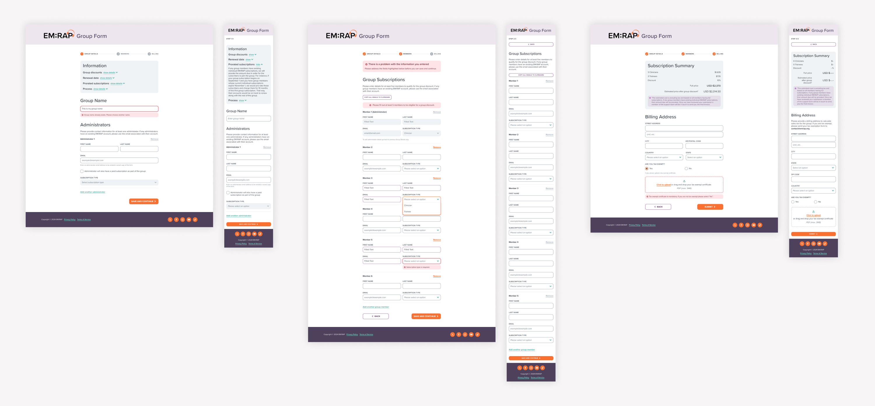
- Customer facing new group & renewal forms: The existing manual group creation process was replaced with an external-facing form for group administrators to submit group details themselves, helping to reduce the workload for the support team.
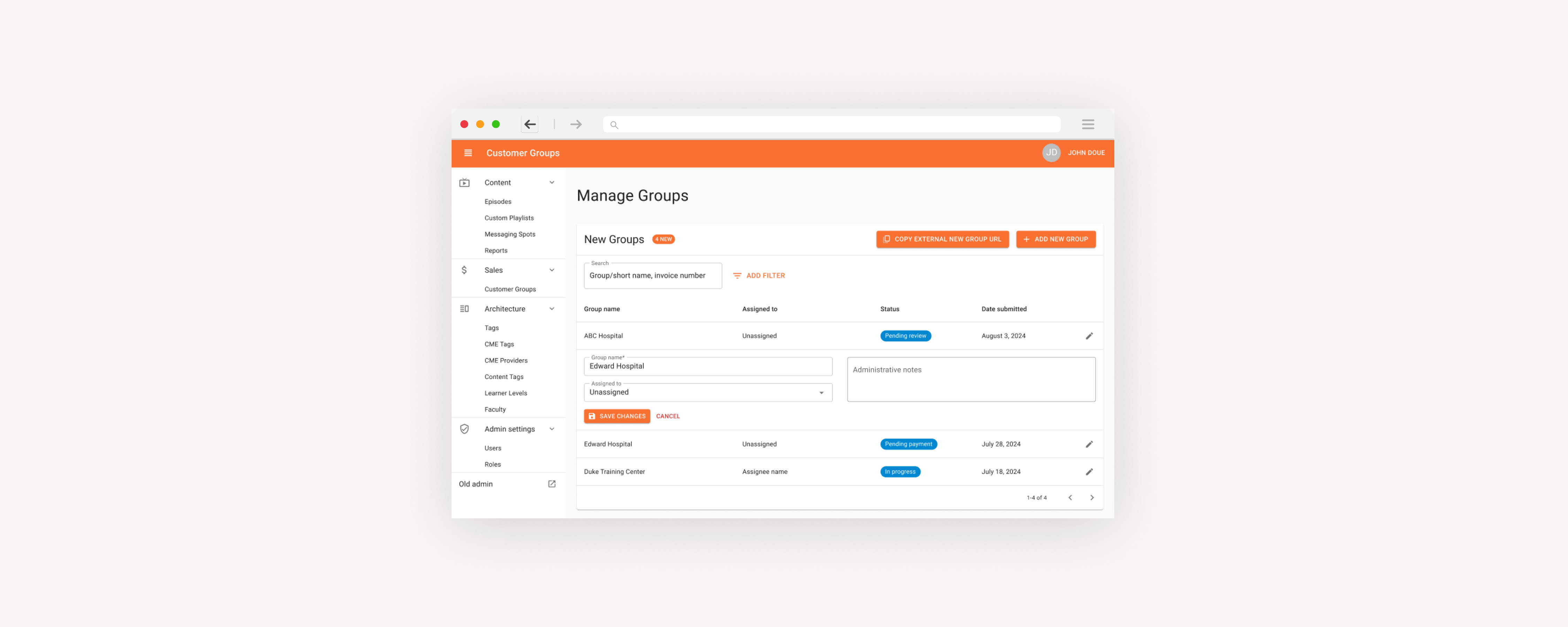
- Main group management screen: An interface to search, filter and manage new group requests, mid-subscription additions and renewals, track statuses, and filter for inactive, soon-to-expire groups and pending invitations, addressing inactive subscription issues.
- Review step: A manual review step, requested by the client, to verify group details that are submitted by the group administrators before finalization, mitigating data conflicts and providing visibility into any account changes that will be automated.
- New groups, additions and renewals: A new page to create mid-subscription additions, which were to be managed solely by the support team. As well as internal pages for creating new groups and yearly renewals, if the group administrator was having trouble doing this using the customer-facing form.
- Payment step: Tax calculations and invoicing, previously done manually, were automated based on group addresses and tax-exempt status. Invoices and receipts are now auto-generated, and credit card payments can be processed directly through the Admin system.
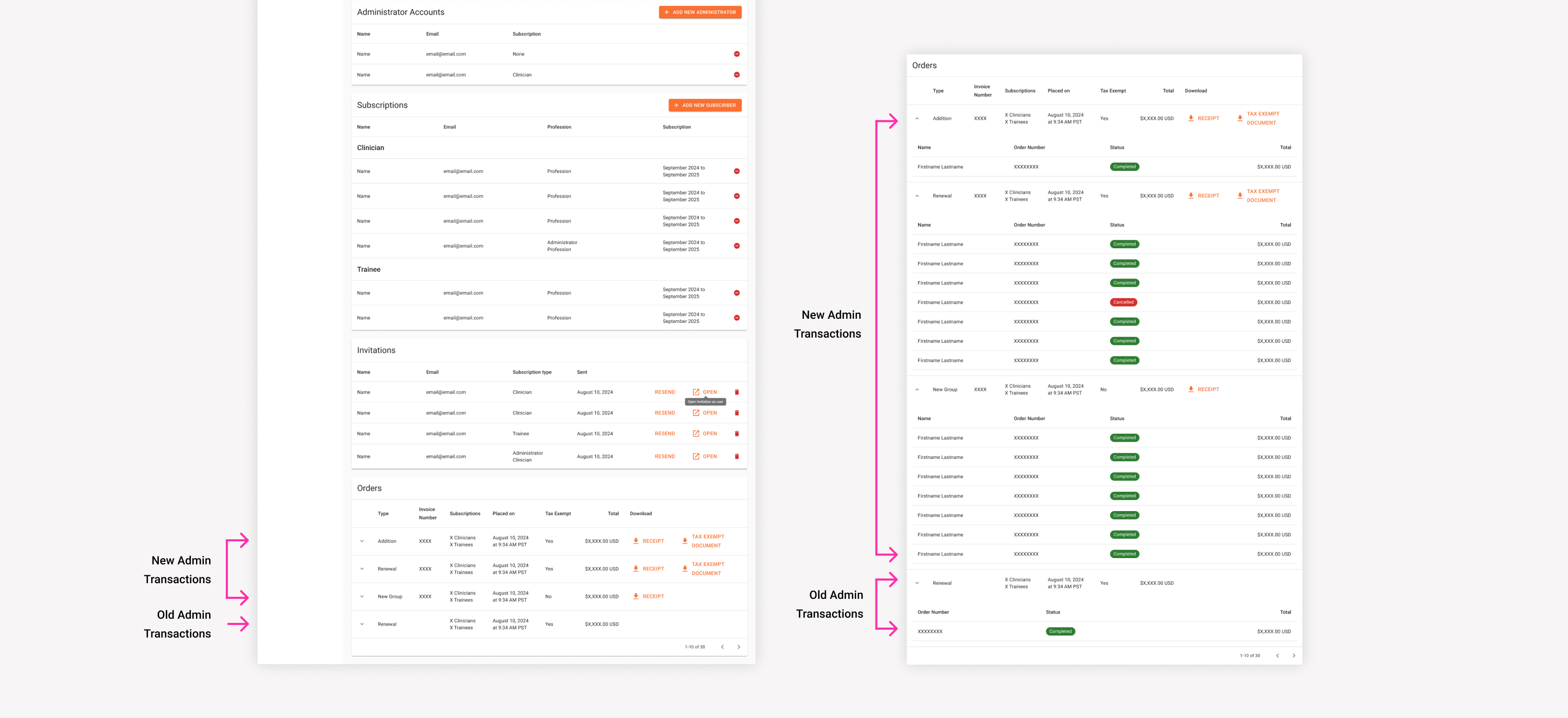
- View/edit active group: This step allowed the support team to manage updating group details, add admin notes, manage and resend invitations that hadn't been activated, and remove and replace subscribers during an active subscription.
Another challenge I had to consider was that not all features had been transitioned to the new Admin. Certain functionalities related to the groups process, such as customer accounts and orders, still linked back to the old Admin. I needed to ensure that updates to the new groups process wouldn’t interfere with managing these areas in the old system and that moving between the two products would be a seamless experience.
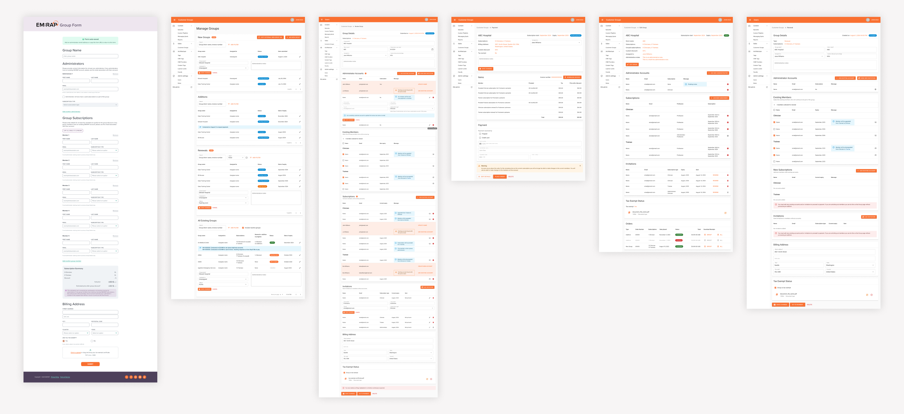
High-fidelity designs
Once the client approved the structure and flow of the wireframes, I transitioned to high-fidelity designs, utilizing the Material UI design framework and the custom design system created for the customer facing website.
During this phase, I also collaborated closely with the internal Checkout team, who were redesigning the sign in and up screens on the customer-facing website. I worked closely with them to ensure groups were factored into this new flow, as well as to design a new group invite redemption form.
Throughout this phase, we held weekly client meetings to present design updates and gather feedback. Several key issues emerged during this stage which led us to iterate on the designs:
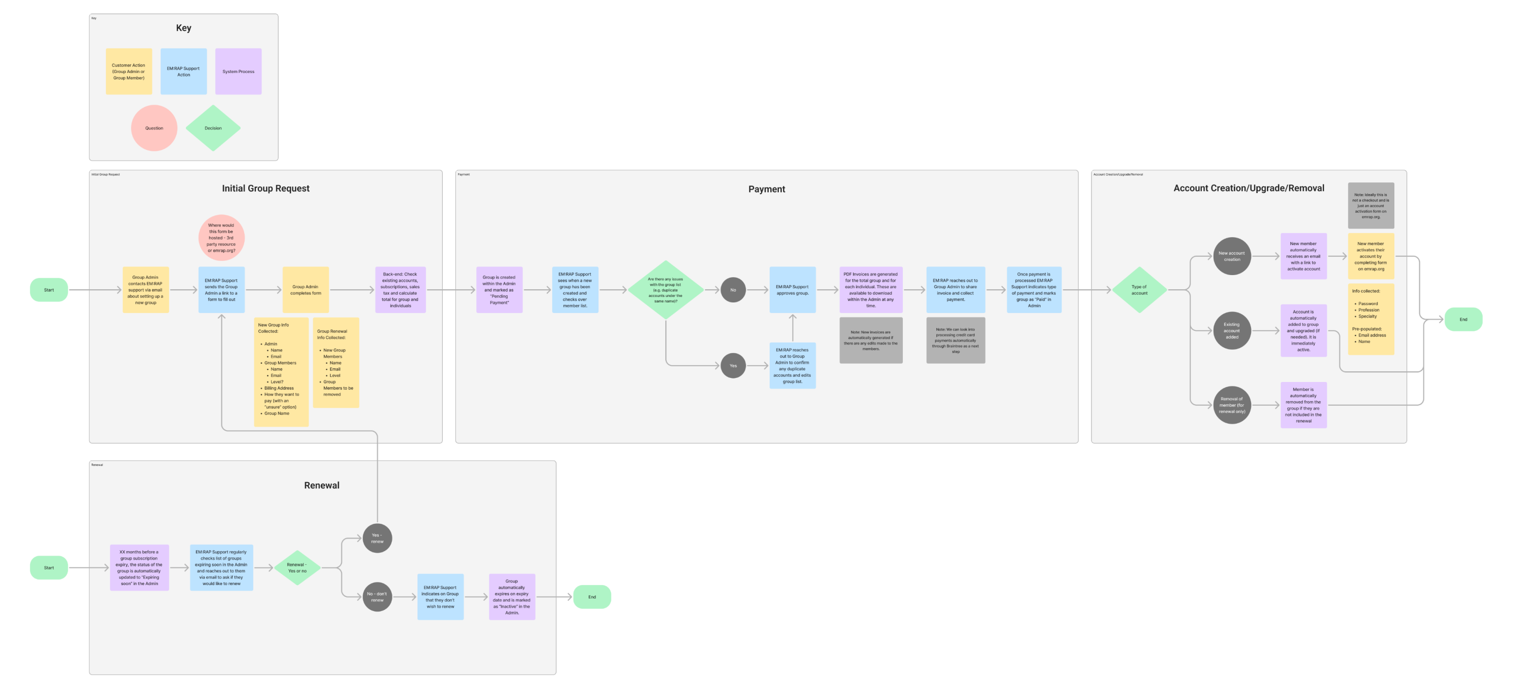
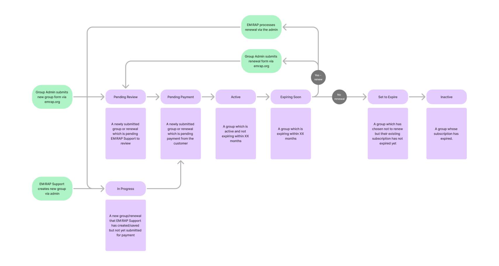
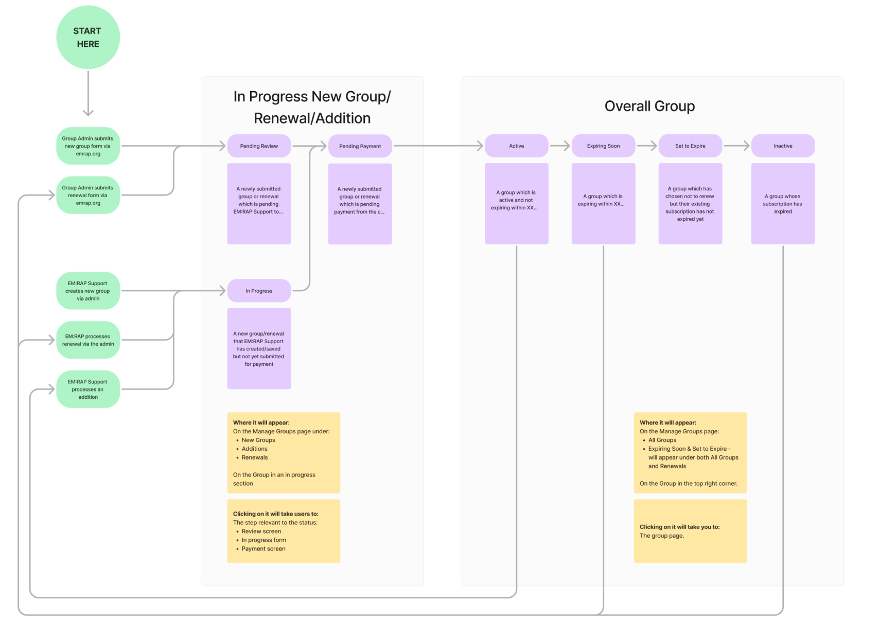
Handling multiple additions and renewals: We discovered EM:RAP often dealt with overlapping additions and renewals, especially when payments for previous additions were delayed. I revised the status approach, introducing two types of statuses: the group’s overall status and an addition/renewal status. I created flow charts to document and present the change to the flow and seek alignment from the client and team.
Additional improvements introduced:
- The ability for customers to indicate tax-exempt status and upload certificates as proof during the group creation process.
- Auto-generated individual receipts alongside group receipts, as group admins often collected payments from individual members.
- The ability to assign and re-assign each group to a specific support team member, ensuring a consistent point of contact for groups during renewals and additions.
- Logic for automatically setting a subscription start date based on the time of month a new group or renewal is created, still allowing the flexibility for the support team to modify it if needed.
Development iterations
Once the design phase was finalized, I documented everything in Figma and conducted a walkthrough with the development team to facilitate a smooth transition. During the development discovery phase and throughout the development implementation, the team analyzed the existing codebase and database structure, surfacing several complex areas that could extend timelines significantly. To balance technical constraints with a high-quality user experience, we worked together to adjust the designs. Below are some of the major changes made during this phase, to reduce development complexity:
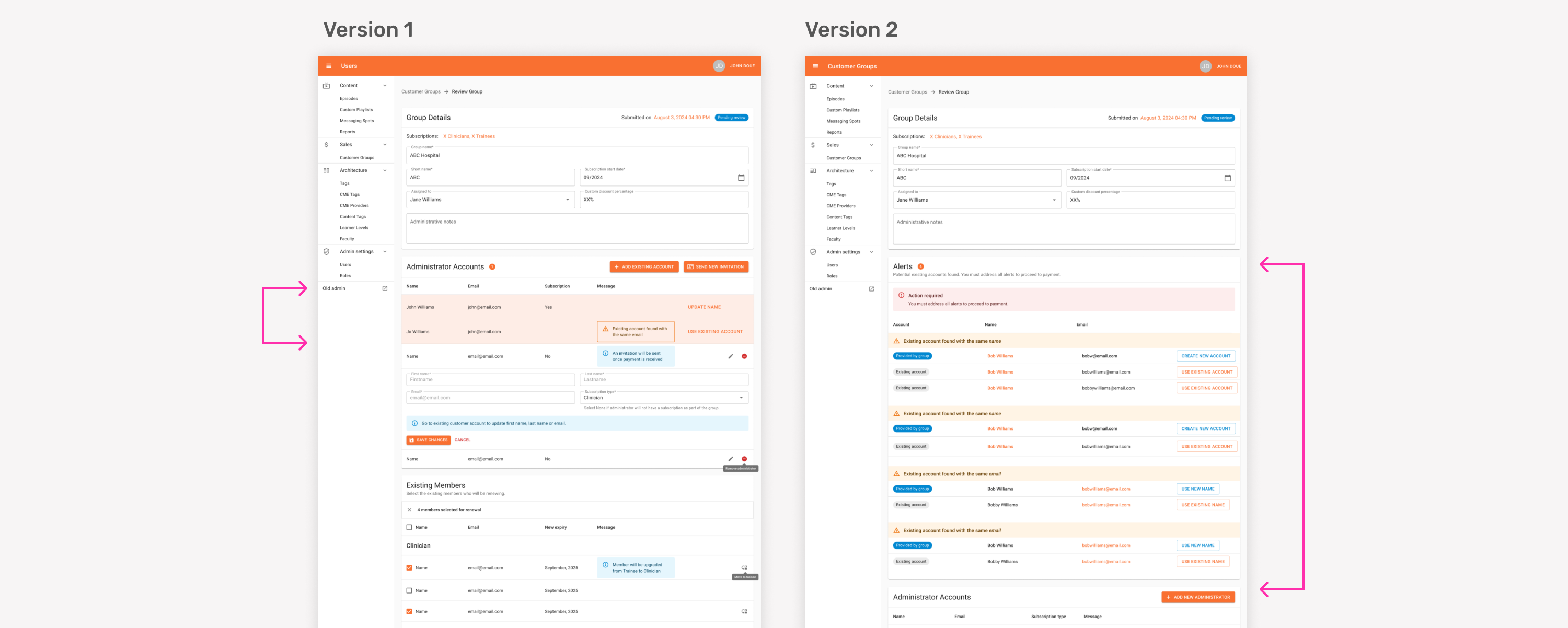
Revising the way duplicate account alerts were displayed:
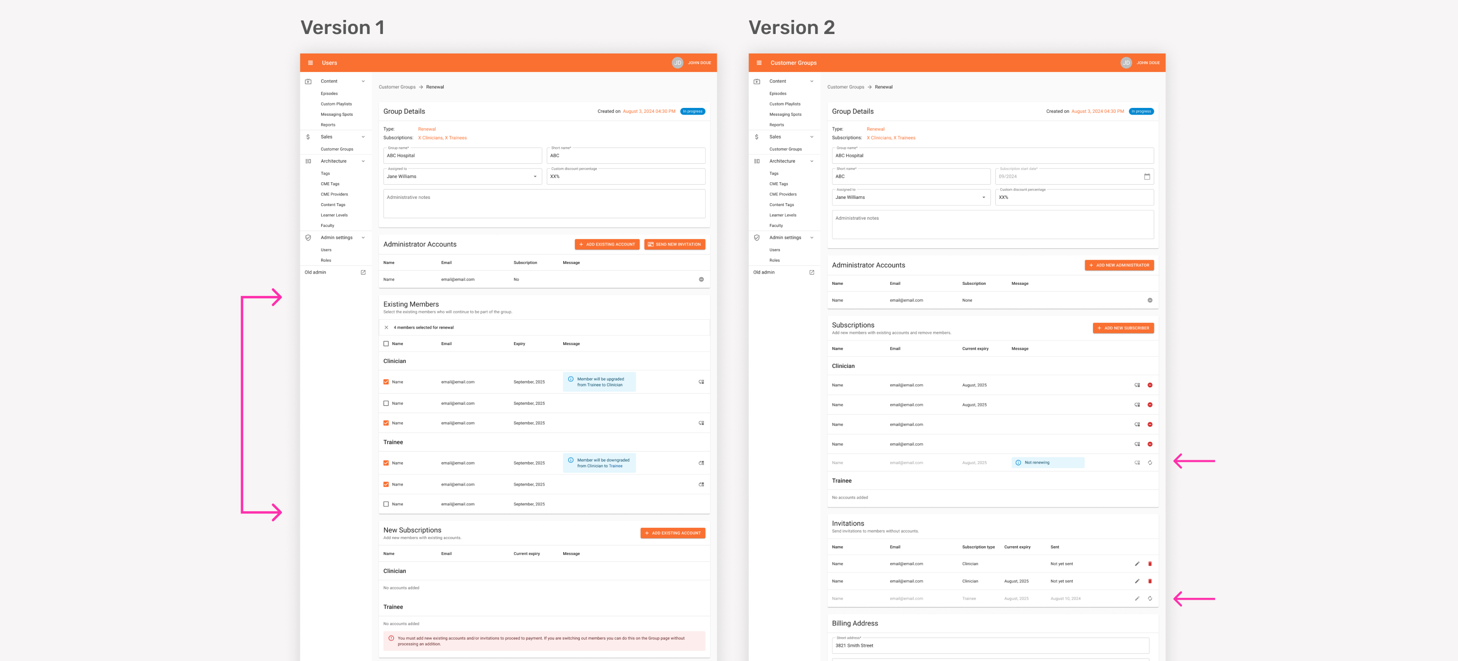
Redesigning the way existing members of a group were displayed when processing a renewal:
Breaking the customer facing new group/renewal form into multiple steps and changing saving behaviour:
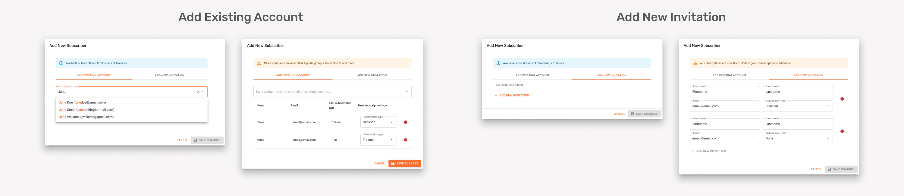
Simplifying the modals for adding new subscribers and administrators:
Revamping the group orders process and design due to the client's unique tax calculation methods, taking into consideration how old orders migrated from the old product would display:
QA testing
The screens were deployed to a staging environment in phases, allowing us to begin testing while development was ongoing. As the lead tester, I created a testing plan outlining expected behaviour within the product for the team to follow. I identified and documented bugs and missing or incorrect functionality in our product management software, including their severity, priority and steps to produce. The development team then worked through resolving these in order of priority. We met regularly to discuss any complications and there were a few instances where designs needed to be updated to make implementation easier.
Once the full product flow was implemented and no critical bugs remained, we provided the client with access to the staging environment to conduct their own round of testing. They did quite extensive testing over a few months, preferring to delay the launch in order to get the feature perfect, rather than launching it earlier and continuously improving it.
Results/learnings
When the feature was released to the EM:RAP Support Team, they consistently noted how much it improved their workflow and saved time by eliminating many manual tasks. In the months following launch, the team identified a few bugs and suggested additional enhancements, which I helped troubleshoot and design solutions for, in collaboration with developers to implement. Overall, the project was a clear success.
As an internal team, several key learnings emerged from this project:
- Involve developers earlier and more deeply in the design phase to better assess feasibility and provide more accurate implementation timelines. This would help reduce scope increases and minimize design revisions during development.
- Enhance developer documentation and handoff processes by clearly outlining all functionality and requirements, followed by a detailed walkthrough and Q&A session before development begins.
- Begin testing only once all screens are functional so that complete pages and user flows can be tested thoroughly in a single session.
- Maintain clearer communication with the client regarding requirements to prevent scope creep and keep the project timeline on track.